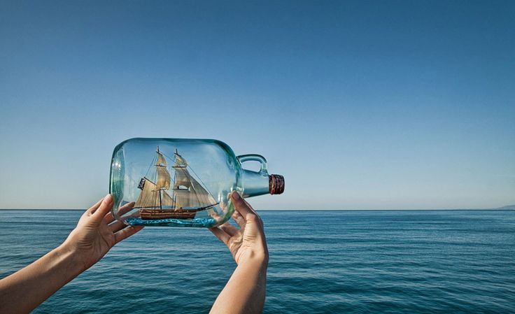
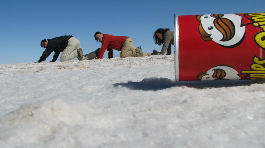
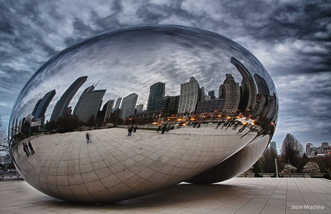
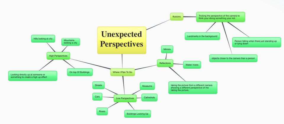
Unexpected Perspectives
Initial Response
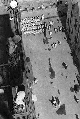
Looking at the world from unusual viewpoints can reveal unexpected perspectives. Ed Ruscha's photographs of car parks, Alexander Rodchenko's observations of city streets and Bill Brant's high-contrast images are all taken from unconventional viewpoints. Make reference to appropriate contextual material and produce your own work.
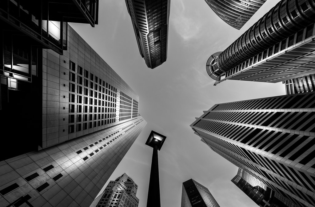
I choose Unexpected Perspectives because I felt this was the most challenging exam question between them all and will allow me to use my creative ability to its full potential. It will also allow me to use certain techniques that will only work in bright, ongoing images. I plan on taking high quality, detailed images to start my exam work, these images consist of shadows, buildings, Liverpool city centre and landmarks. Firstly, I decided that i had to plan were i wanted to go and how I wanted to take the pictures.
I choose Unexpected Perspectives because I felt this was the most challenging exam question between them all and will allow me to use my creative ability to its full potential. It will also allow me to use certain techniques that will only work in bright, ongoing images. I plan on taking high quality, detailed images to start my exam work, these images consist of shadows, buildings, Liverpool city centre and landmarks. Firstly, I decided that i had to plan were i wanted to go and how I wanted to take the pictures.
Research
The Work Of Other Photographers
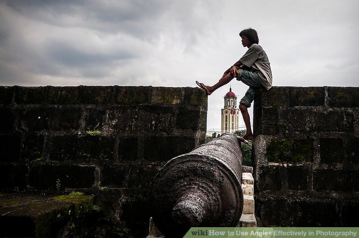
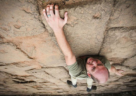
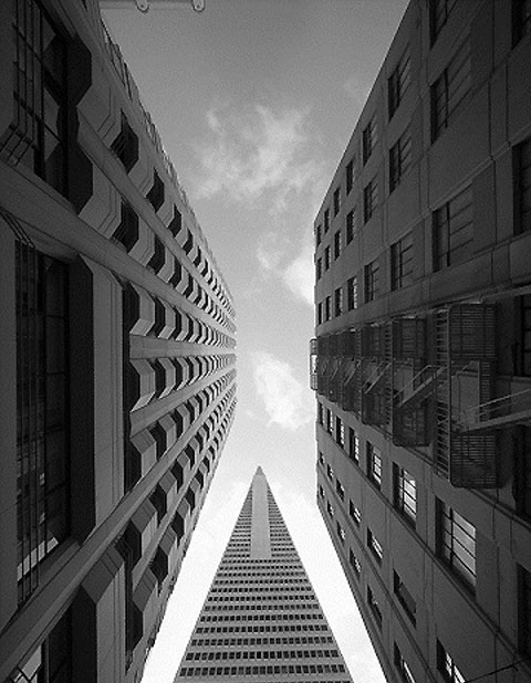
Perspective in photography can be defined as the sense of depth or spatial relationships between objects in the photo, along with their dimensions with respect to the viewpoint (camera lens or the viewer).

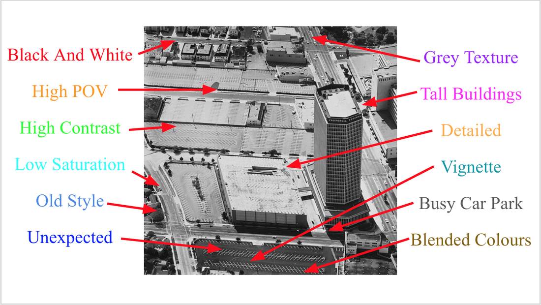
These images are very high in colour and contrast and show a different dimension of perspective with in photography, I think making these ngles work and have a low point angle can be difficult to portray.
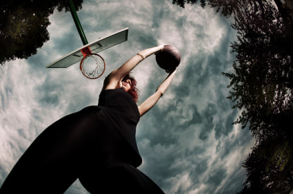
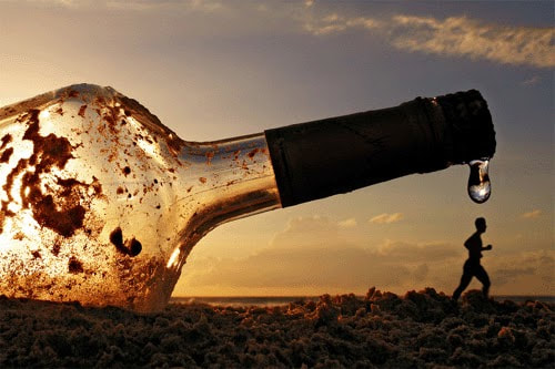
Optical illusion photography is an impression of a visible object or phenomenon that is not appropriate to reality, optical illusion of sight. This occurs more naturally during photography, rather than using photo post production services and all sorts of photo manipulations.
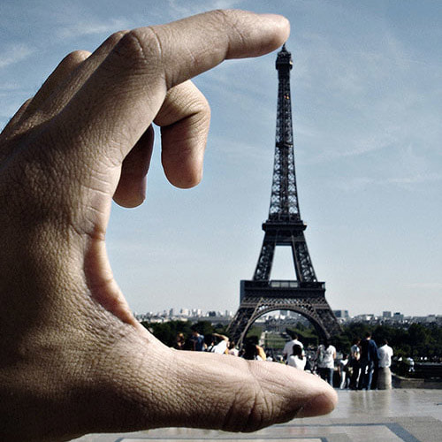
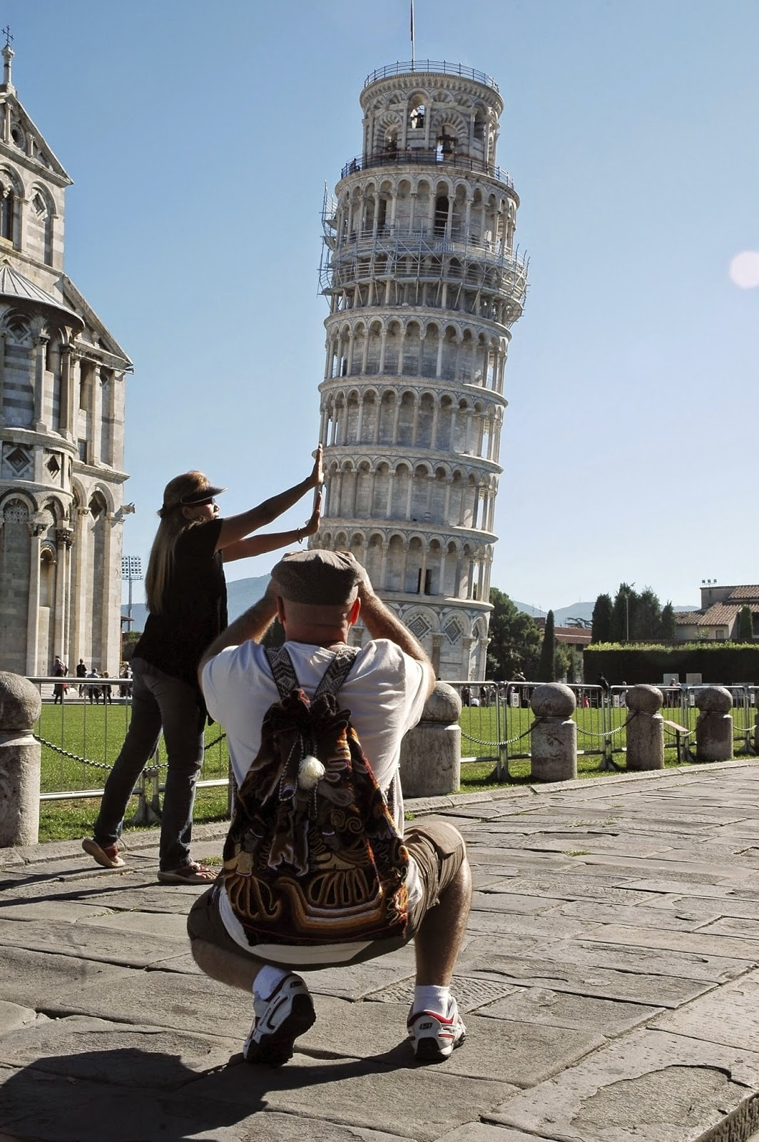
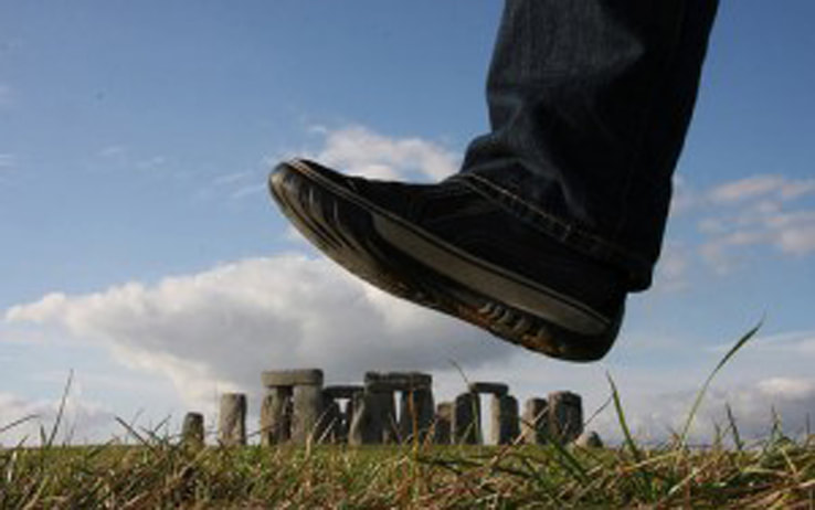
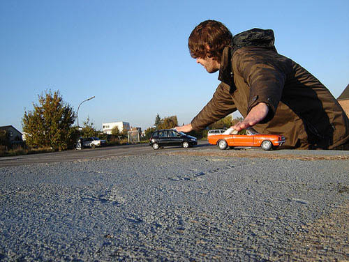
Forced perspective is a technique which employs optical illusion to make an object appear farther away, closer, larger or smaller than it actually is. It manipulates human visual perception through the use of scaled objects and the correlation between them and the vantage point of the spectator or camera.
In photography “perspective” refers to the sense of width, height and depth which creates three dimensional relationships between objects in a photograph. In particular 'Perspective' relates to two visual experiences: Relative size: Distant objects appear smaller than near objects despite larger actual measurements.
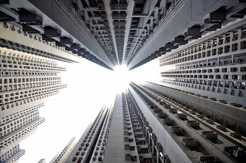
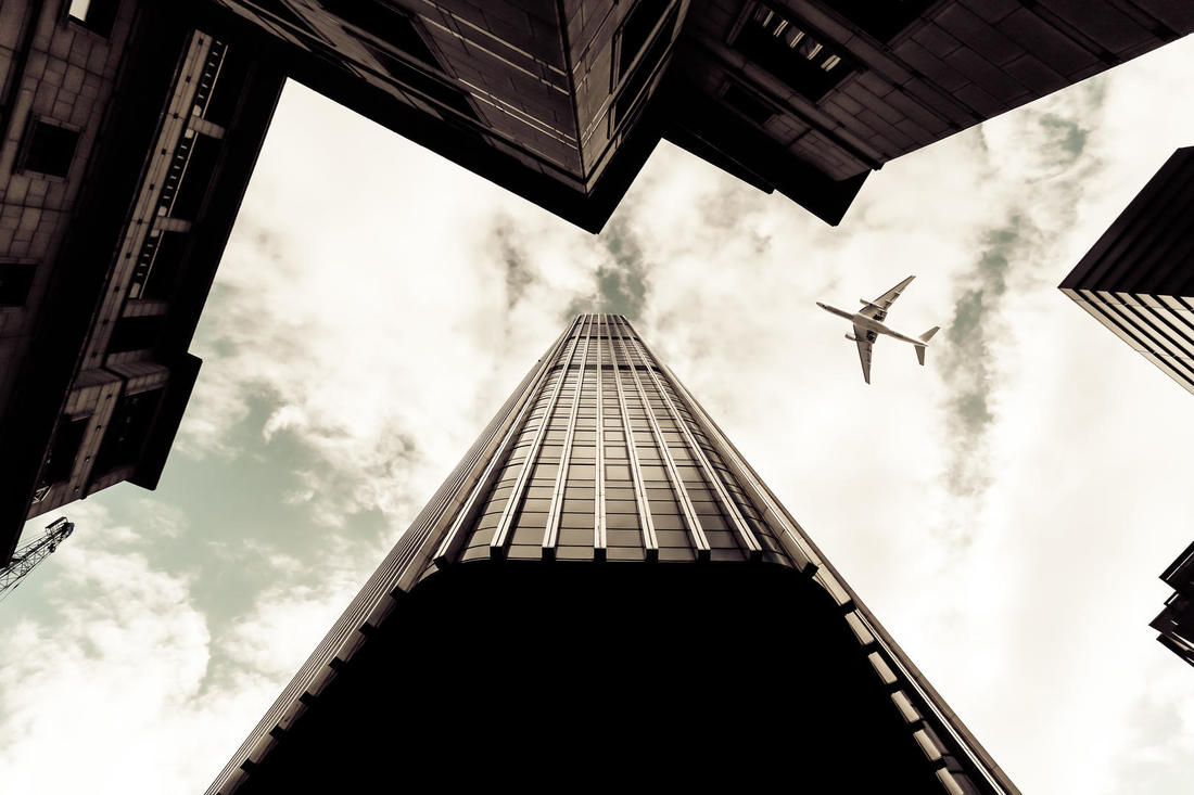
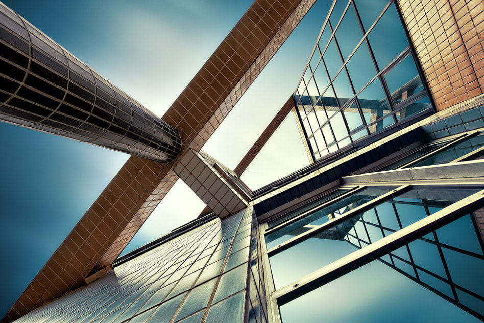
Architectural Photography is the photographing of buildings and similar structures that are both aesthetically pleasing and accurate representations of their subjects. Architectural photographers are usually skilled in the use of specialised techniques and cameras.
After researching Unexpected perspectives I feel this is a very challenging topic choice and am excited to look into more work of other photographers who specialise in units of perspective. Having images that you have to look at more than once creates a powerful images as you have to focus more into the image.
Artist Research
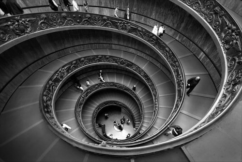
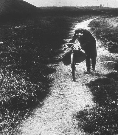
Alexander Rodchenko's Work
Aleksander Mikhailovich Rodchenko was a Russian artist, sculptor, photographer and graphic designer. He was one of the founders of constructivism and Russian design; he was married to the artist Varvara Stepanova.
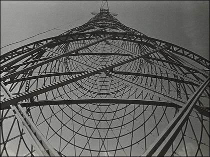
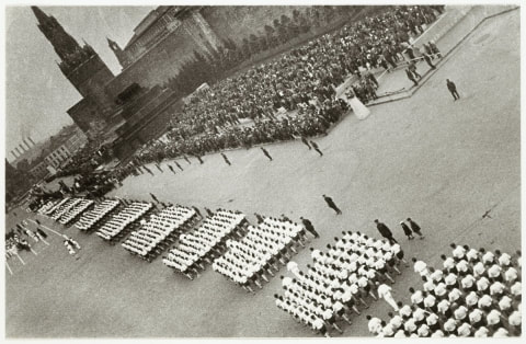

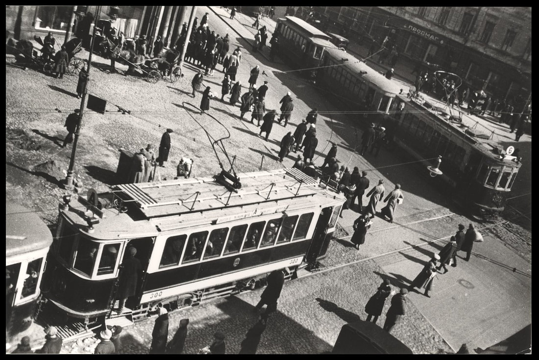
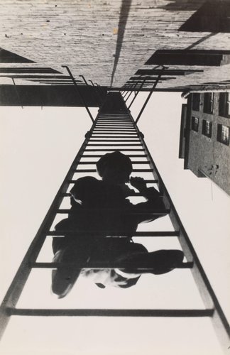
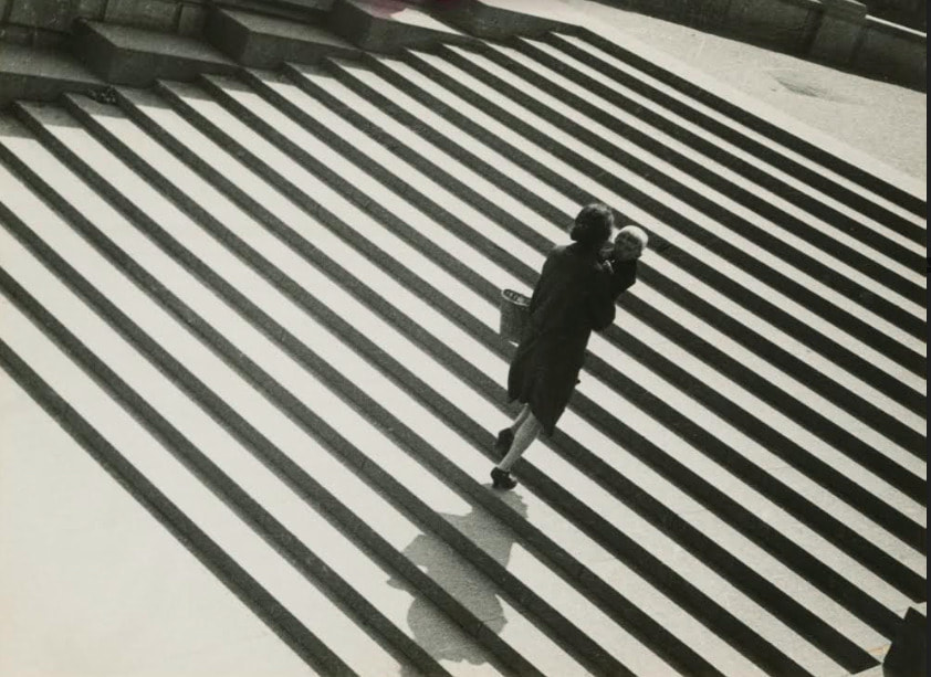
I decided to use Alexander Rodchenk's work as he explores very interesting perspectives and shows amazing talent using objects and people to drive the focus on the audience into a different part of the picture.
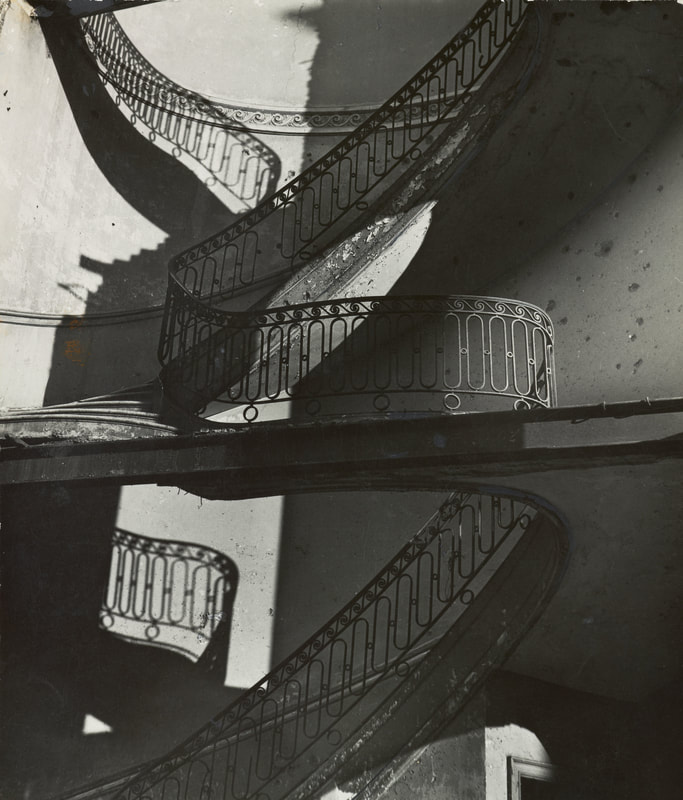
Photo Deconstruction
I decided to do some photo deconstructions to this artist showing what i like about his work and style and how i am going to try and replicate the old style presented in Alexander Rodchenko's work. He also shows a large quantity of images that are taken from unusual angles or a different perspective.
Researching How To Make There Stye
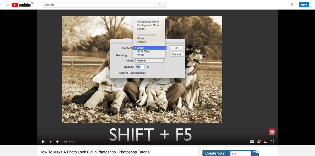
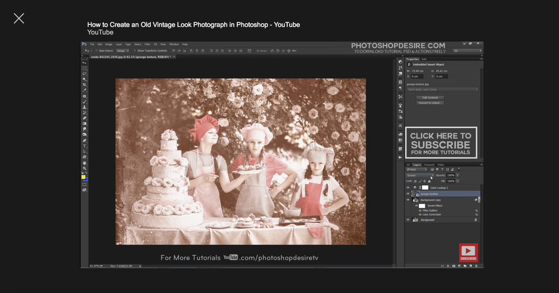
Finally, I decided to research more into the technical side of photoshop to give me more understanding of how to create old style pictures by just draining the colours out of the picture. This tutorial was very helpful completed my research of Alexander Rodchneko.
Artist Research
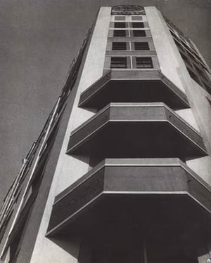
Ed Ruscha's Work
Edward Joseph Ruscha IV is an American artist associated with the pop art movement. He has worked in the media of painting, printmaking, drawing, photography, and film. Ruscha lives and works in Culver City.
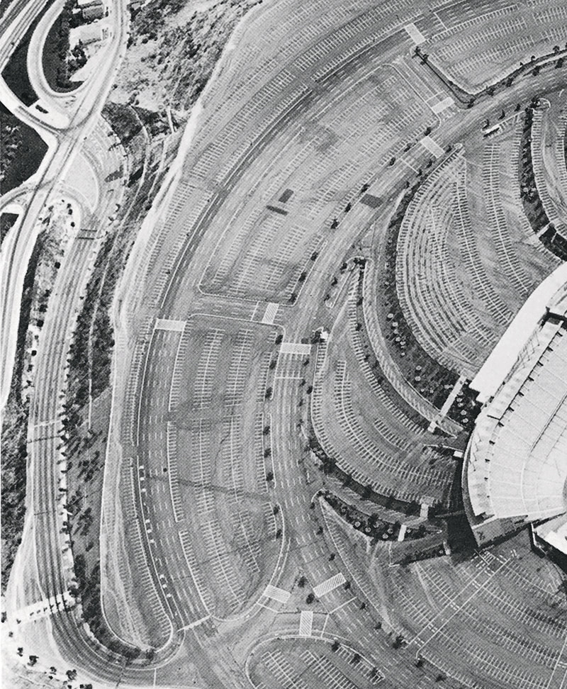
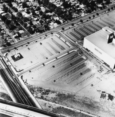
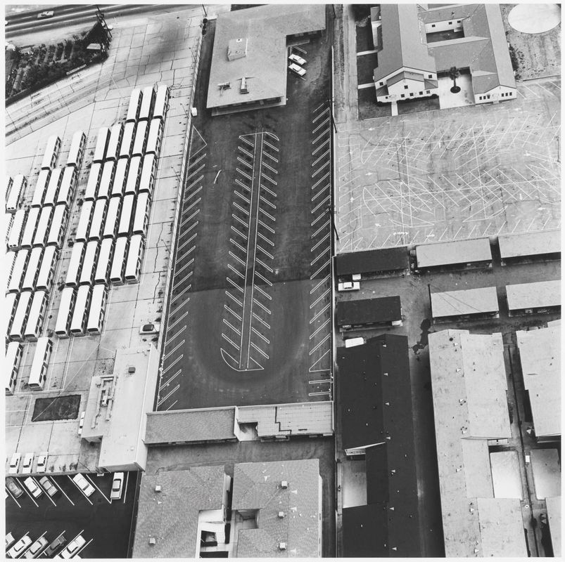
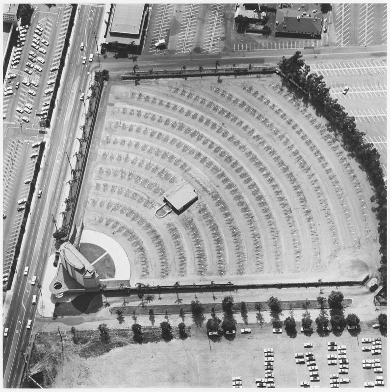
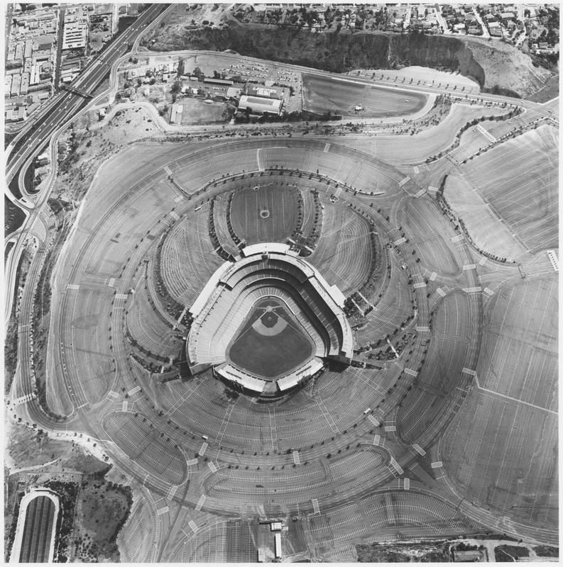
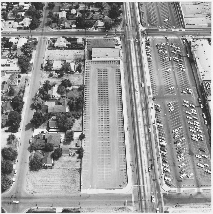
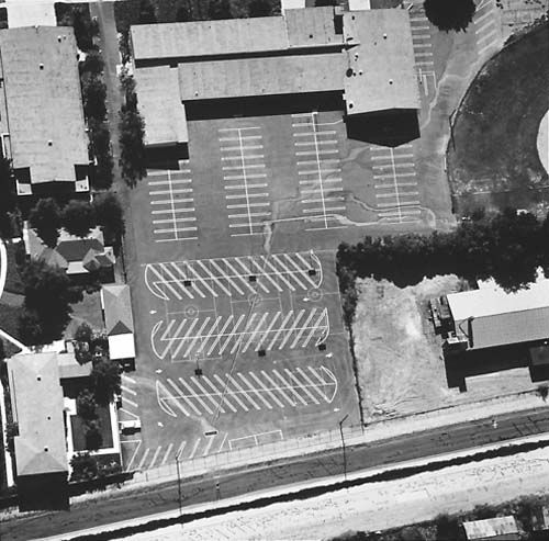
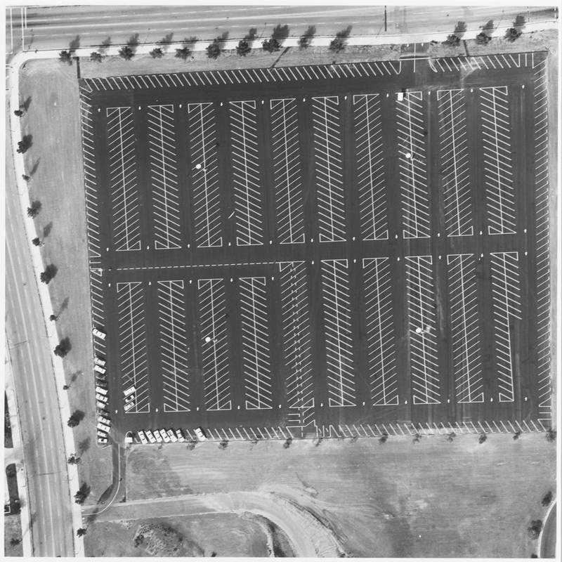
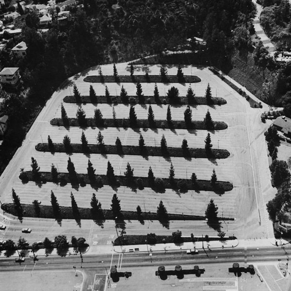
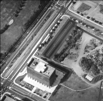
I really like his work using different angles, his idea of taking pictures from high perspectives is very interesting and shows how simple car parks can be creative, this is inspiring for my self to work similar images.
Photo Deconstruction
I decided as part of my research into Ed Rushca I had toshow what I liked about his work and unique part of the picture that I will try and replicate using his style work. His work is very unique and shows a completely different look into photography as his images are all taken from really high up and look incredible.
Researching How To Make There Stye
To complete my research on Ed Rushca I felt I had to do some final research into what makes his style unique and how i am going to replicate his style when it comes to making my pictures. This youtube tutorial goes into lengthy detail on the colour exposure and how controlling the gradients in the levels are essential to this style.
Artist Research
Bill Brandt's Work
Bill Brandt, was a British photographer and photojournalist. Although born in Germany, Brandt moved to England, where he became known for his images of British society for such magazine as Lilliput.
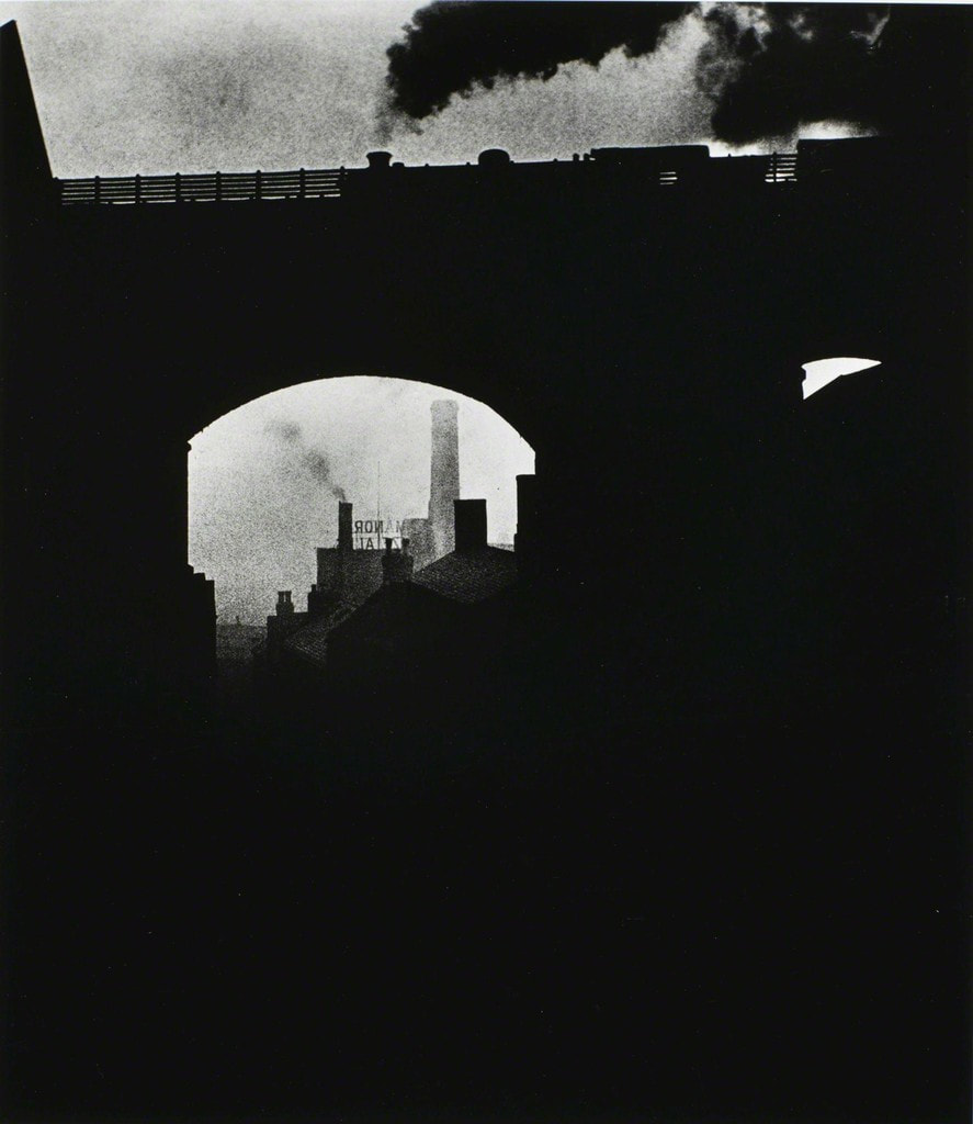
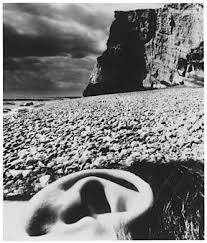
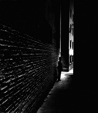
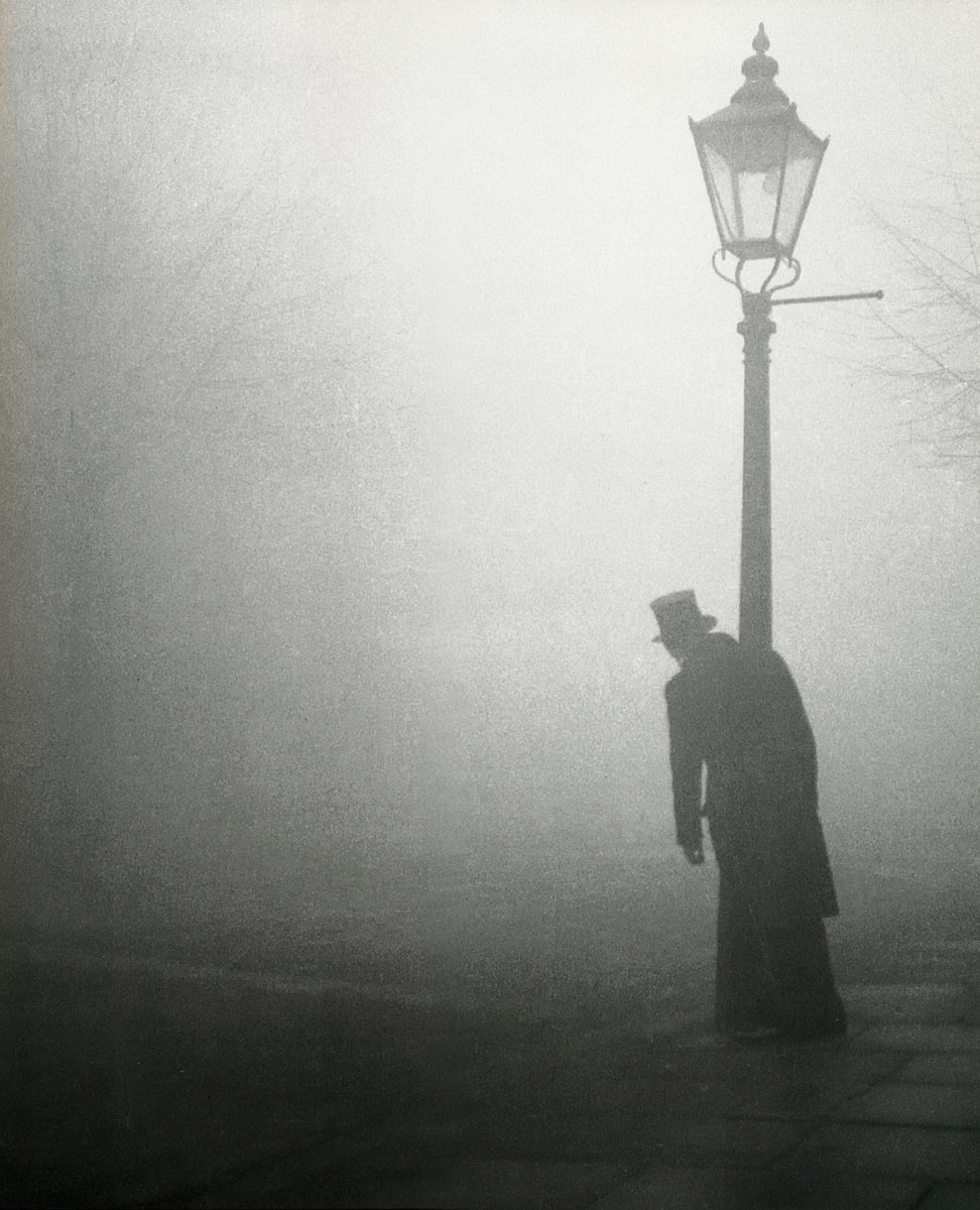
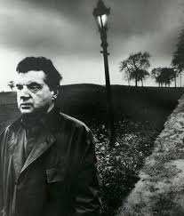
After researching all my artists work, Bill Brandt's photography is the most creative and were i would like to focus on as his low key black and white images are very stylish and have a certain destroyed feel to them.
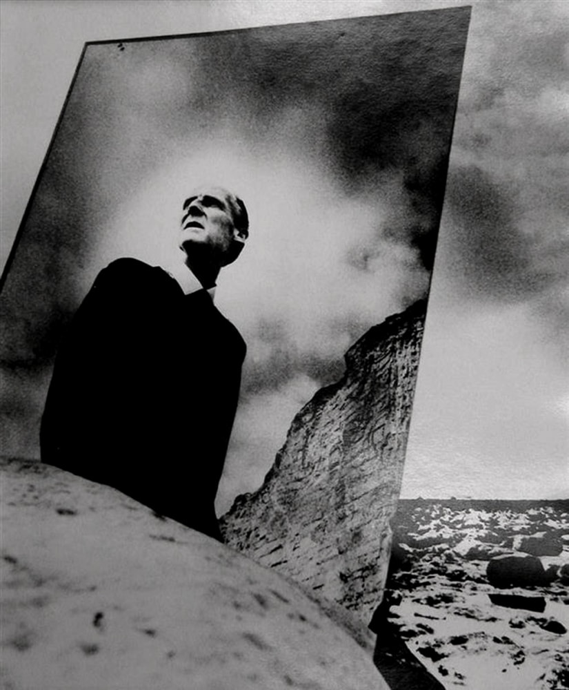
Photo Deconstruction
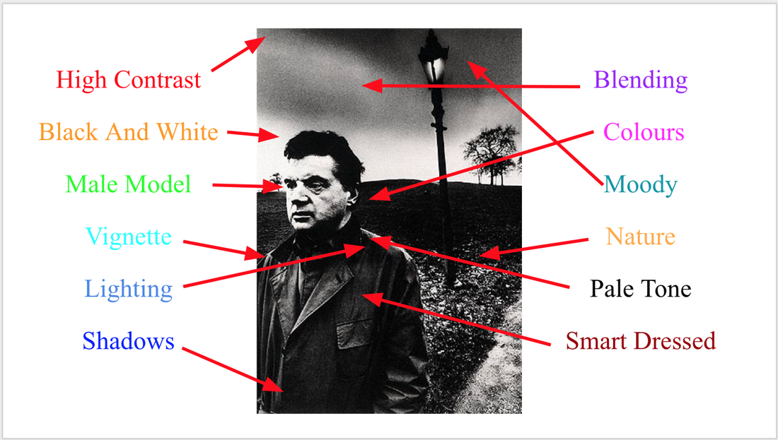
I decided as part of my research into Bill Brandt I had to show what I liked about his work and unique part of the picture that I will try and replicate using his style work. His work is very unique and shows a completely different look into photography as his images are all taken with high contrasting white and black gradients.
Researching How To Make His Stye
After researching into powerful black and whit tutorials I found this great youtube video explaining different types of contrast and level controls you can use on your images which represent the style of Bill Brandt, this video will help my work when it comes to replicate this work.
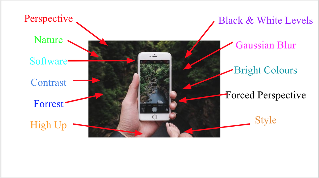
Style Research
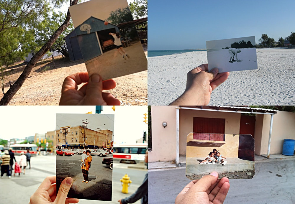
Past To Present Photography
Past to Present Photography in simple terms is holding an old picture up to the exact same location and photographing it, capturing and contrasting past and present. This is a very fun and exciting topic as it brings back memories of loved ones.
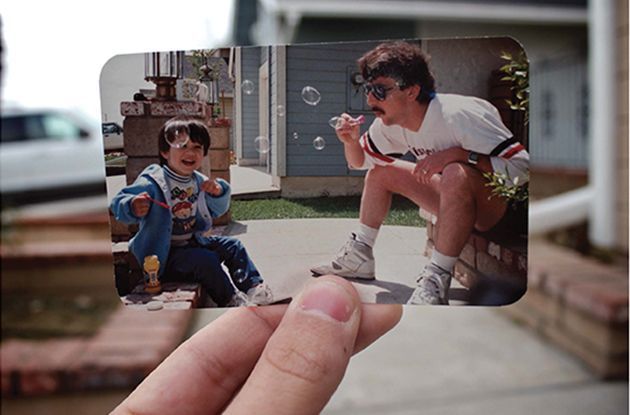
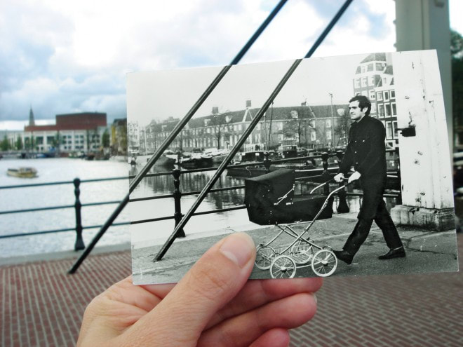
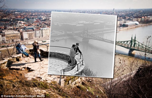
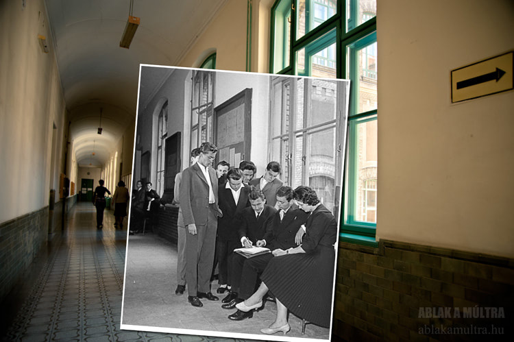
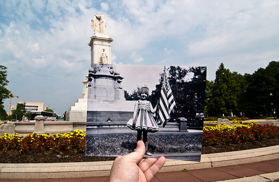

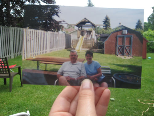
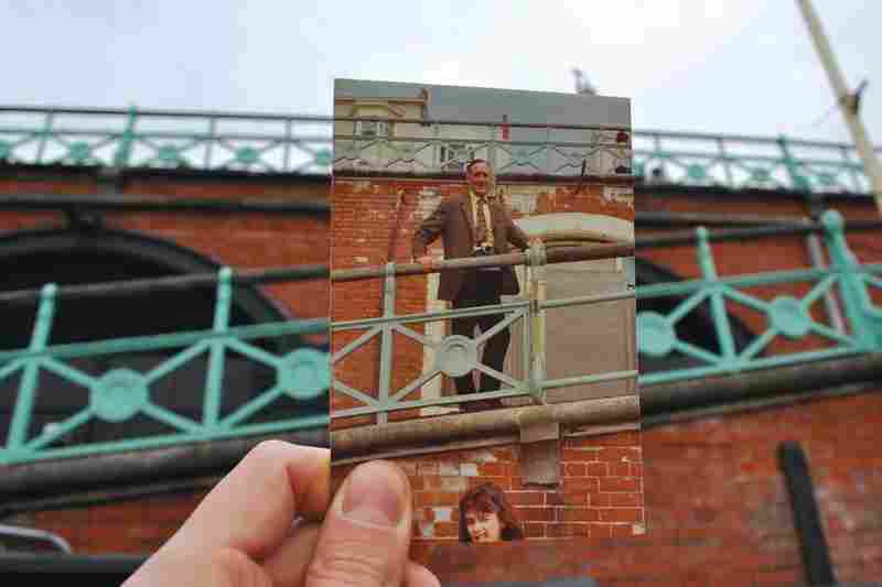
This style of photography is very interesting to me and probably the most unique choice of photography technique I could have choose, I know at home I have old pictures that I can use to re-create these memories.
Photo Deconstruction
I decided as part of my research into this style photography I had to show what I liked about this style work and unique part of the picture that I will try and replicate using this technique of work. I really like the nostalgic feeling this image gives and shows a great amount of detail and planning to do.
Style Research
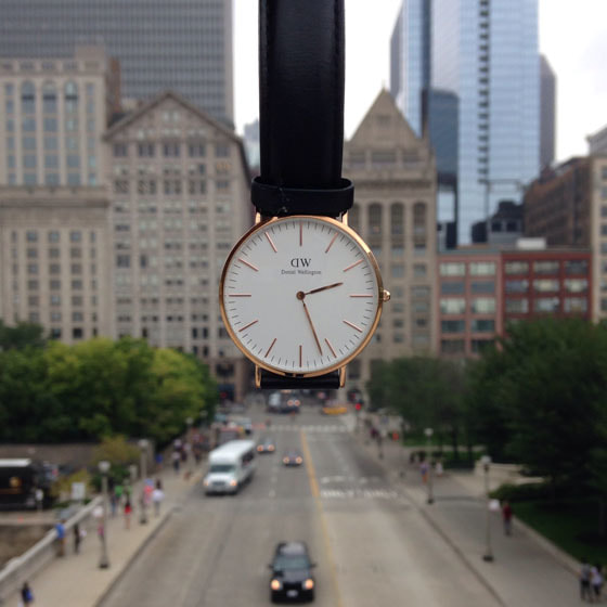
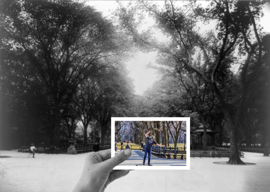
Phone Perspective
Phone Perspective Photography in basic terms is holding your smart phone up to your subject or location and blurring that subject on your camera and making it only visible on the phone.
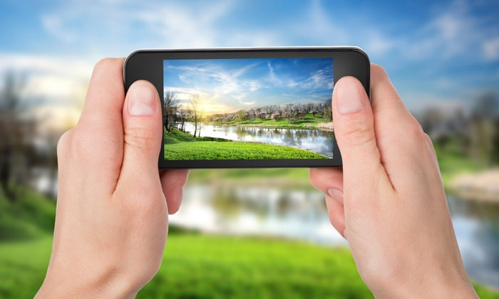
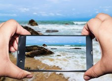
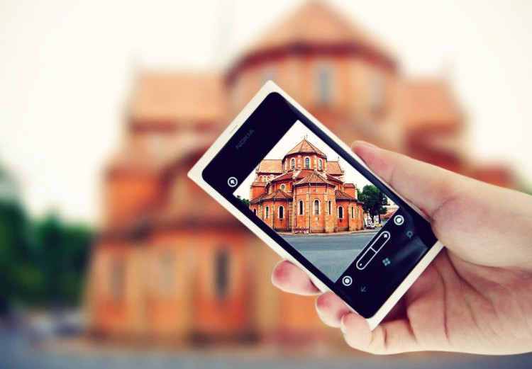
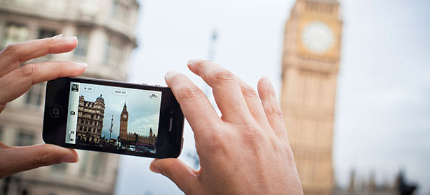
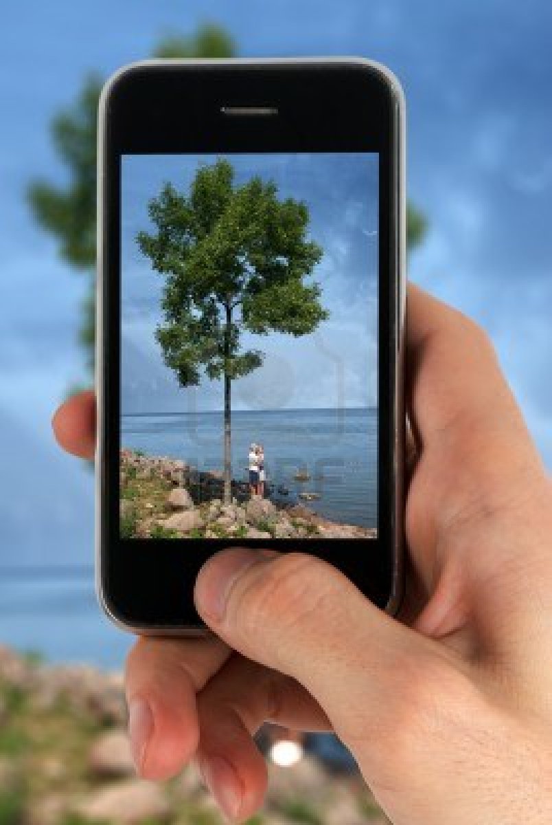
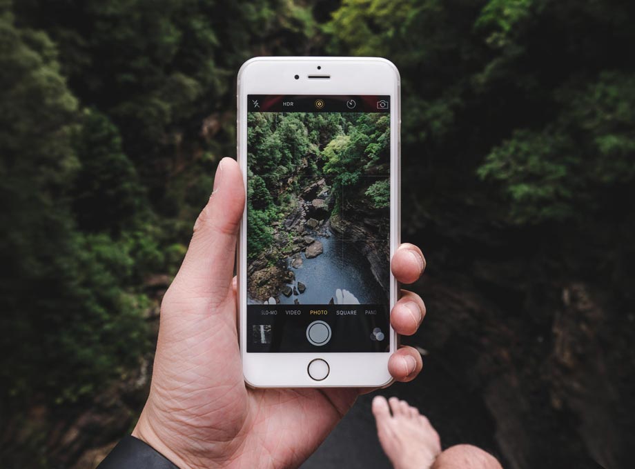
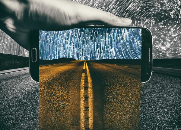
I love this style photography, this allows me to take inspiring pictures from google and recreating them using my Iphone as they are unexpected perspectives. These are very creative and strong contrasting images, also adds a whole new dimension to this part of photography.
Photo Deconstruction
I decided as part of my research into this style photography I had to show what I liked about this style work and unique part of the picture that I will try and replicate using this technique of work. I really like the simplicity of this style work, it looks easy to do and allows your perspective aspect to be about anything.
Where I Plan To Go
|
|
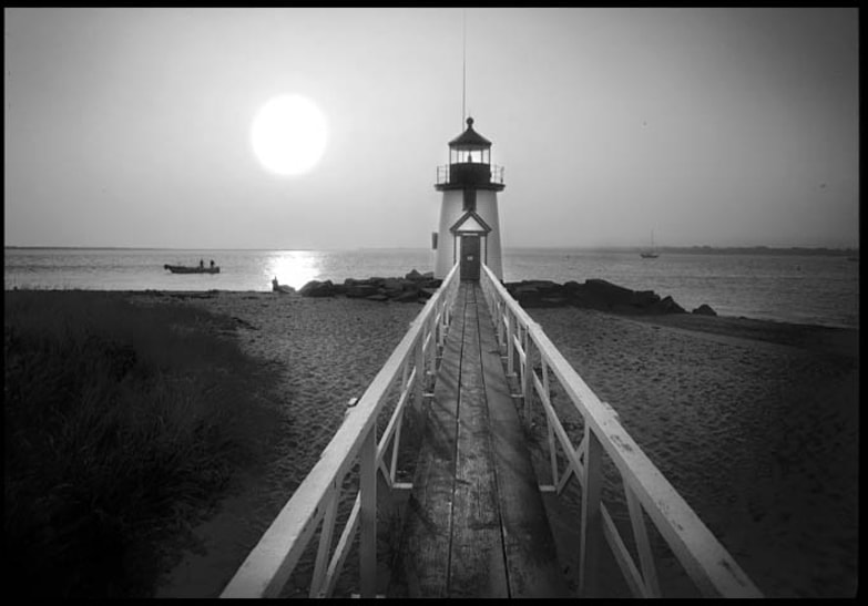
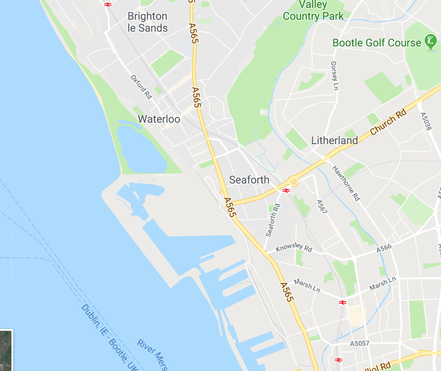
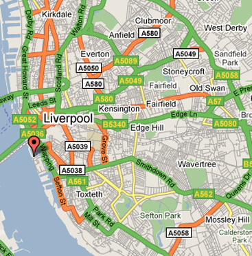
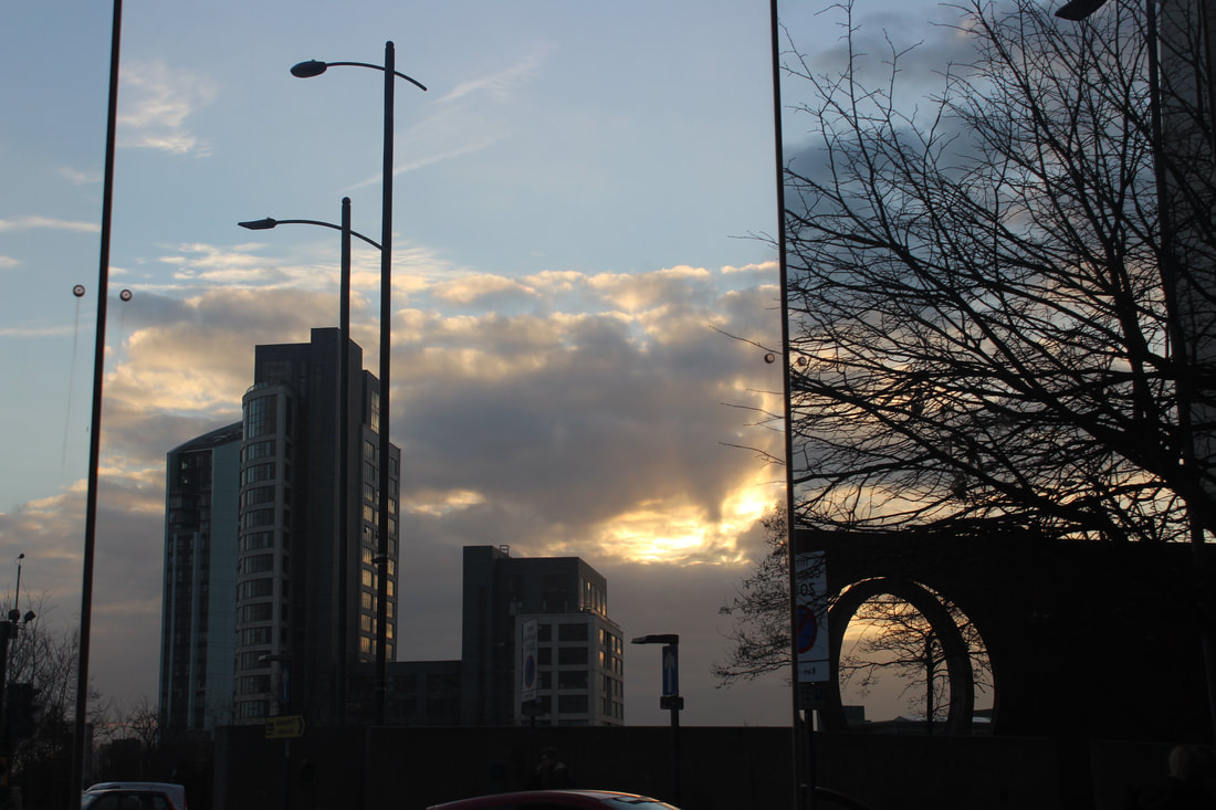
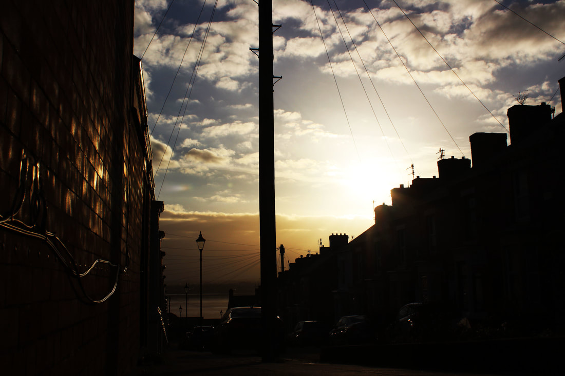
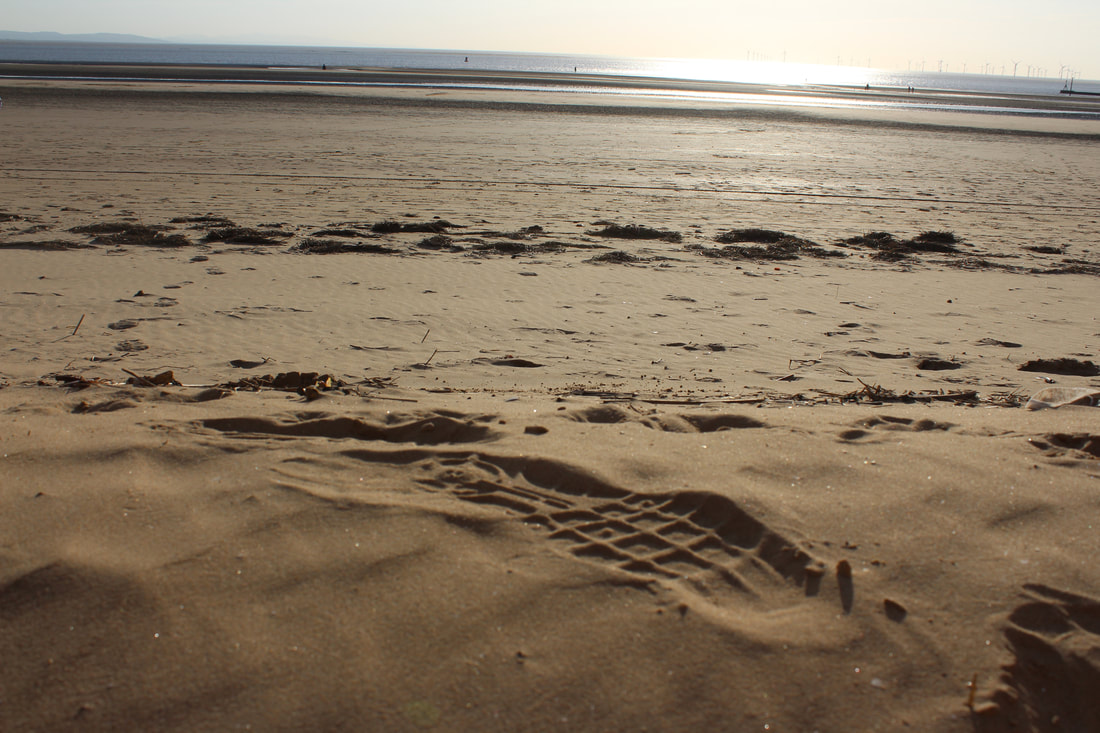
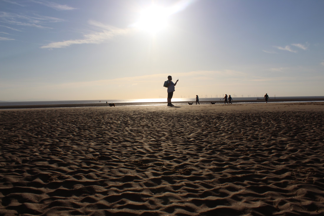
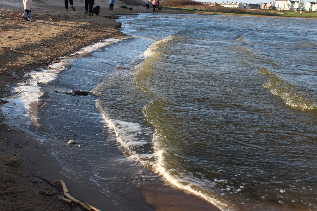
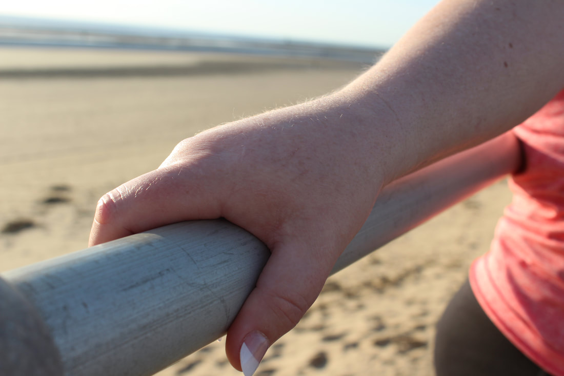
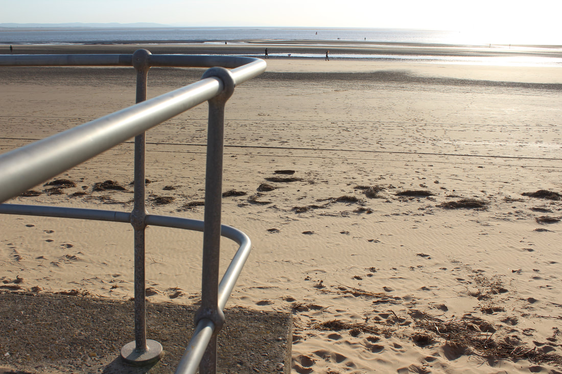
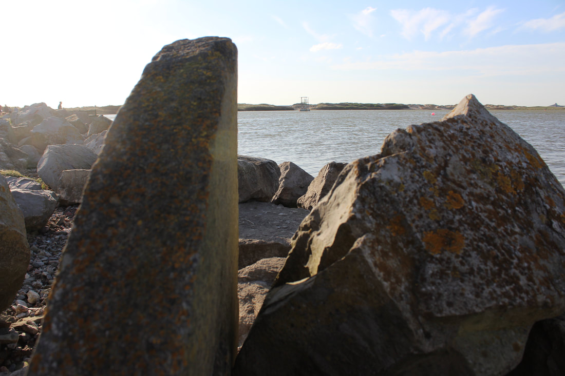
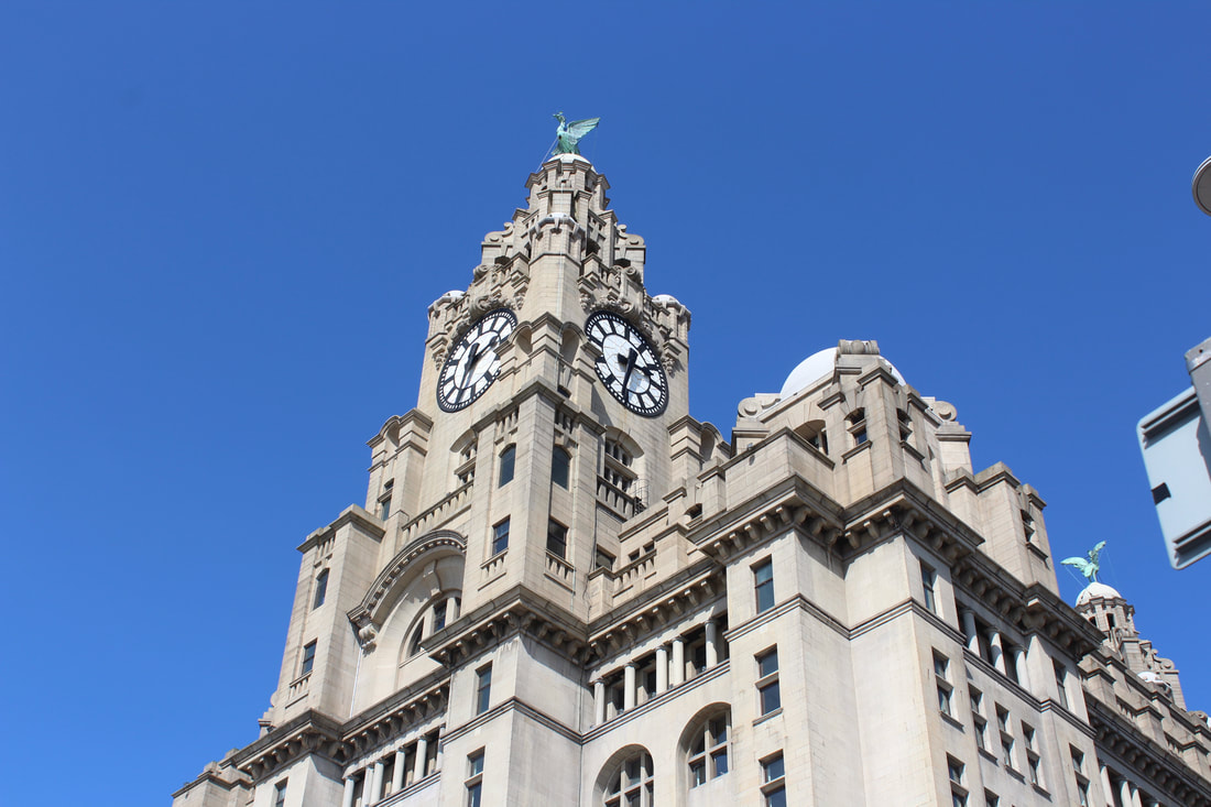
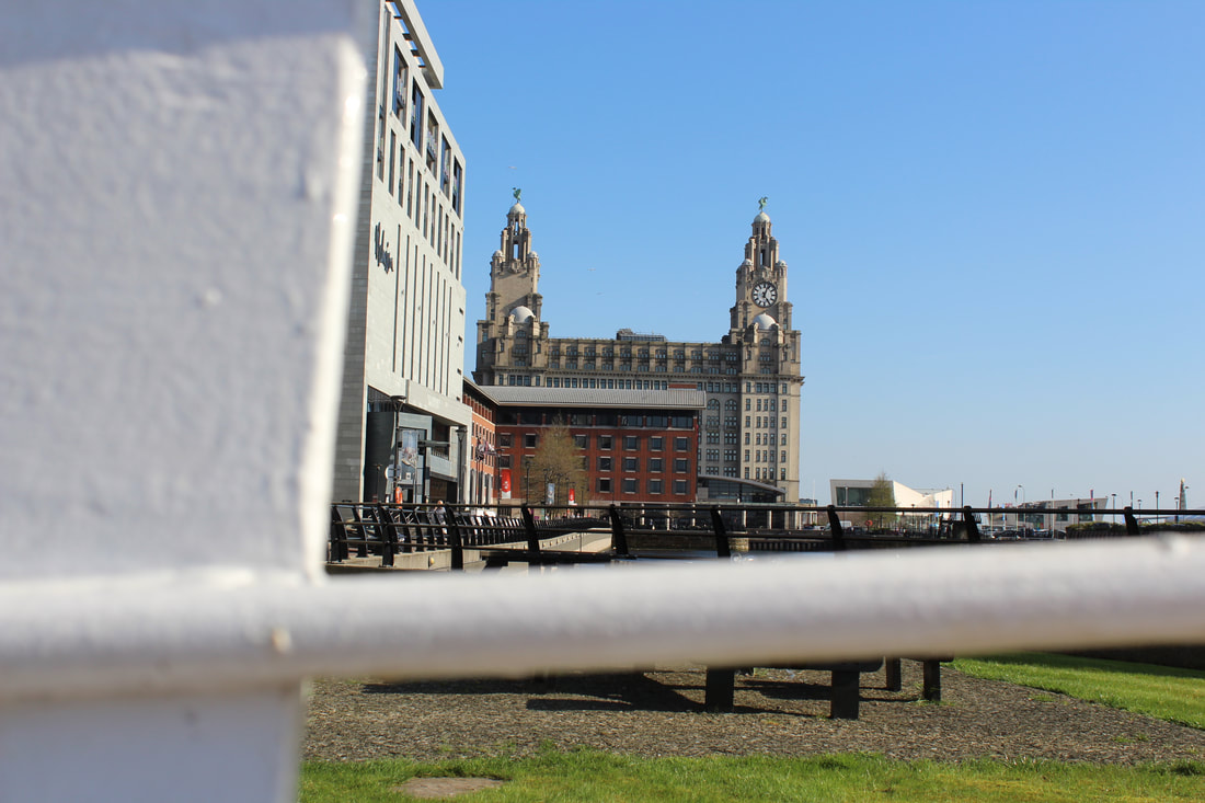
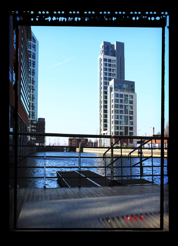
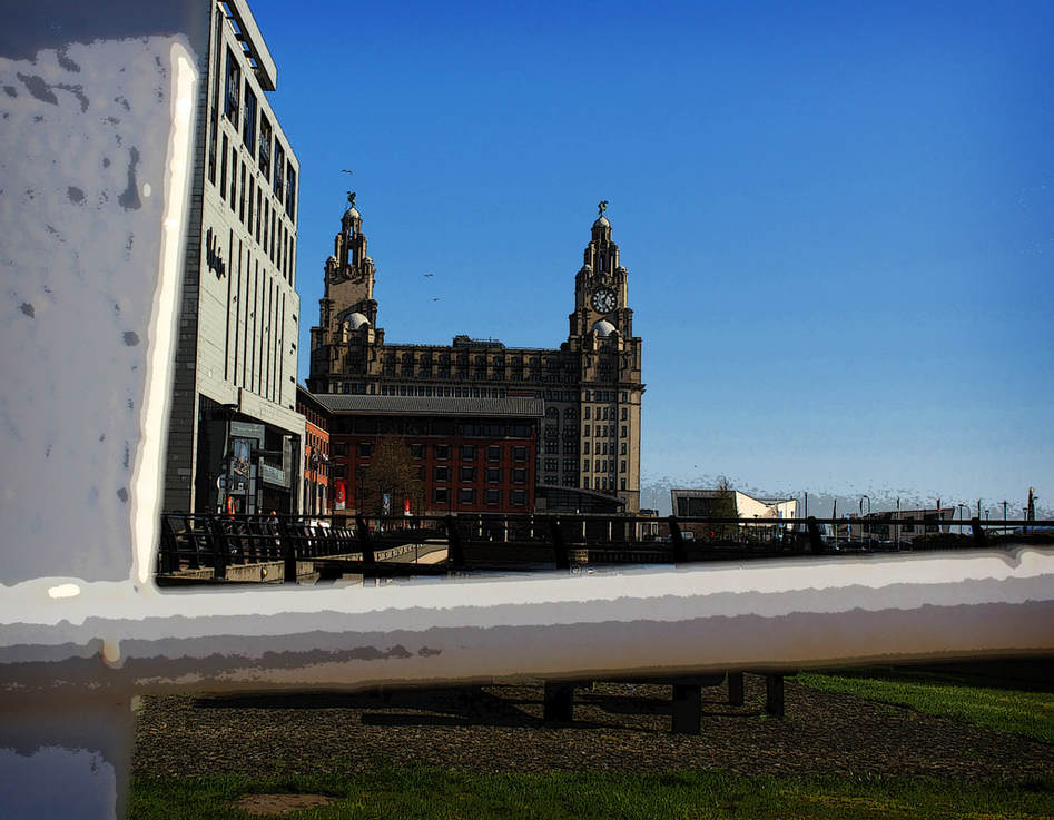
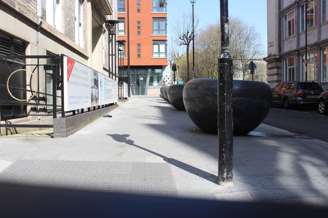
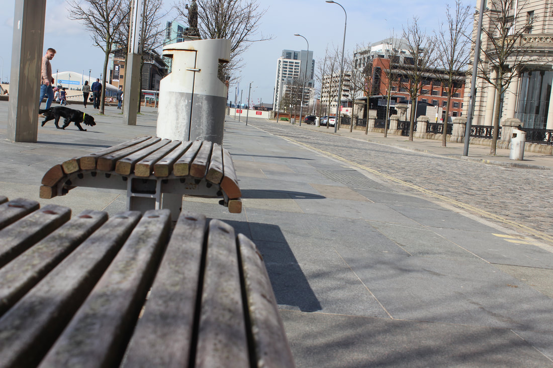
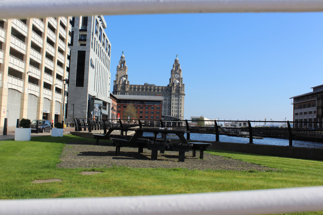
This is a map of the "Albert Dock" as well as "Crosby Beach" with in Liverpool were I will started my pictures for my exam, Unexpected Perspectives. The Albert Dock and Crosby Beach is a very memorable place for the people of Liverpool and i thought it would be a perfect set of places to start my exam of here. The Albert Dock has a lot of well known building, such as the Liver Birds, The Wheel, Beatles Statues, ETC. There is also a great sun set of the river themes at night and create some really meaning photos. The construction of some of these landmarks are very intricate and have a very stylish design to them and show a completely different perspective. Crosby Beach has very strong sun sets and high u vantage points were I can definitely utilise my perspective work.
Camera Planning
|
|
|
|
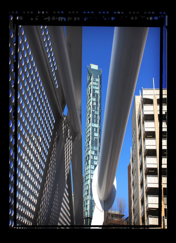
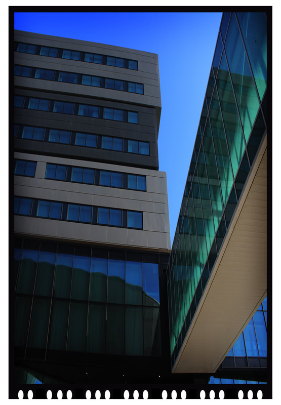
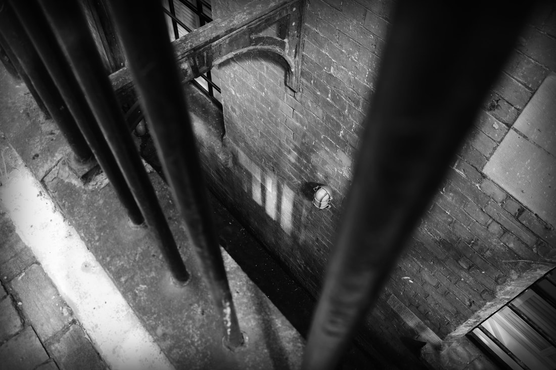
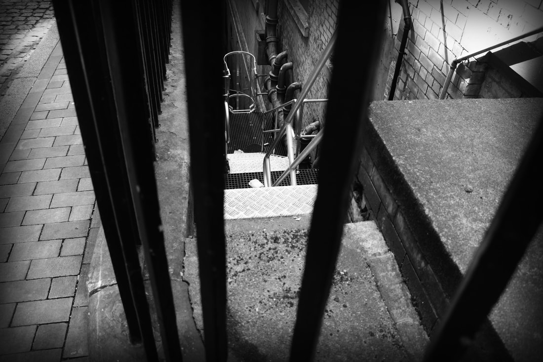
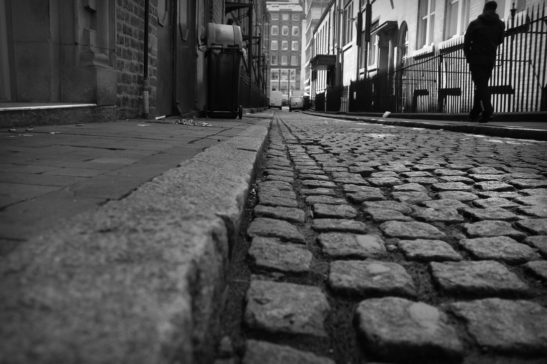
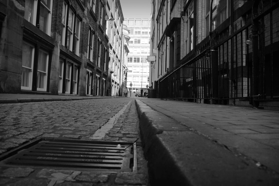
My Photographical Work
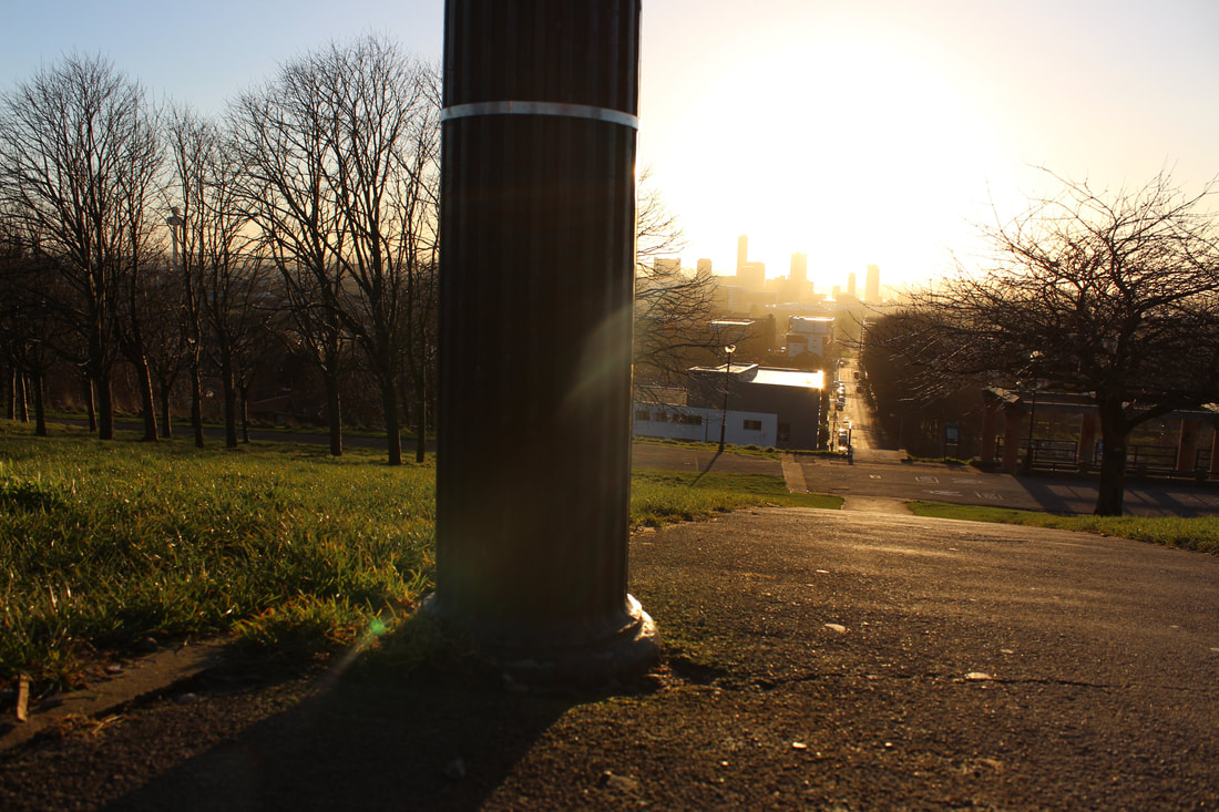
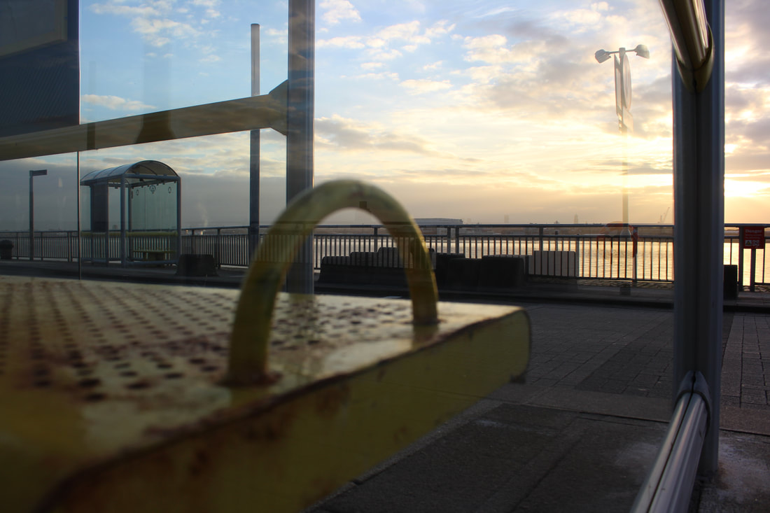
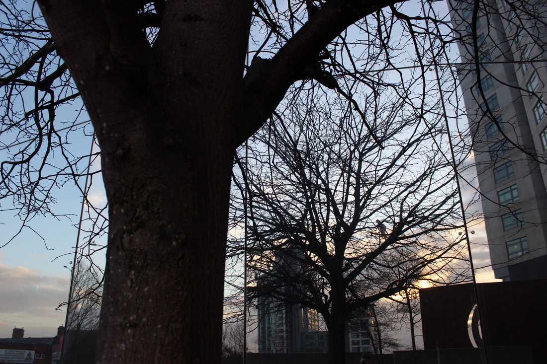
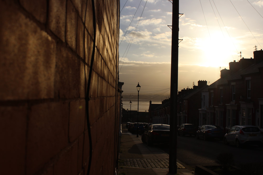
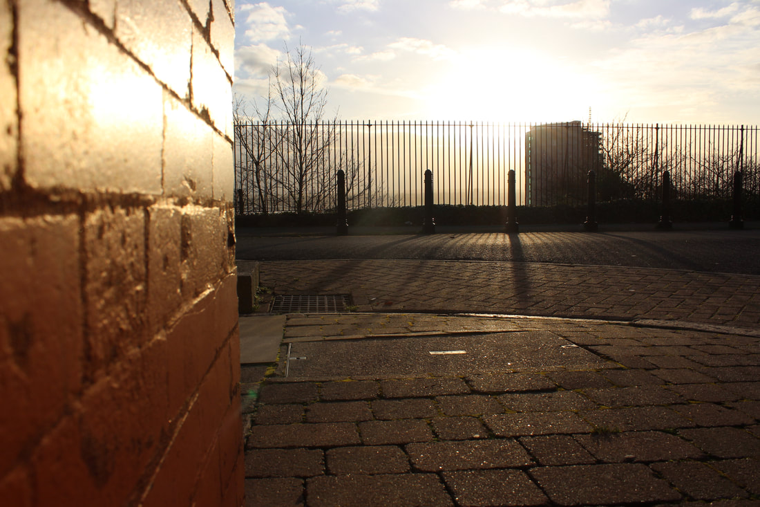
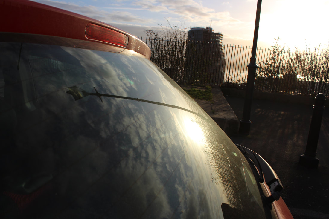
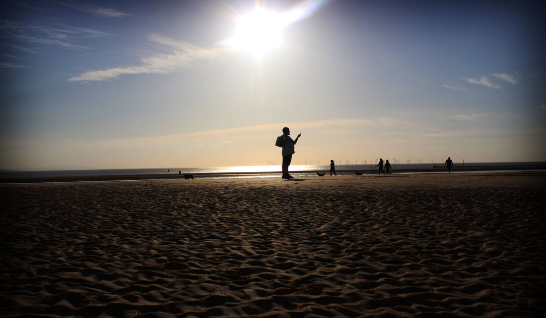
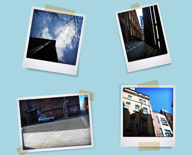
Initial Response; Raw Images
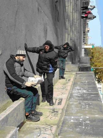
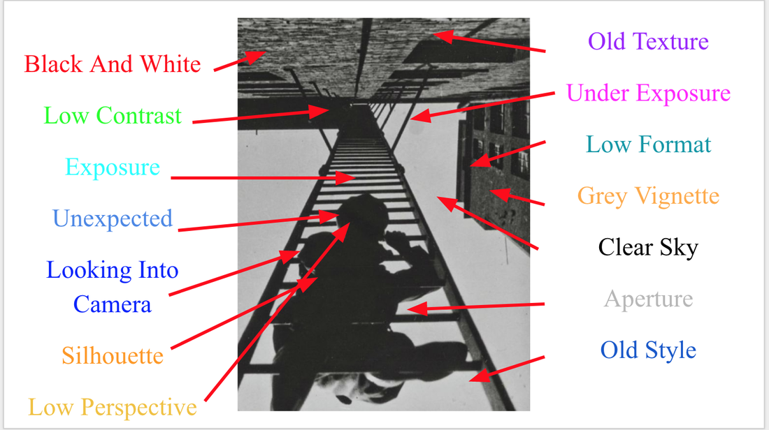
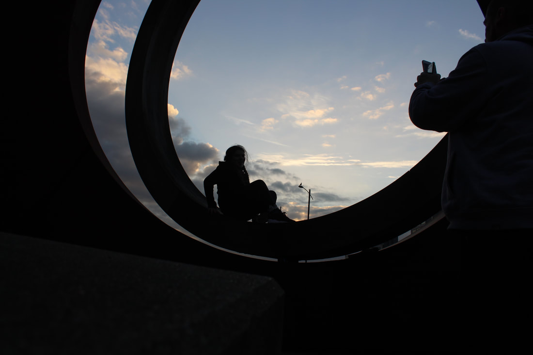
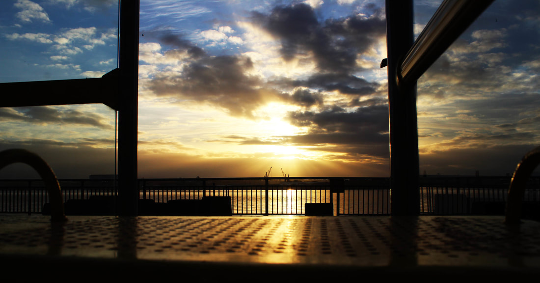
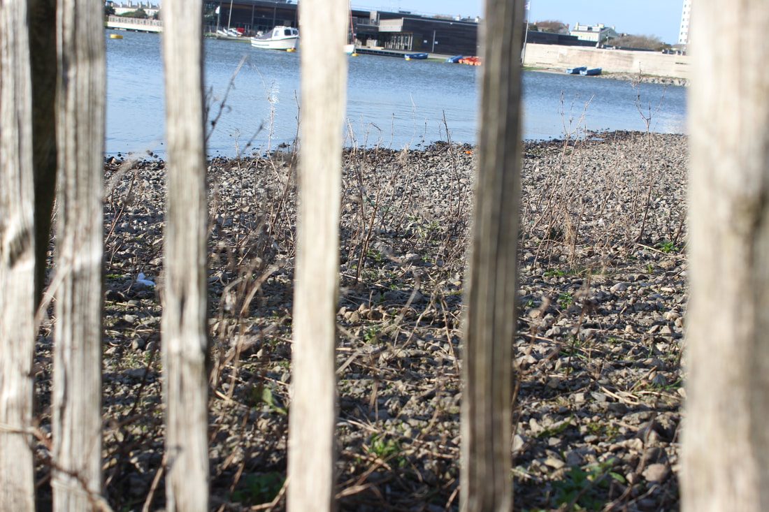
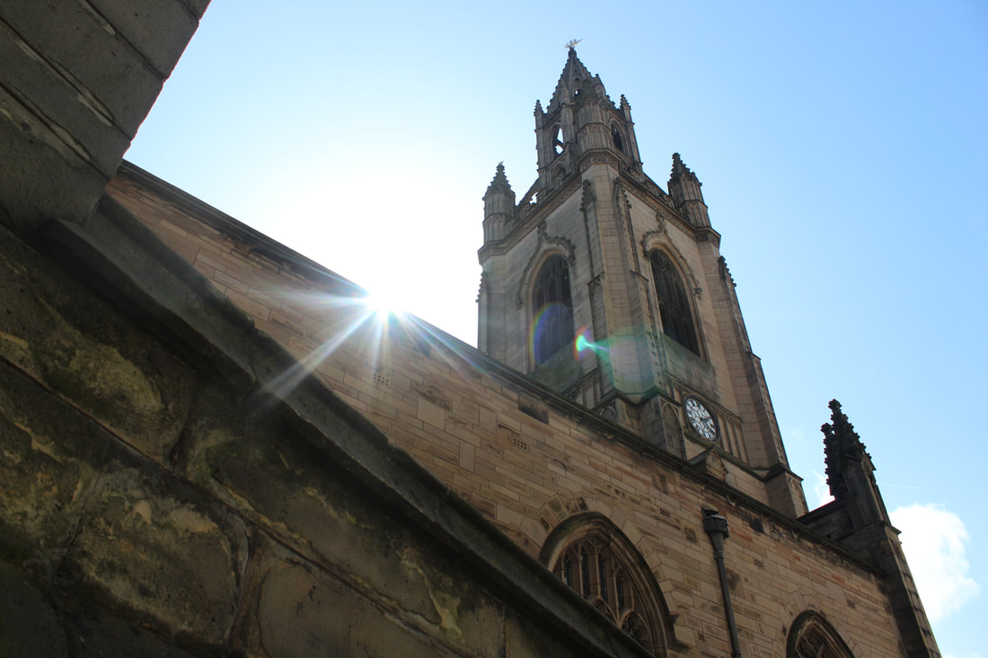
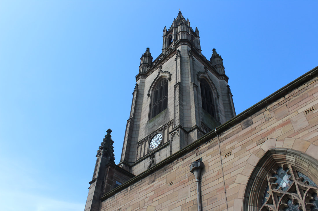
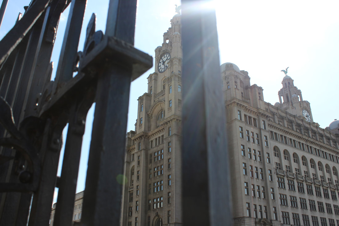
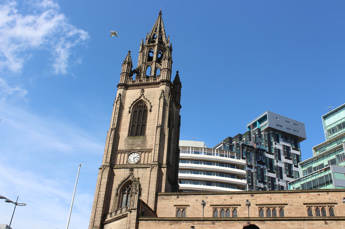
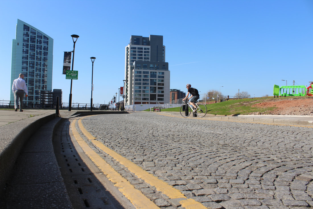
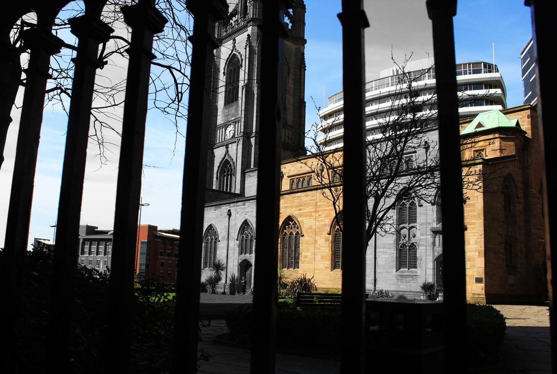
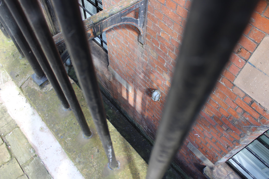
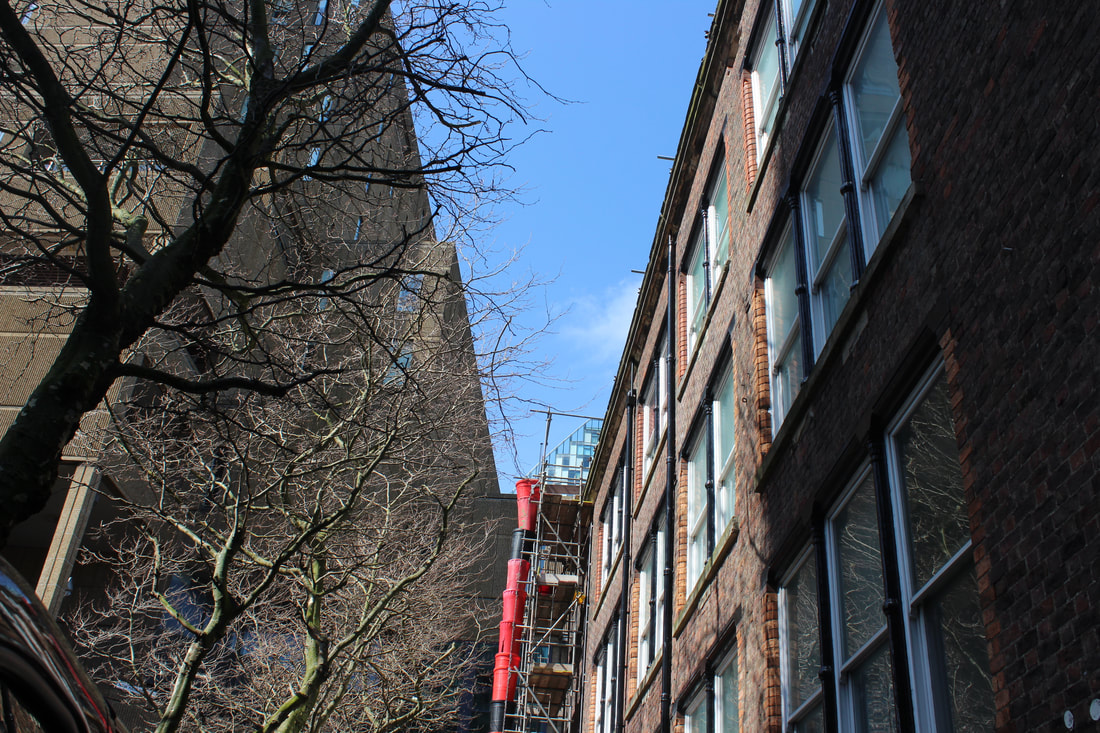
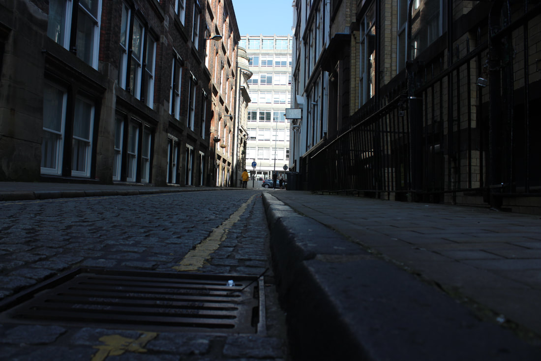
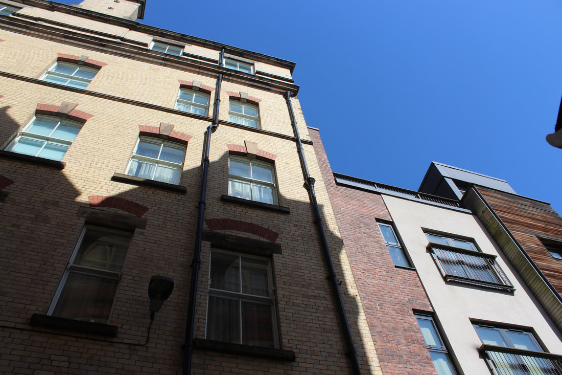
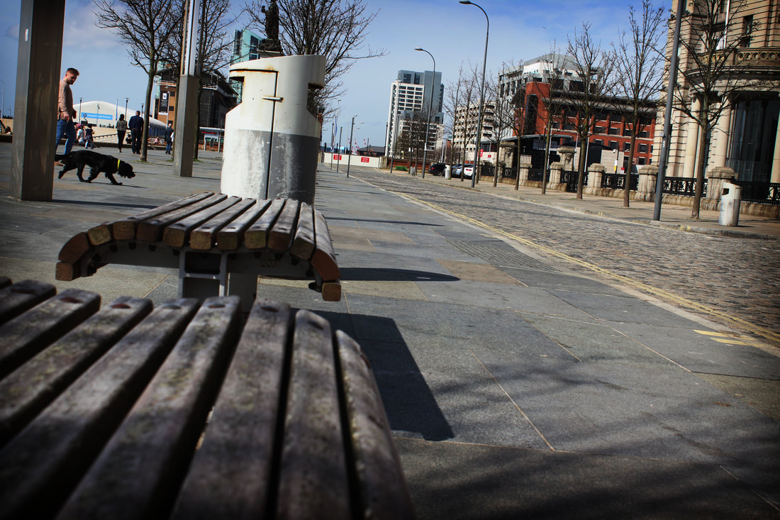
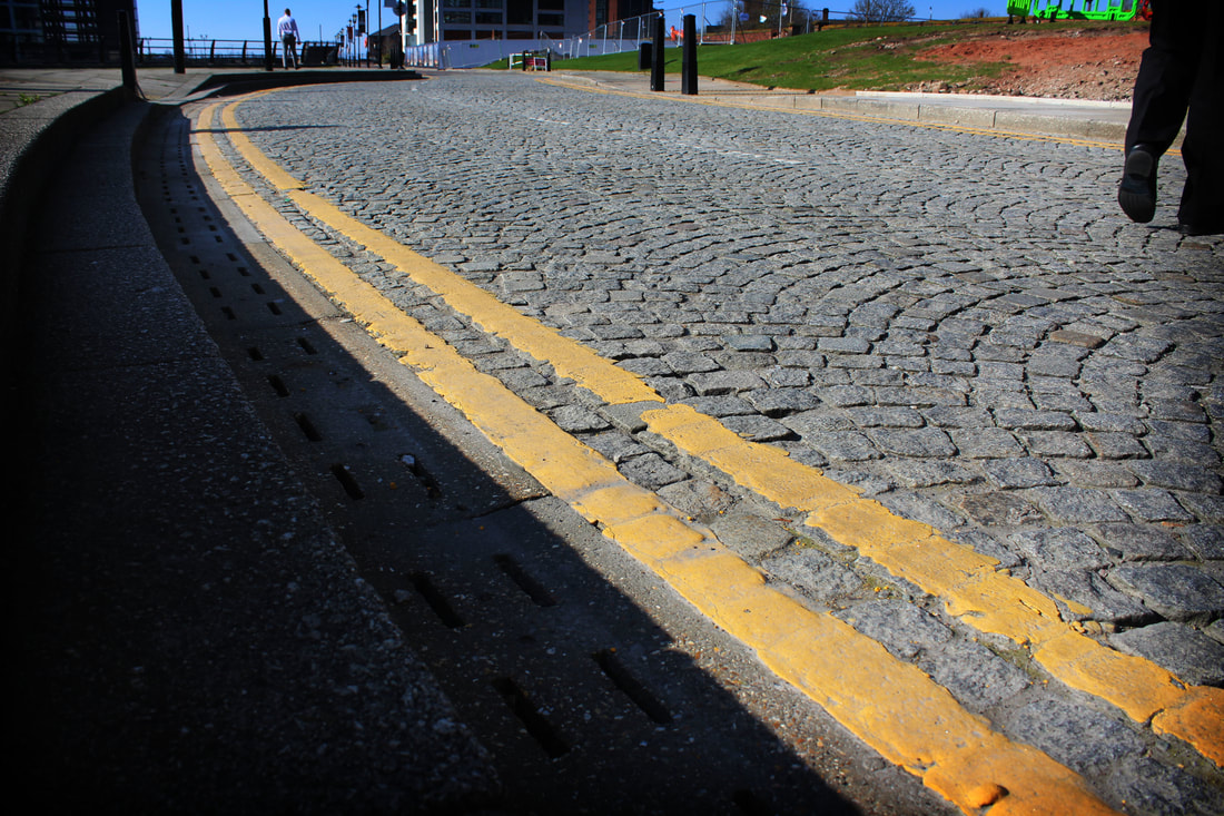
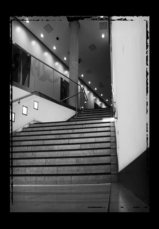
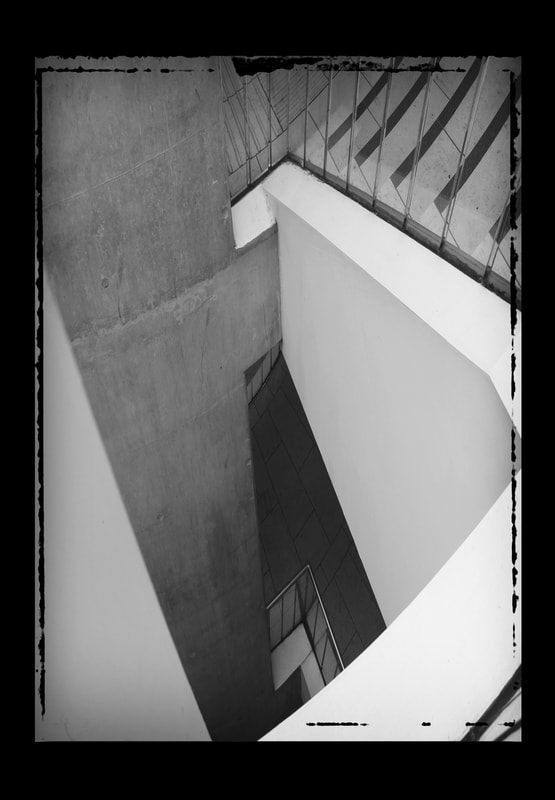
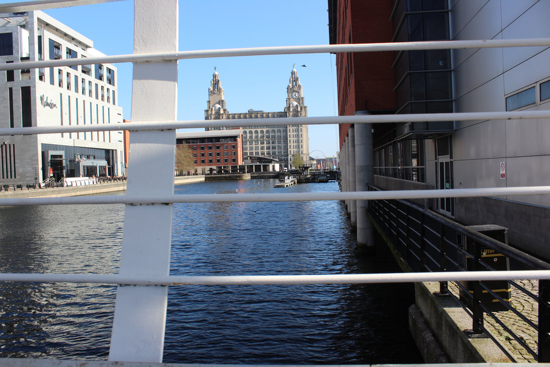
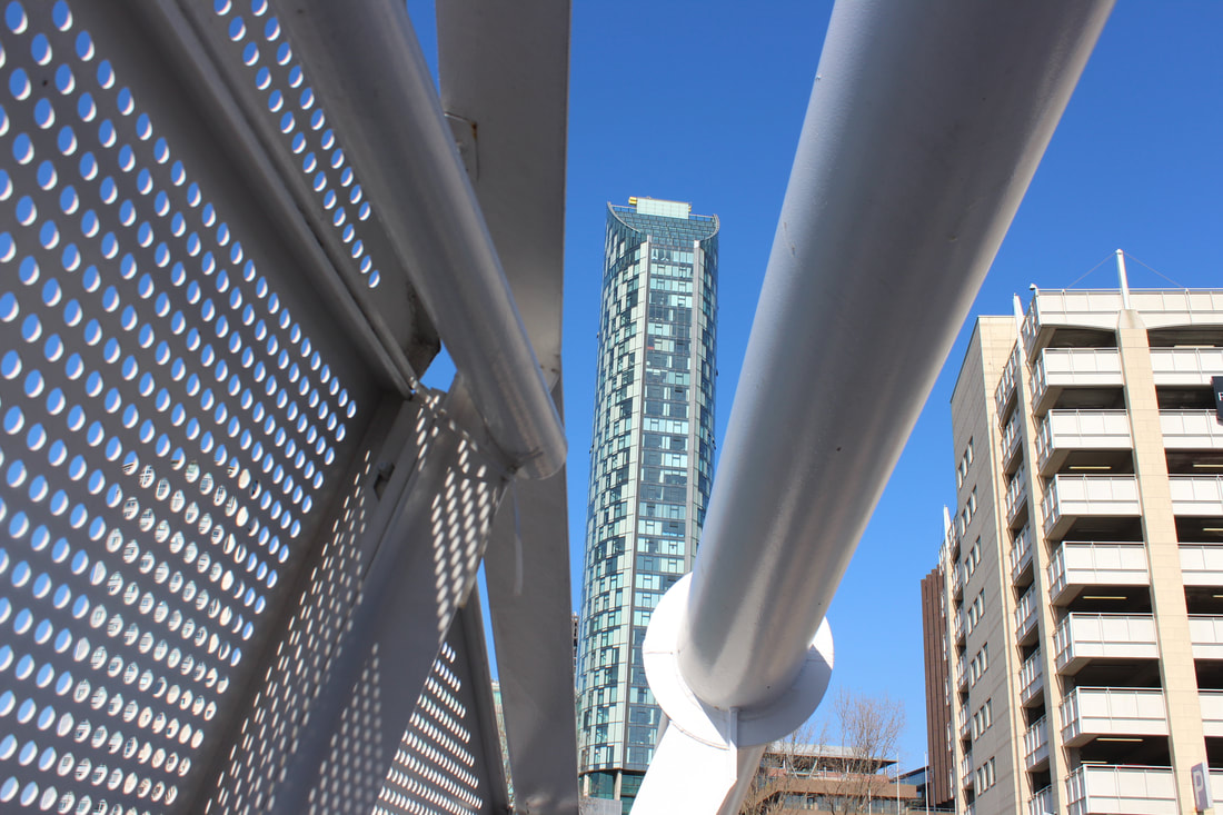
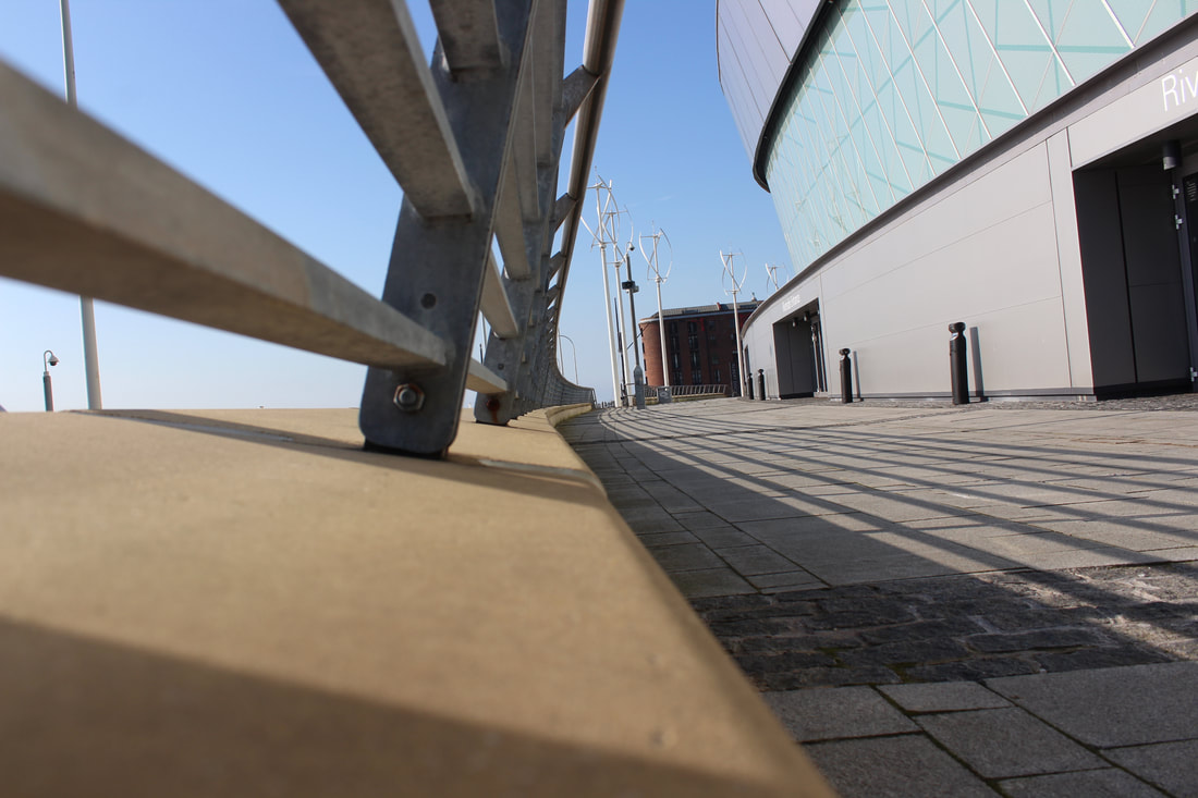
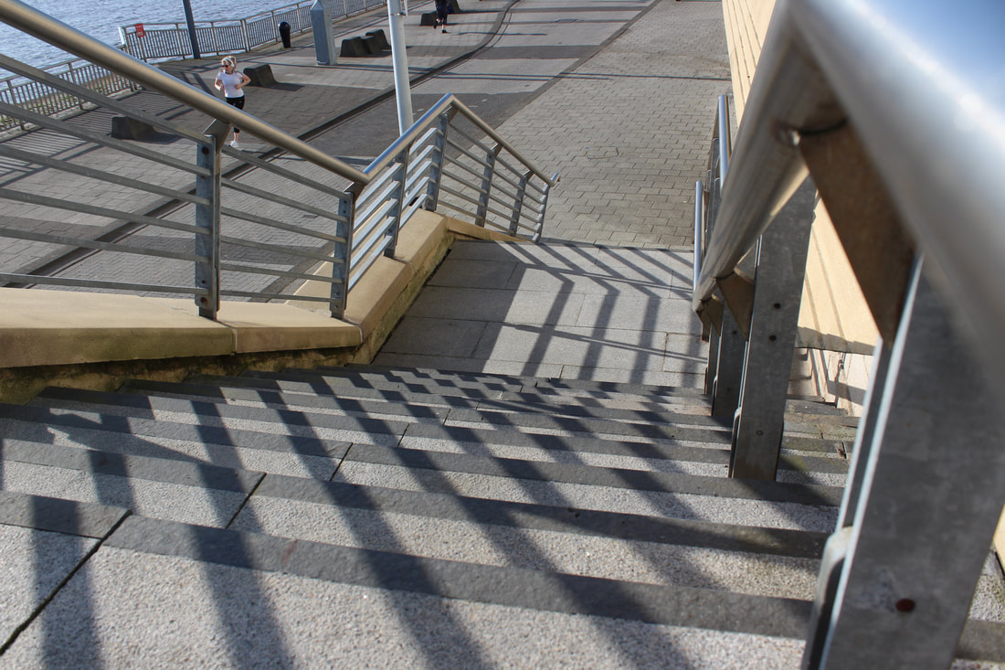
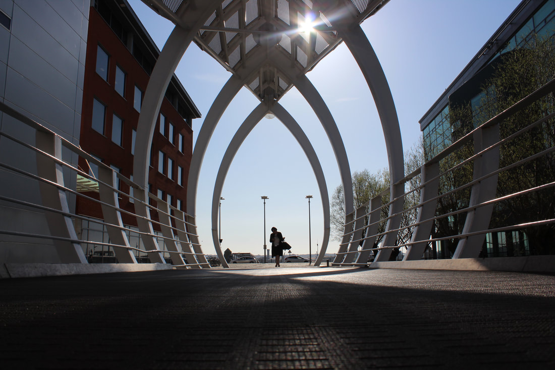
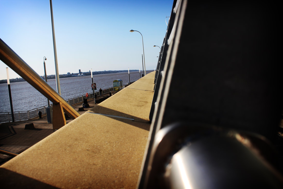
Starting my work through unexpected perspective, I am very excited for my journey of this topic as the level of design and creativity that is required to do well, I started by taking random unexpected pictures around me waking through the streets of Liverpool which are high up looking into the city, making great images showing a overview perspective. I didn't just take my pictures, I planned and carefully captured a beautiful moment using photography techniques with in my skill set, such as symmetry, exposure, portrait, silhouette's and much more. Having to think before you just take the picture makes it ten times better.
Contact Sheet
I decided to make a small contact sheet of all my initial images to narrow down what I thought to be the best images to show an unexpected perspective, I have circled the images I liked and wrote next to why I think that, and placed a cross on the ones that didn't show perspective or was too similar to another image.
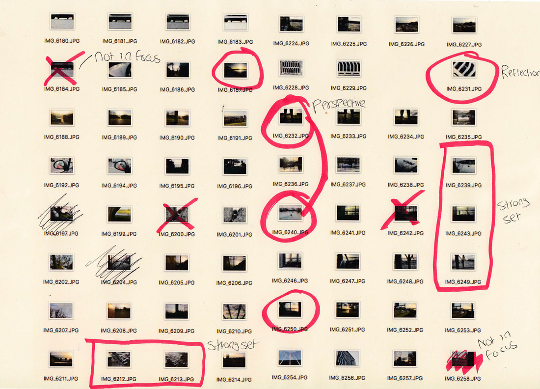

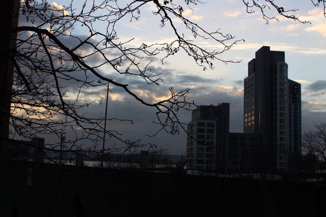
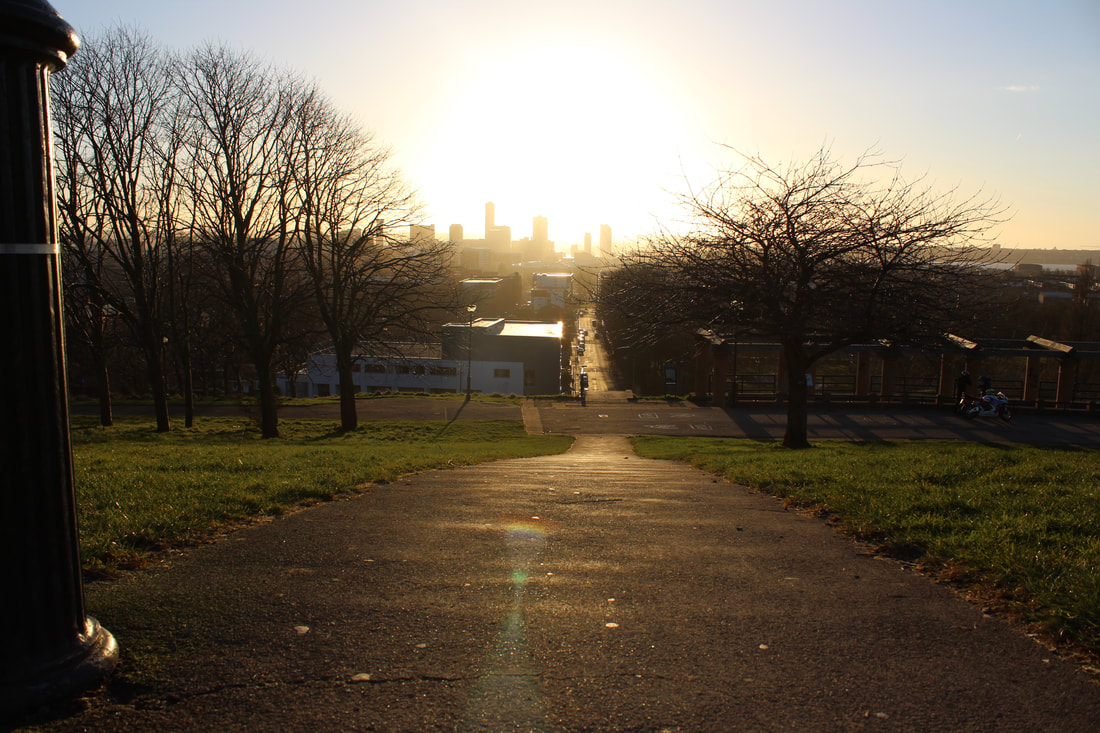
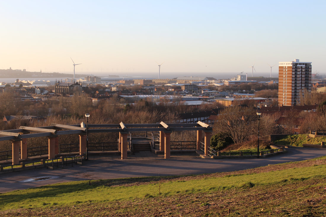
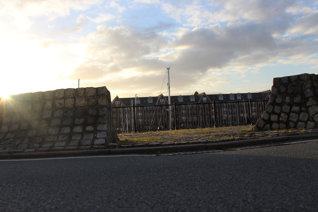

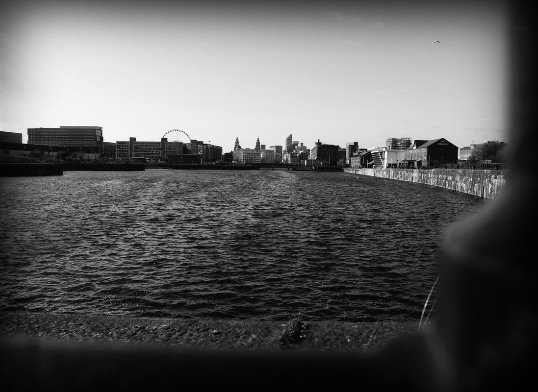
These pictures were taken around Merseyside Liverpool and showcase some very interesting landmarks and buildings, i wanted to start this project by discovering what is s o unexpected about a perspective, such as reflections angles or just plain images in the above or below angle.
Edited Images
I then went on to editing these images using multiple different photoshop techniques to enhance these images and showcase some of the best parts of them, such as the angle.
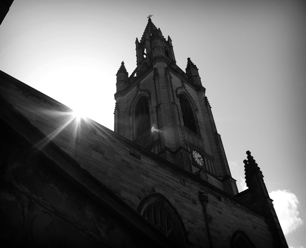
This is a really powerful high contrasting image with very high contrast in the bottom of the image making the sun set stand out which makes it very unique and shows the understanding of photoshop techniques.
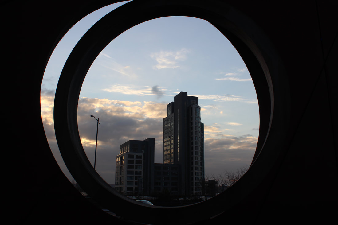
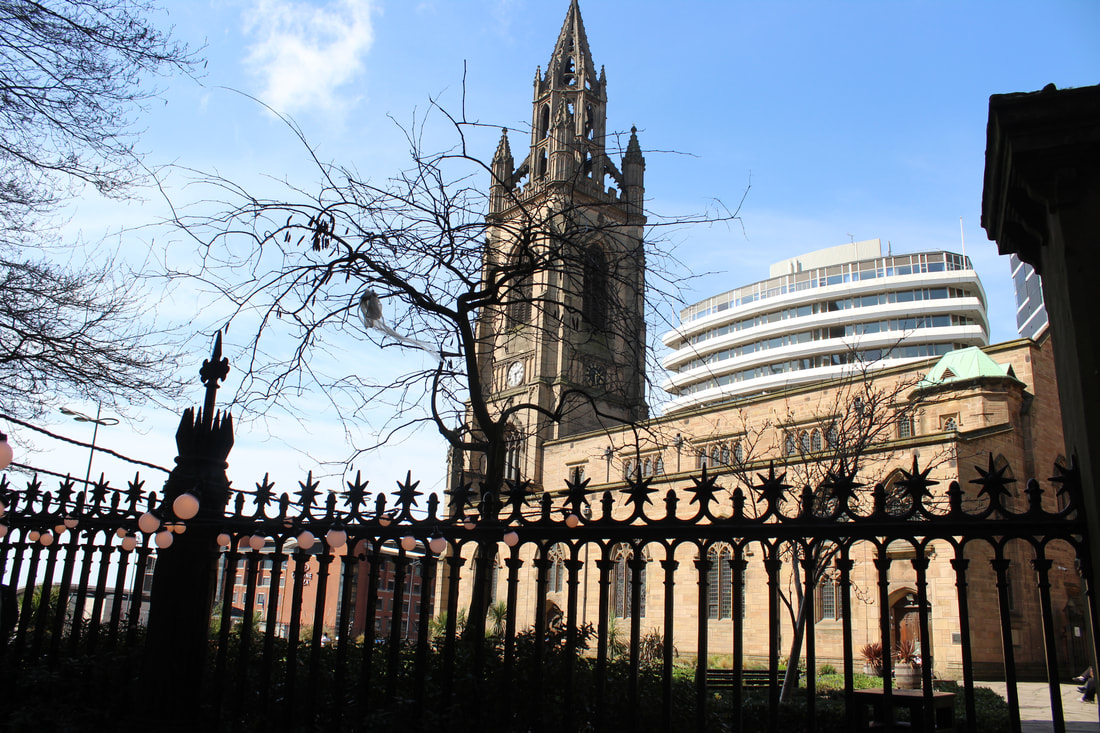
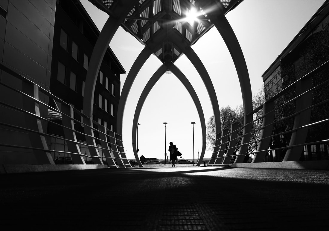
This image is very unique and stands as a powerful silhouette surrounding the popular Liverpool building, I was lucky enough in this image to get a glimpse of a sun set in the background making more colours glimpse in the image.
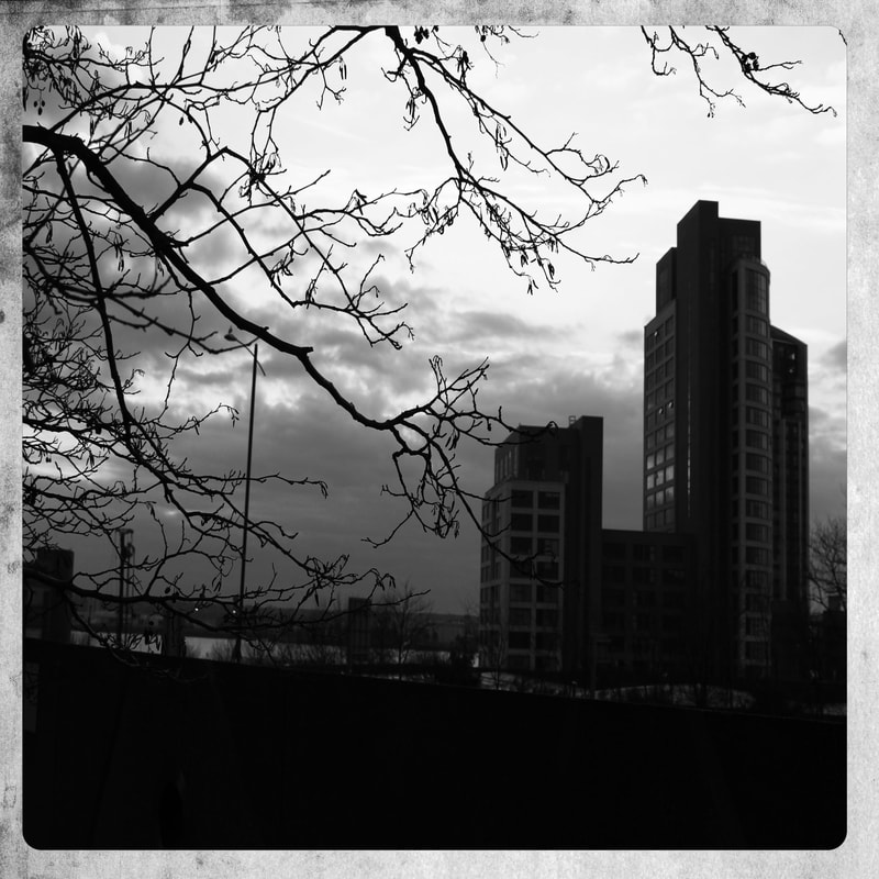
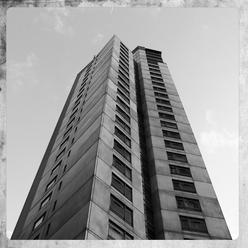
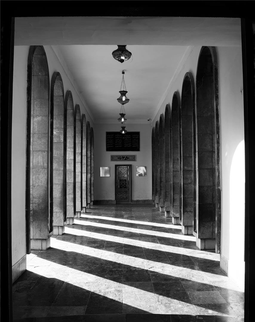
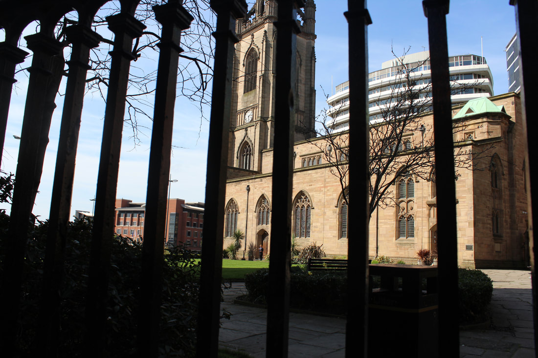
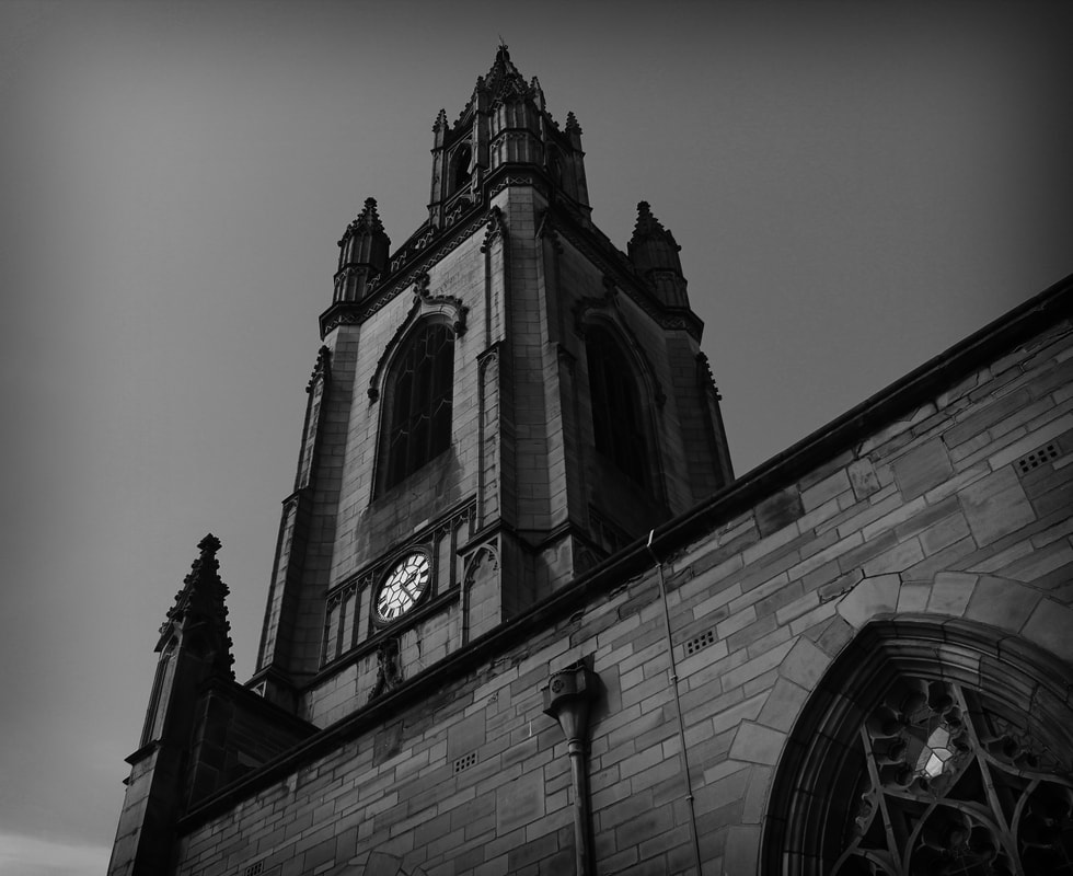
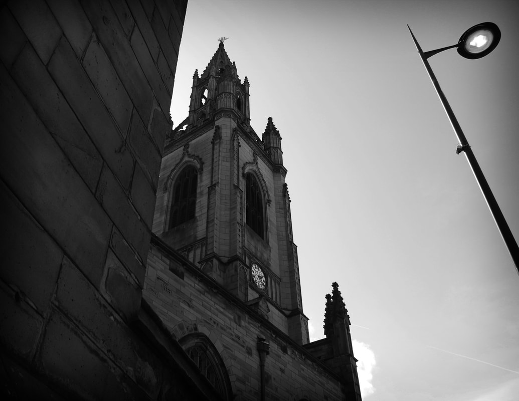
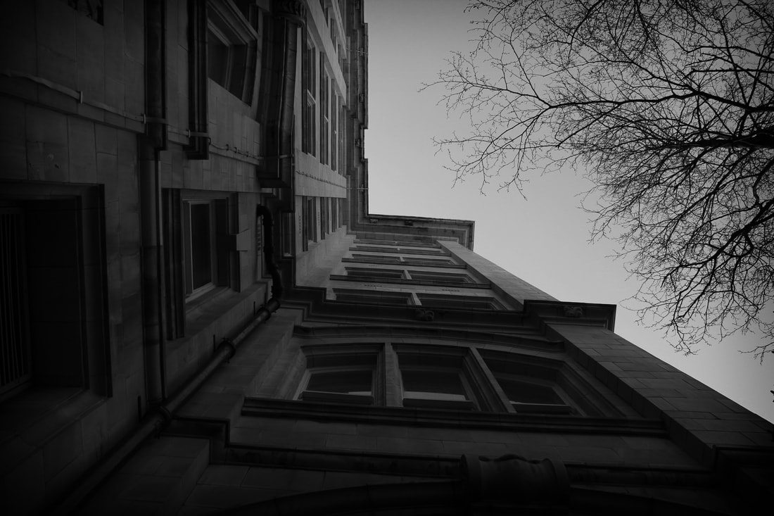
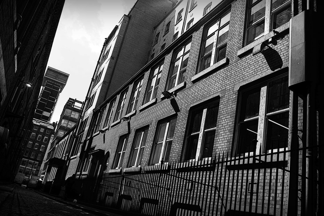
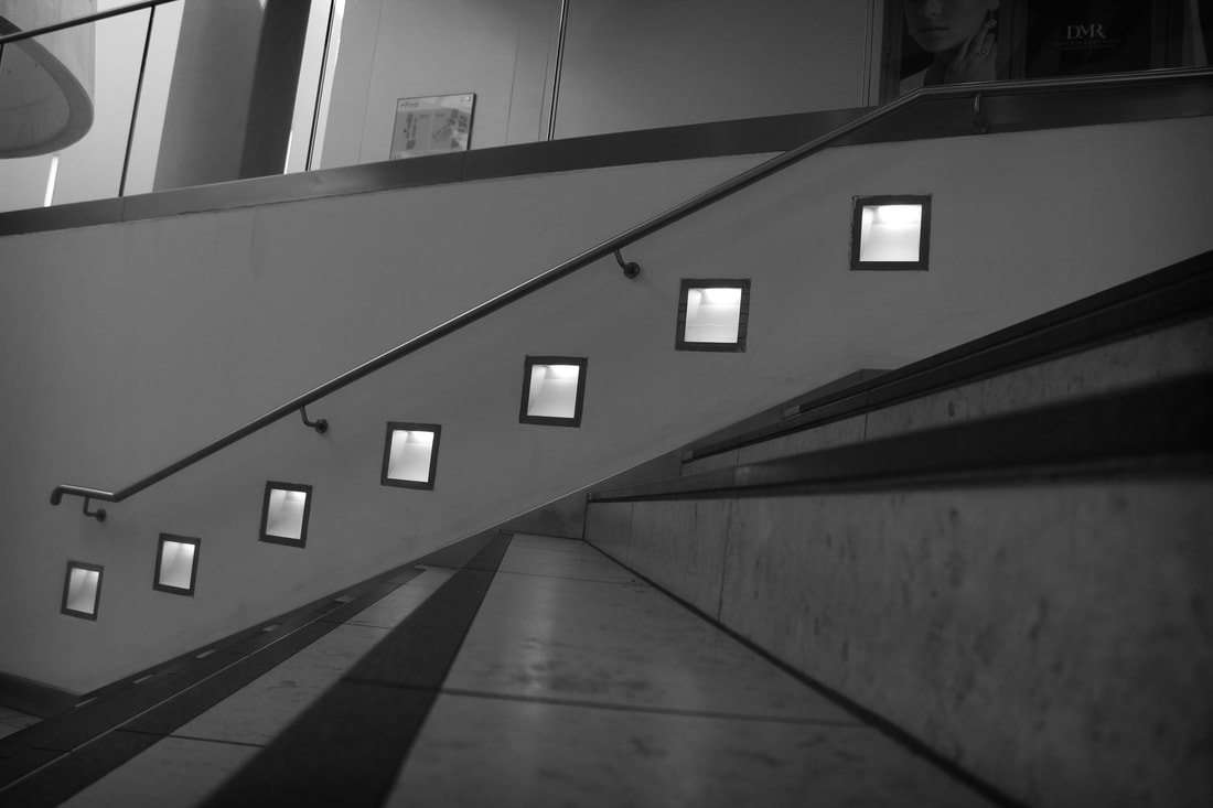
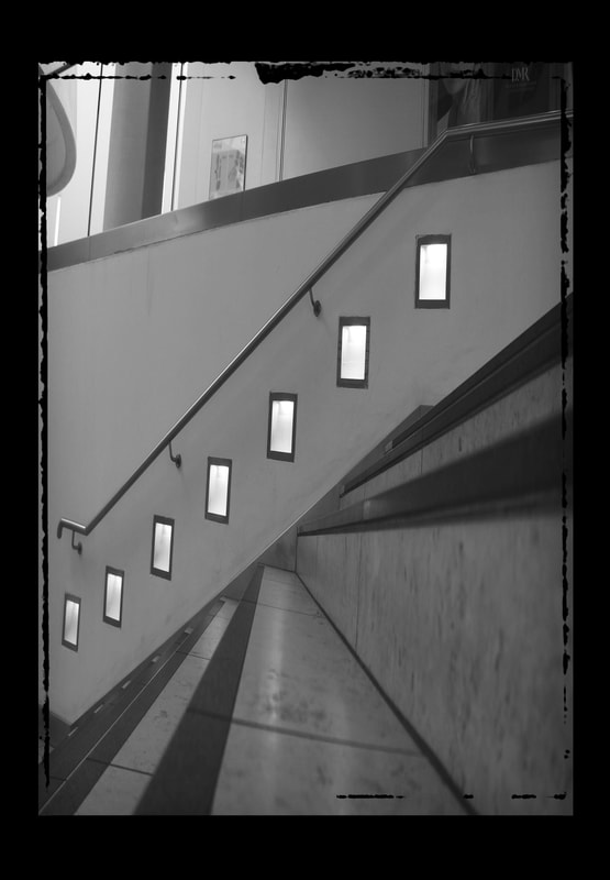
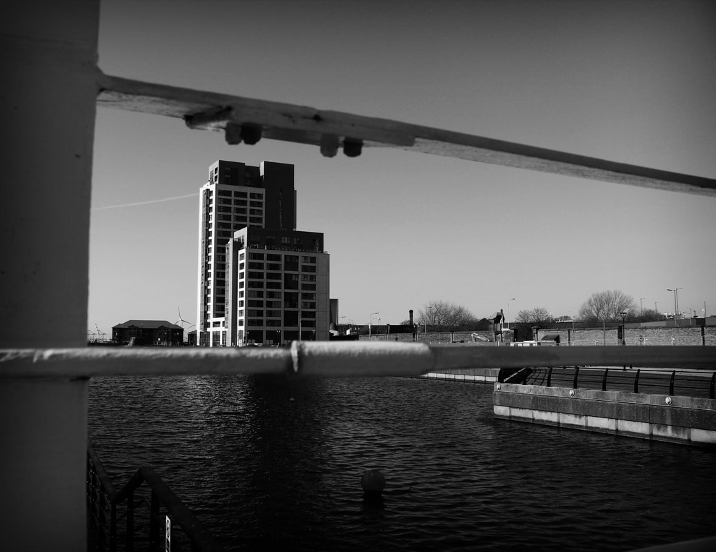
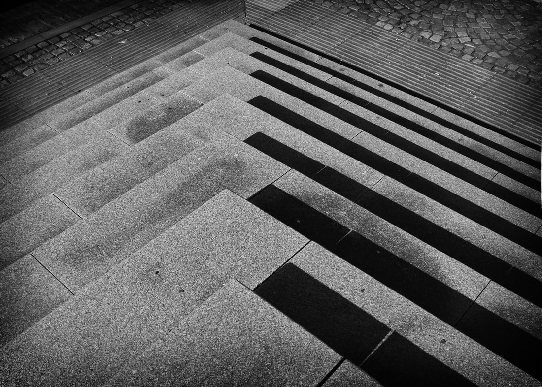
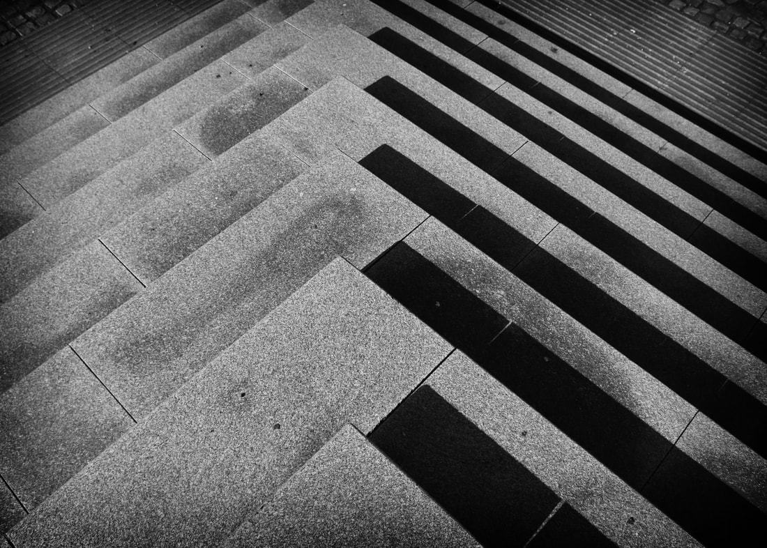
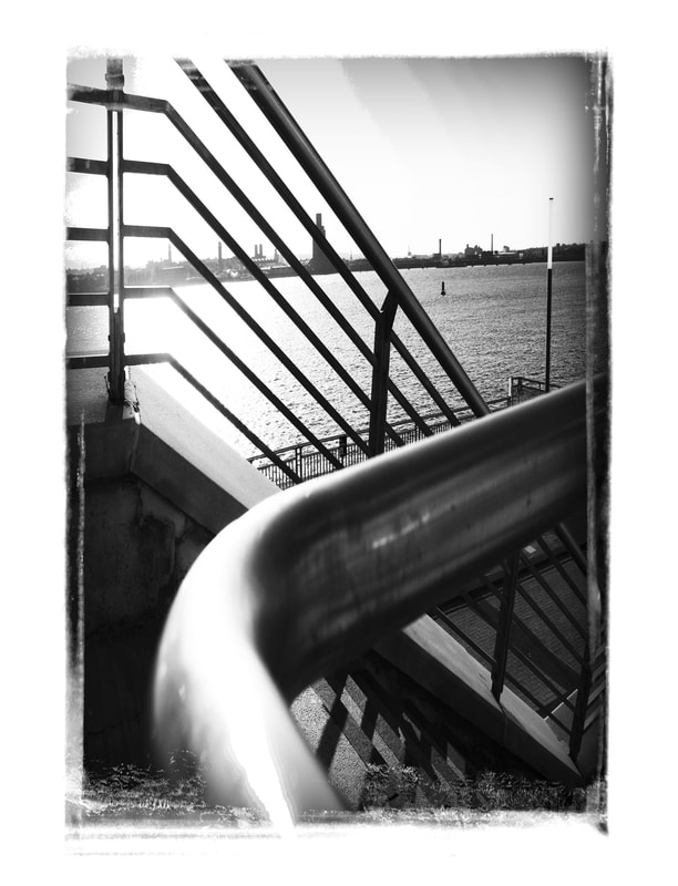
These 2 images are very high contrasting black and white showcasing 2 very popular Liverpool buildings by the Albert Dock, these images are very tall and show an unexpected perspective as well as the distance from the ground and the floor
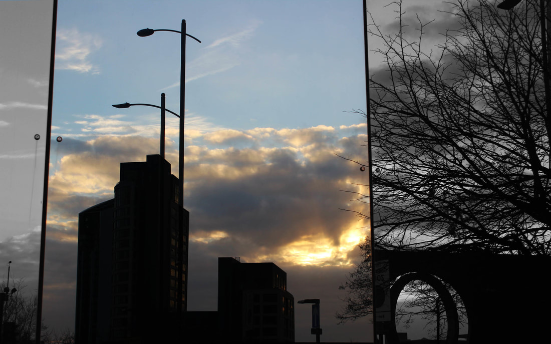
I really like this image as it shows multiple different photoshop techniques as well as being unexpected by looking into direct glass to act like a mirror effect reflecting the object or person, The image has been trued black and white in the mirror 1 and 3 leaving the bright on going colours in the centre mirror. The sun set adds a really strong element to this image.
Finally for my initial response to unexpected perspective this image is a high contrasting image with a blended sun set taking control of the image and lowering the greys in the image making the focus the sun set and ongoign colours.
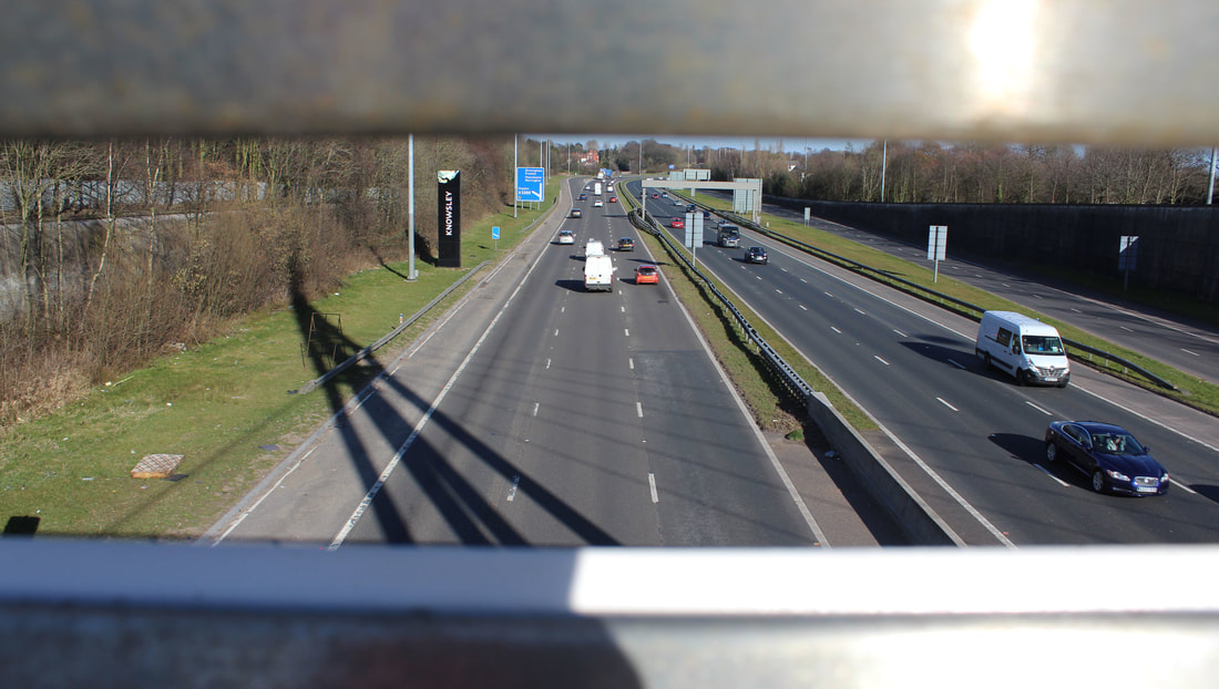
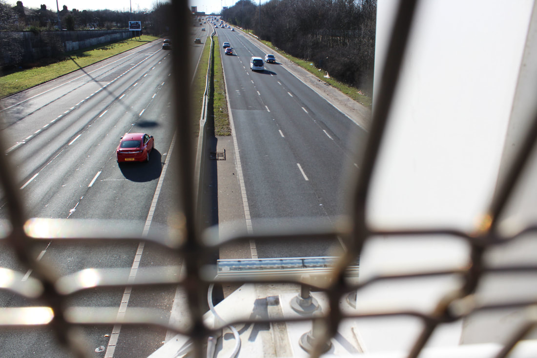
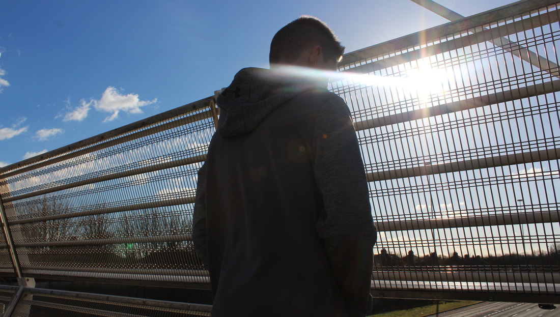
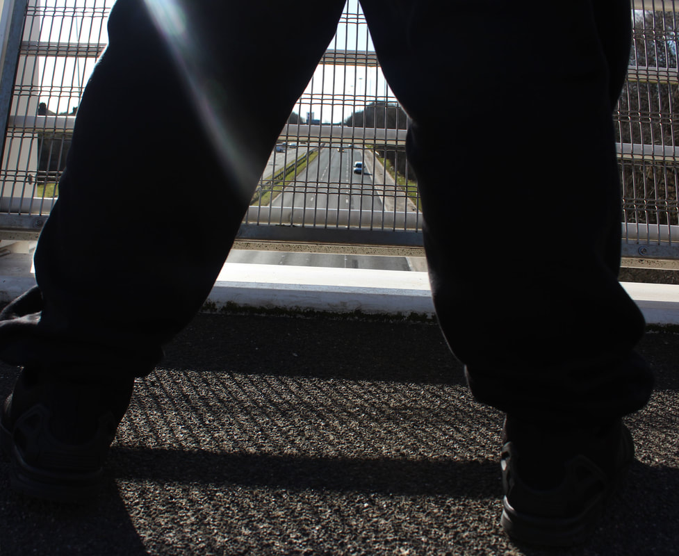
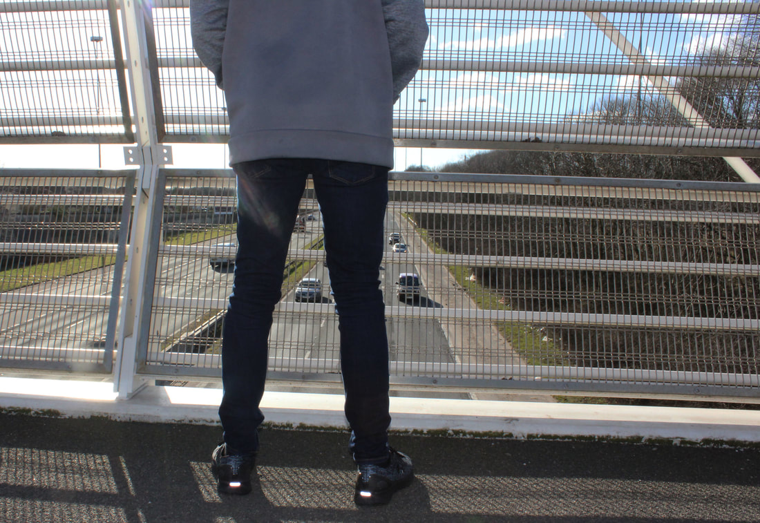
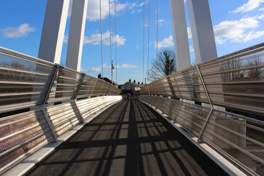
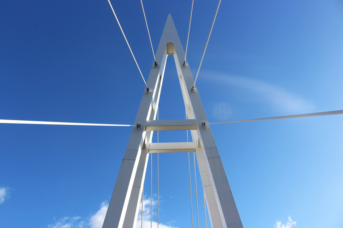
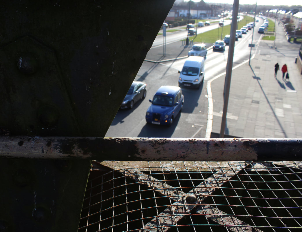
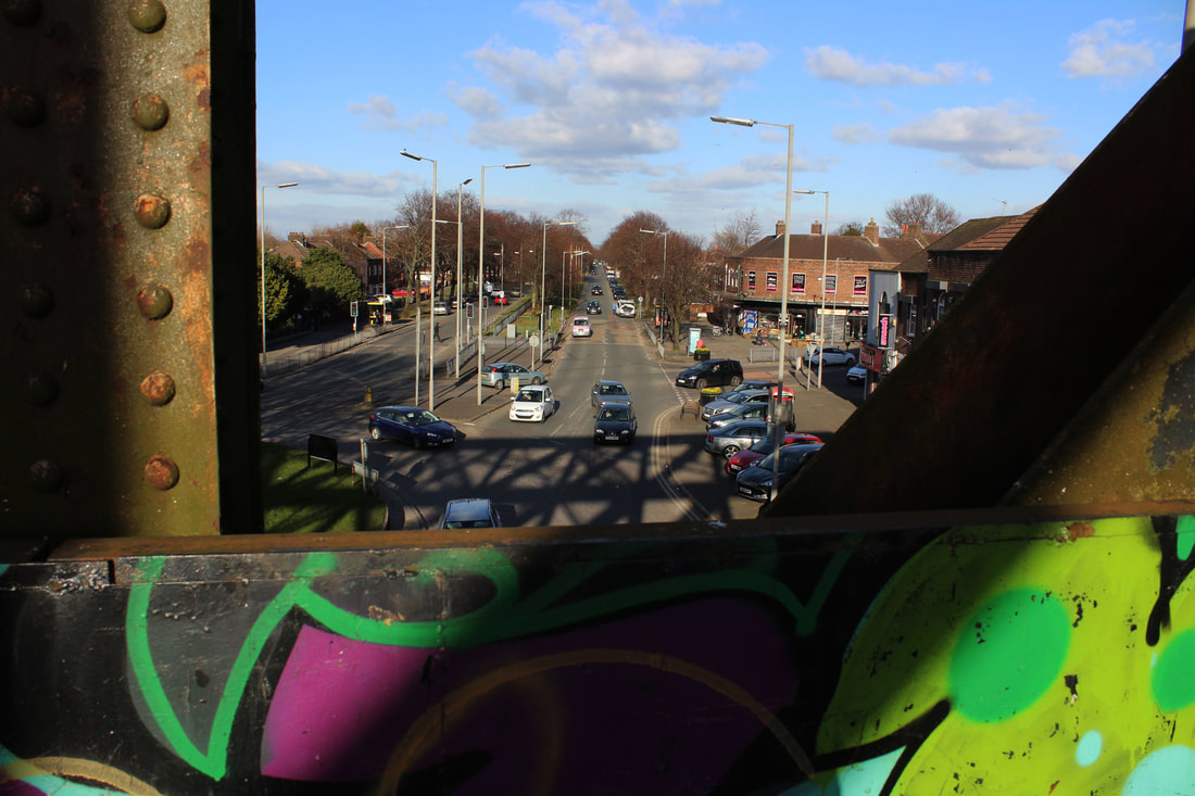
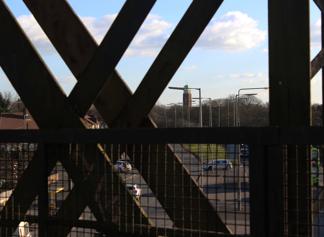
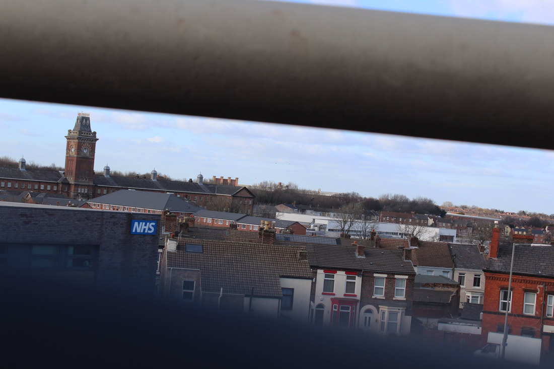
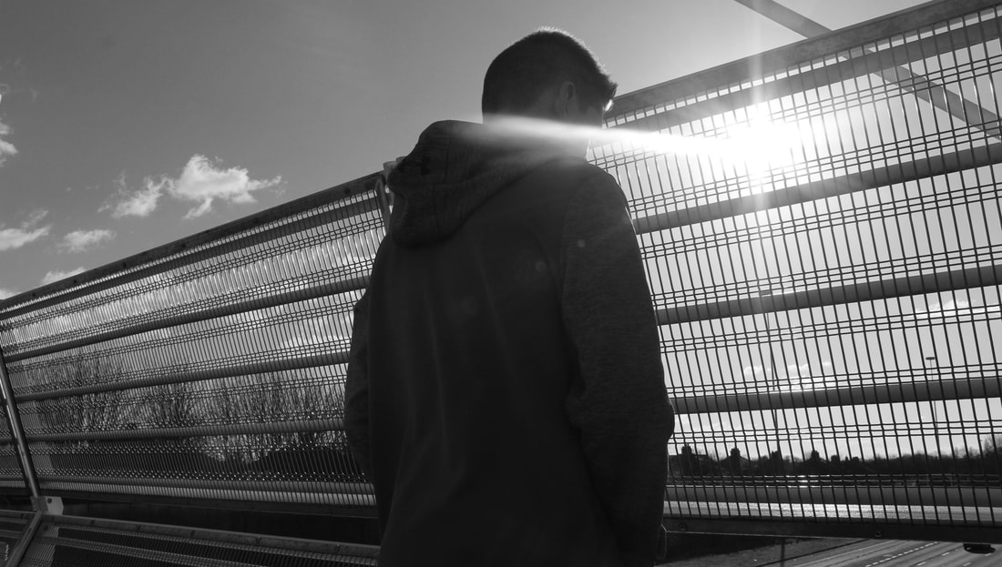
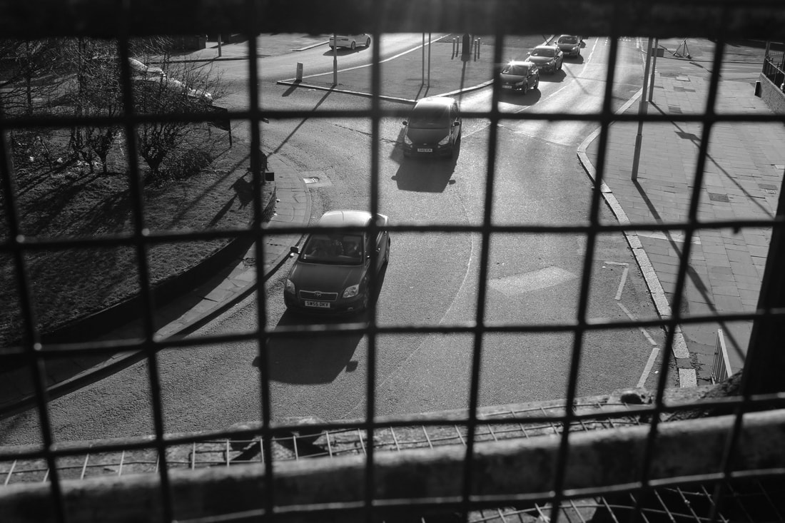
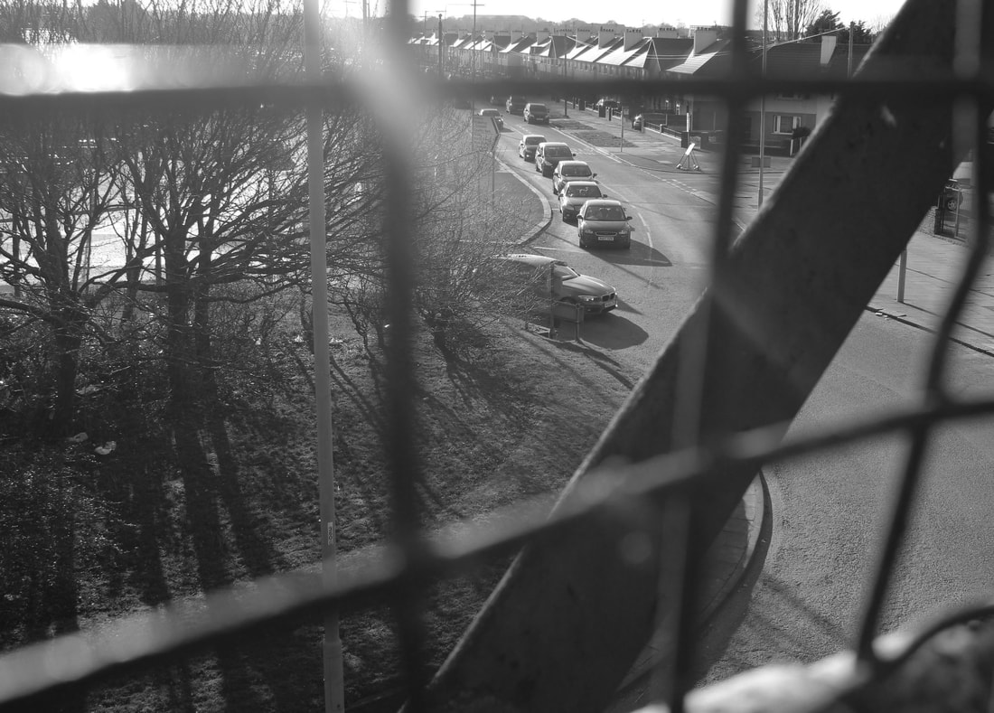
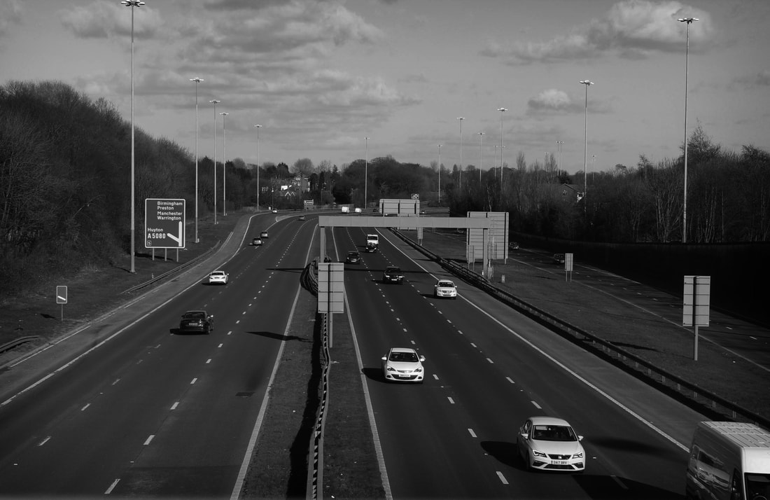
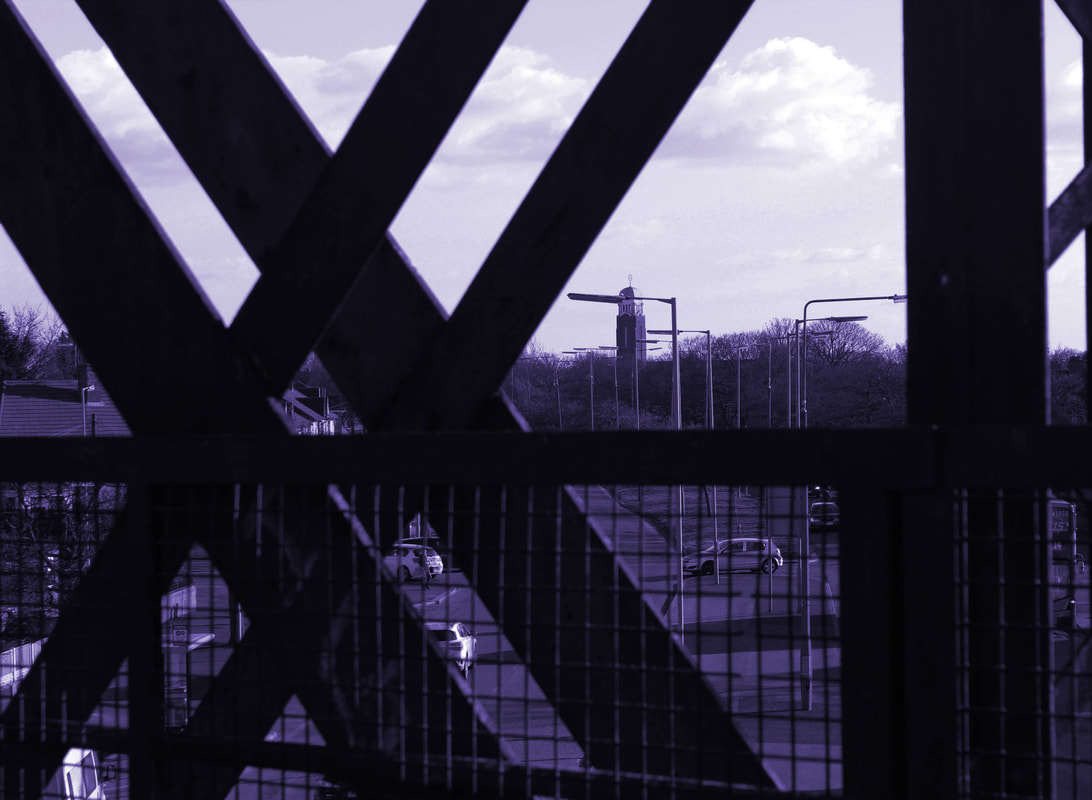
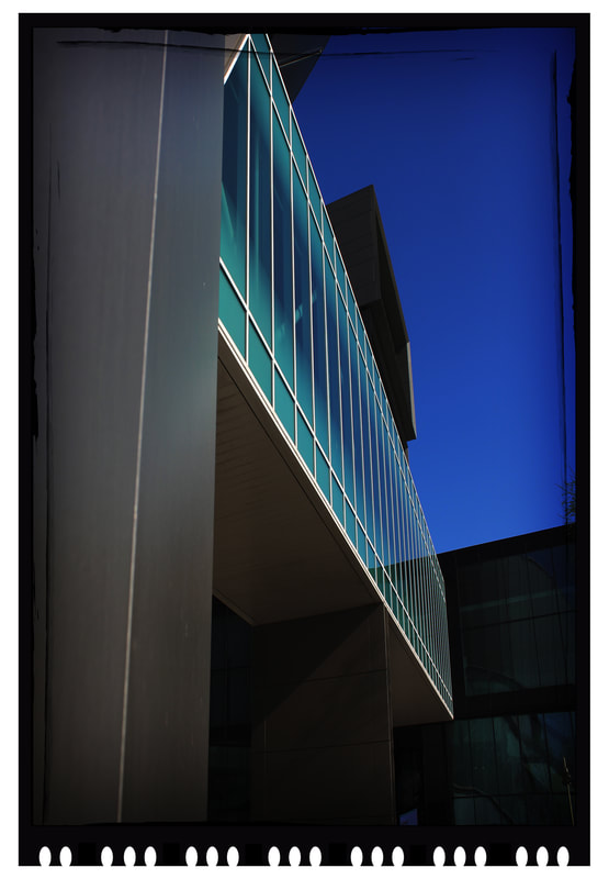
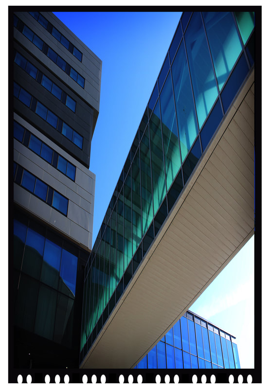
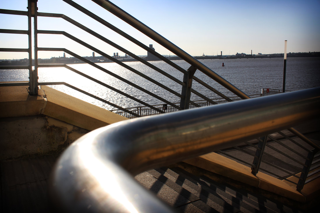
Bridges Perspective
Raw Images
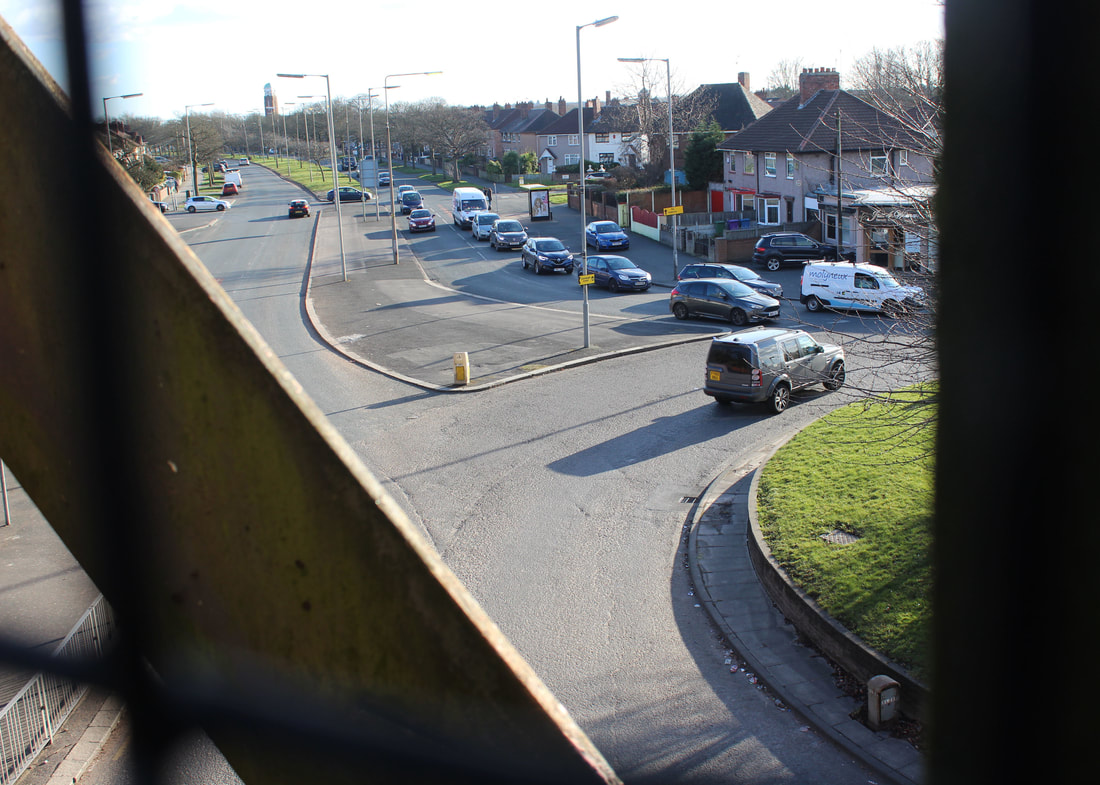
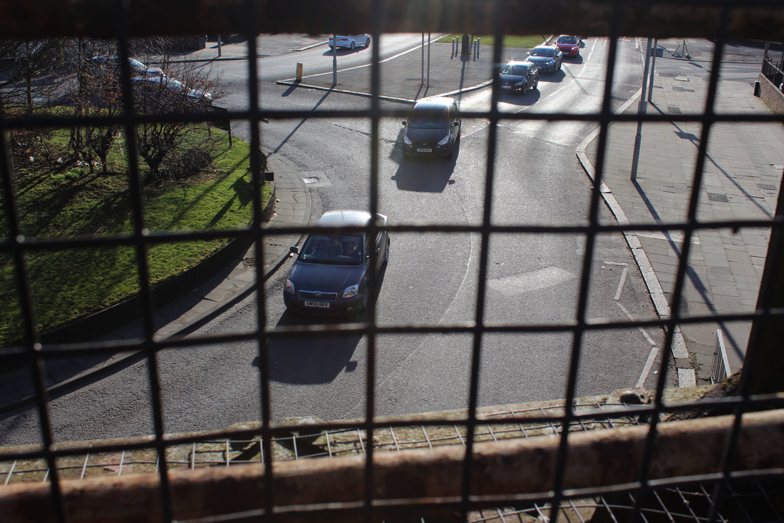
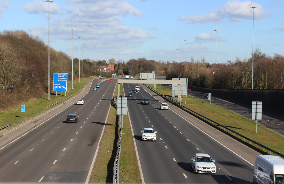
Next, I decided to show the perspective of a bridge and show how high up bridges look at busy streets and junctions of people in every day travel, these 2 bridges I went to were in a busy intersection including a double around a bout ad a busy motorway.


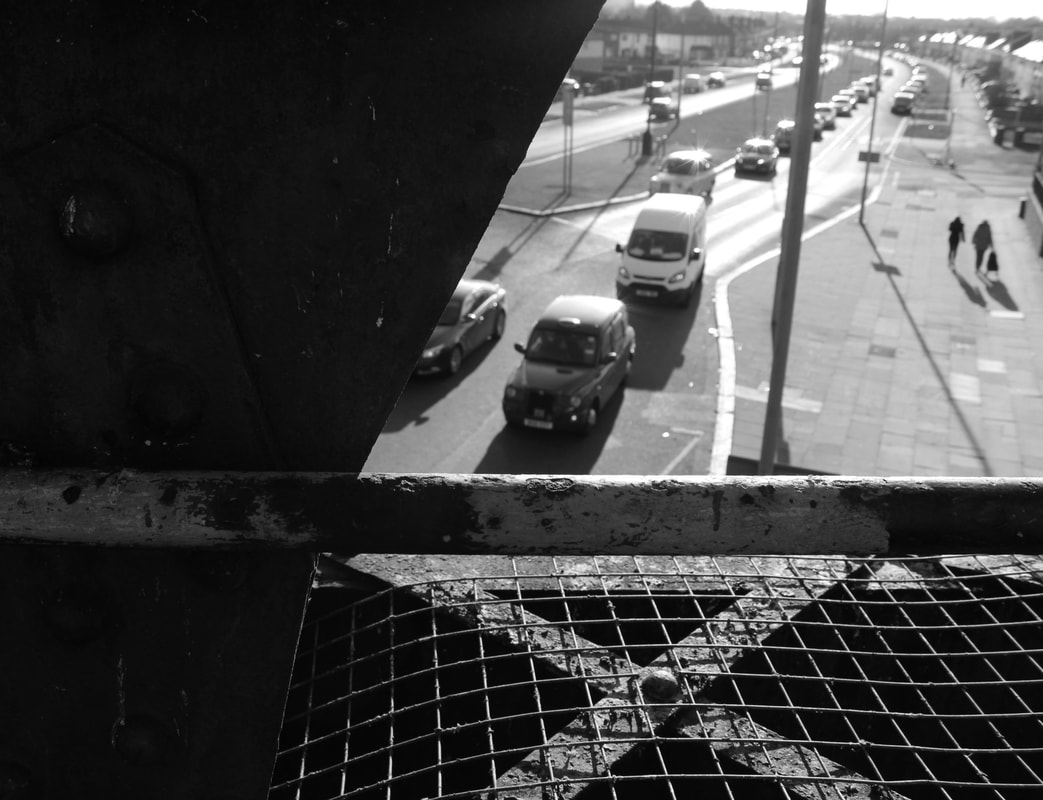
Bridges Perspective
Edited
I then decided to edit some of these pictures using multiple different photoshop techniques to enhance these images and showcase some of the best parts of them, such as the angle.
These images showcase the black and white effect, this is very simple to do but can be very effective in dragging the emotion o fa picture out. I really like how these images have been presented and think they showcase what is unexpected.
This image has been edited to have a blended purple sliced effect, this makes it look very unique and show the experimentation involved to create this effect.
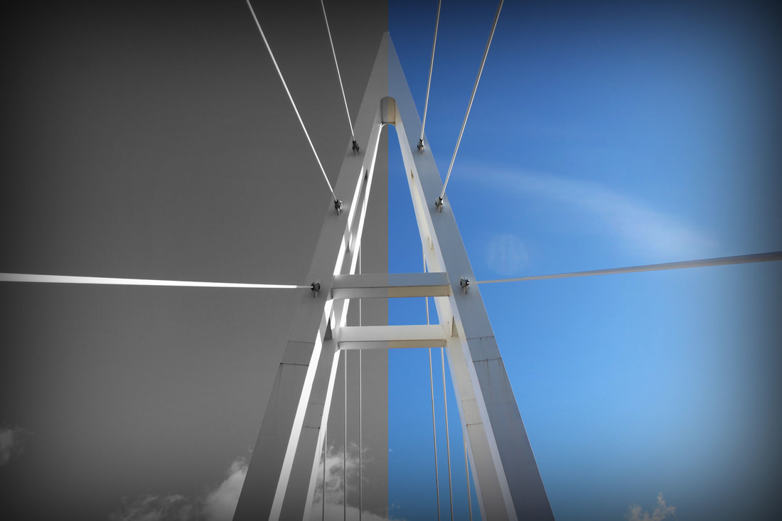
This image has been cut in half with colour and the other half in black and white this makes it look unique and shows the colours and contrast been the image main focus being the connector of the bridge.
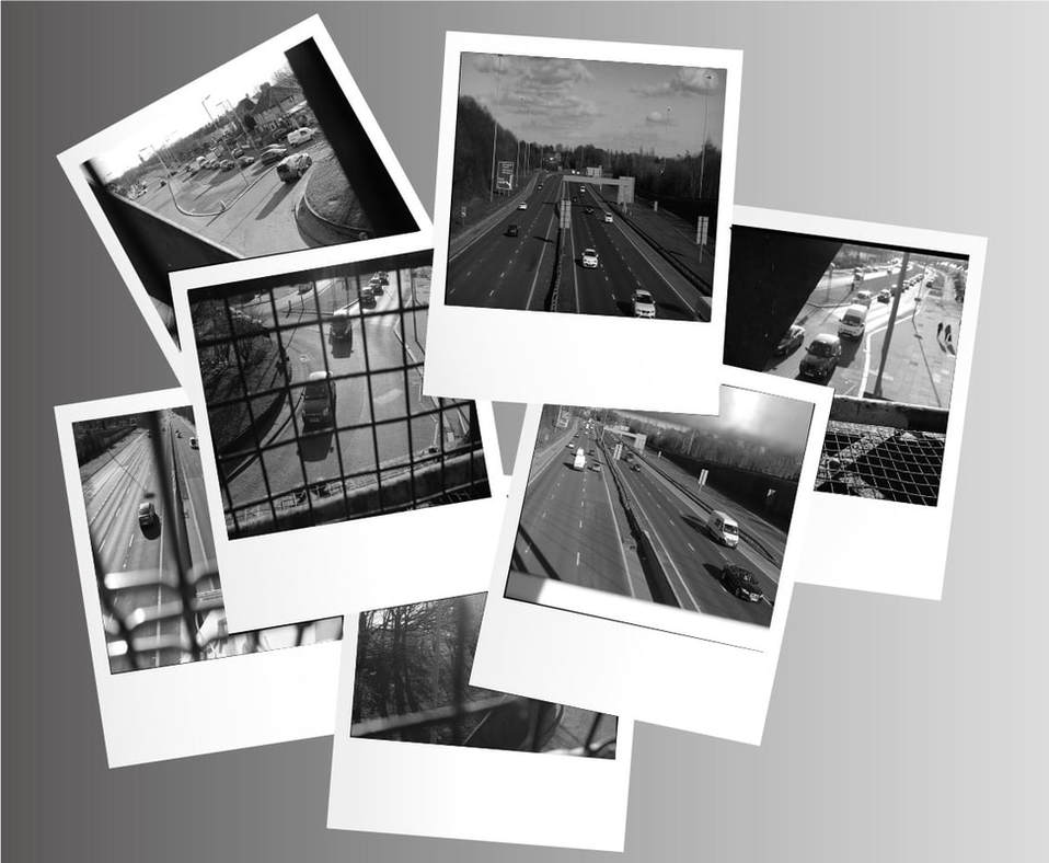
Finally for my bridge perspective I decided to present some of the best work and edit them into an old style polaroid using a high contrasting black and white effect.
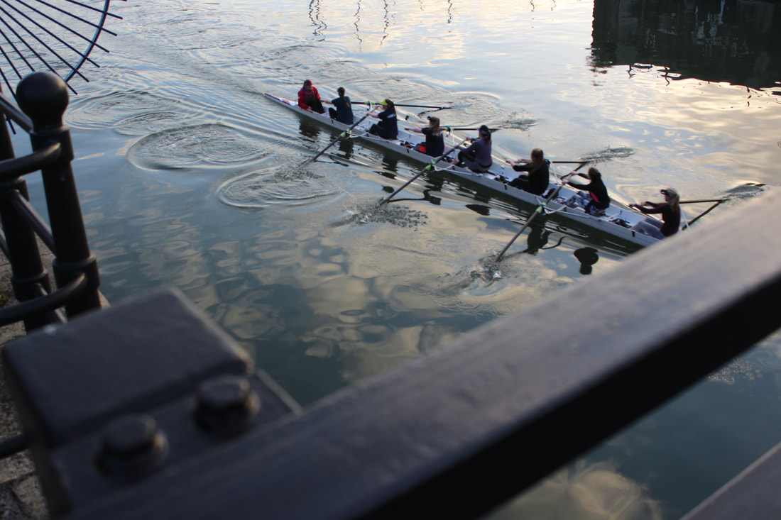
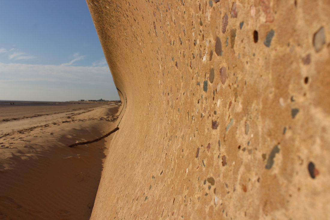
Crosby Beach Perspective
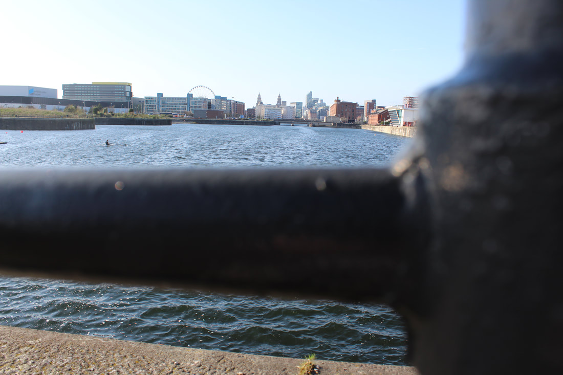
Raw Images
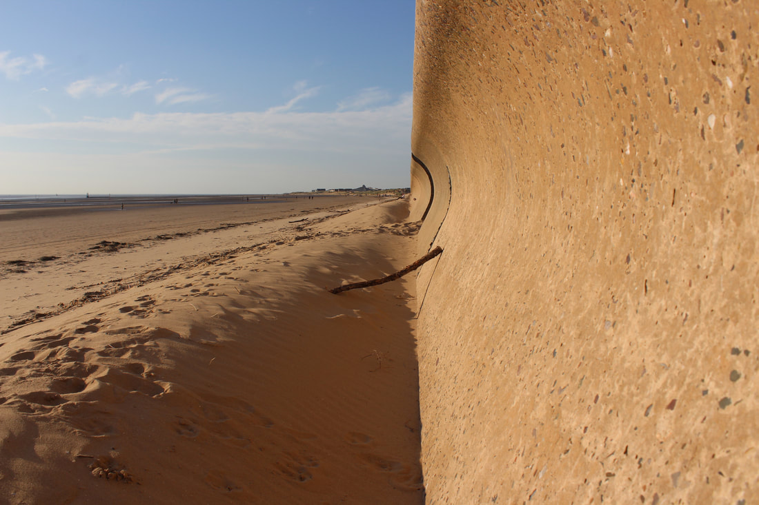
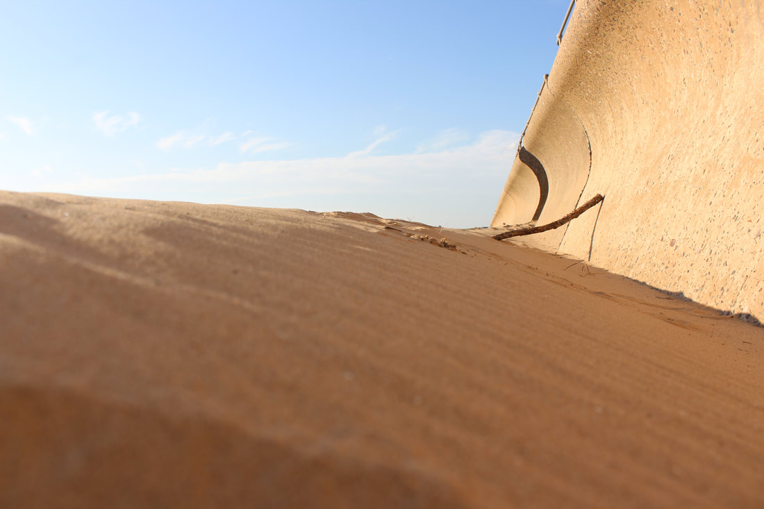
Continuing into my journey through unexpected perspectives i decided to visit crosby beach and see what unexpected perspectives could pop up, my plan going here was to try and use forced perspective to show my understanding of photography.
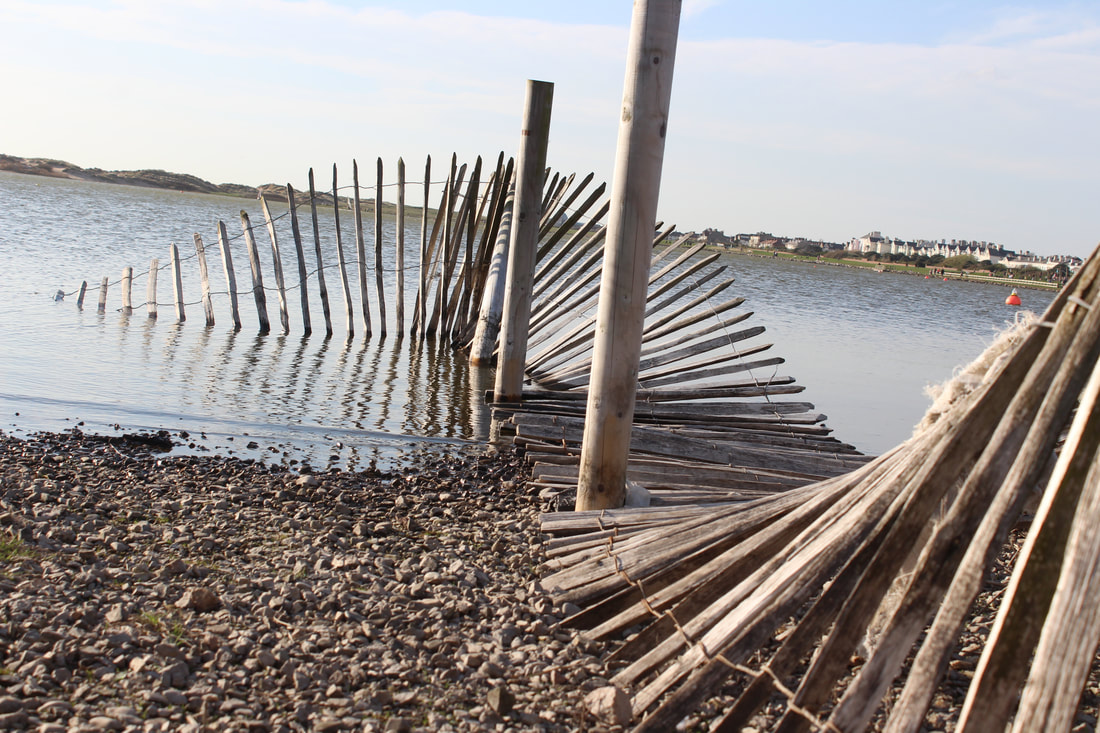
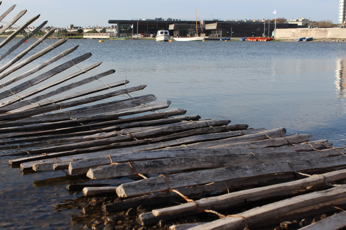
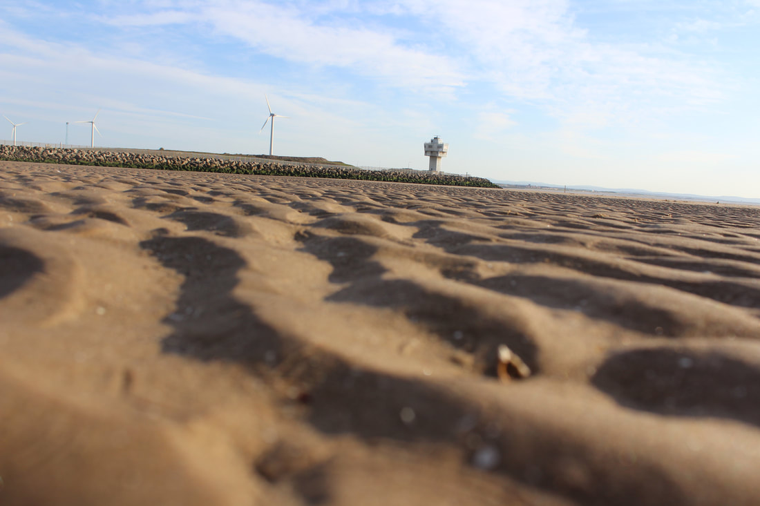

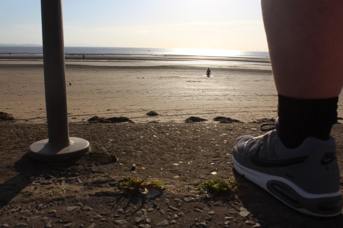
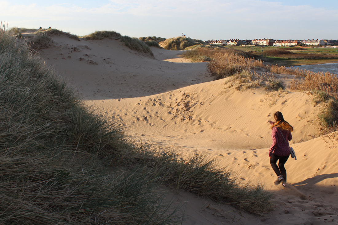
To get really rewarding images images i put myself high up on hills and looked down at people or objects, i also looked down staircases or alongside the beach floor.
Edited Crosby Beach Perspective
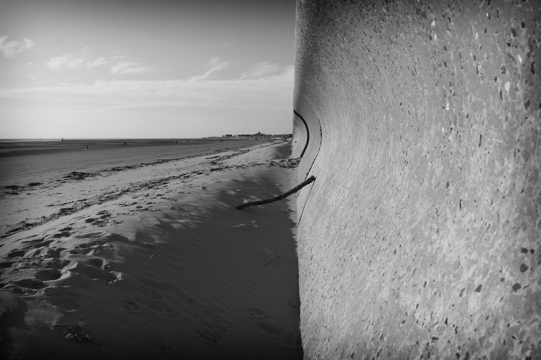
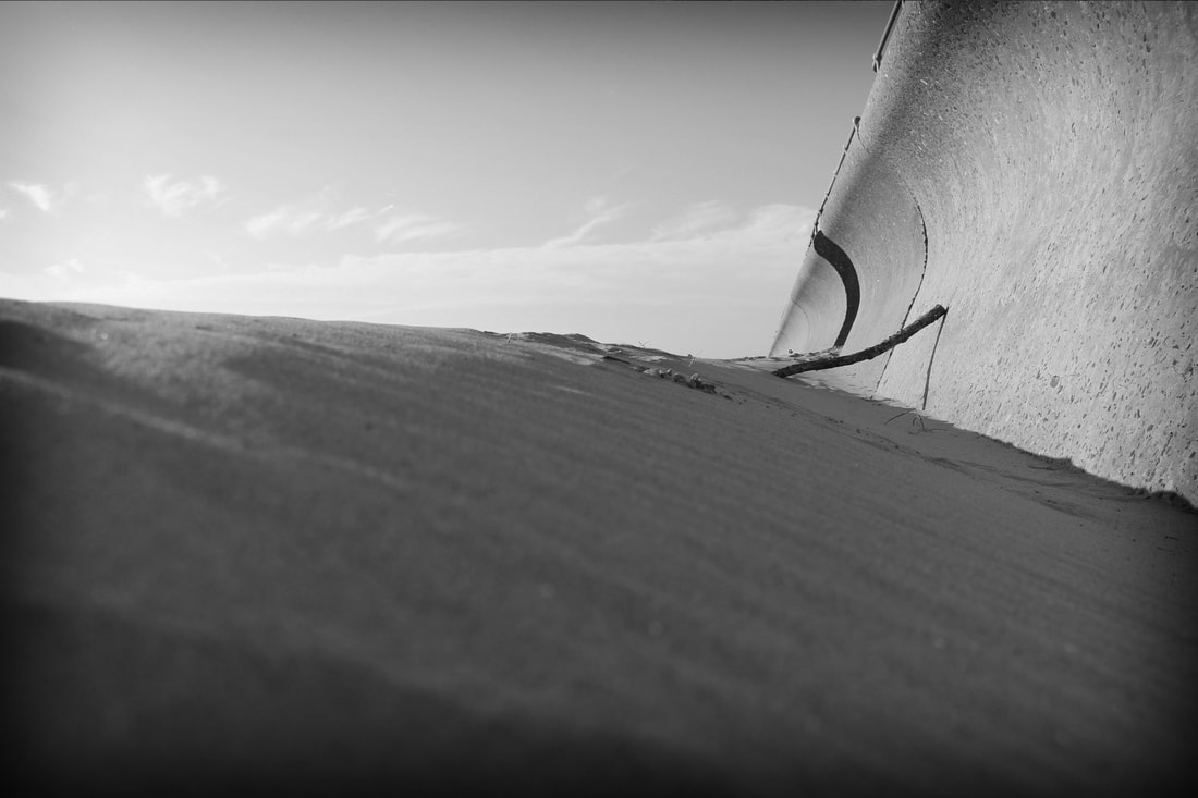
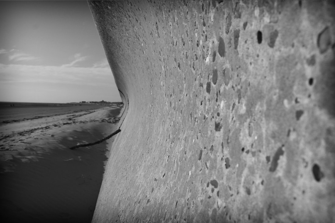
To start my editing process i created 3 of the same image twice and shown them in colour and black and white to get the most out of the bach, the first set shows high contrasting colours looking alongside the beach, the second set is in black and white and have a high key boosted contrast to make them stand out more.
This image has been edited with high boosted colours to make it contrast with the silhouette model, I think this image has turned out really and shows a great understanding of photoshop techniques.
This image has been turned into a high contrasting black and white image with boosted curves and levels to make the image have a gradient and feel to it. I really like the rubber ring in the centre of the image and think it works well.
I wanted to really experiment with this image and play around with pop filters, this is what i idid, I made the image look nice and have saturated colours, I then added the cut out filter making it look completely different and unique on this work.
Finally, I tried the pop filter effect again using this sea front image and think it worked well, this time i used the poster edges effect as it looked well in the water and brought out all the detail in the picture.
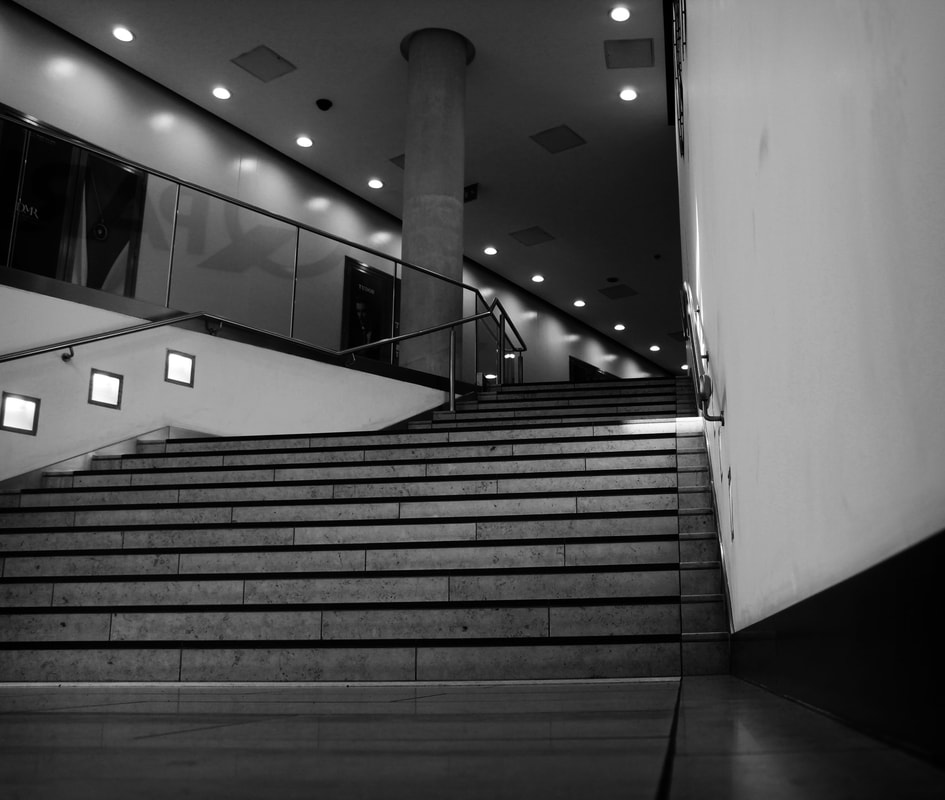
15 Hour: Timed Examination
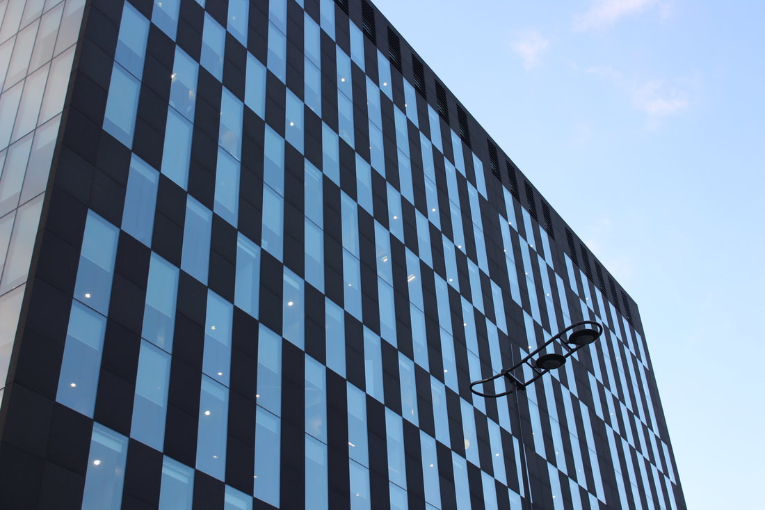
Building Perspective
Raw Images
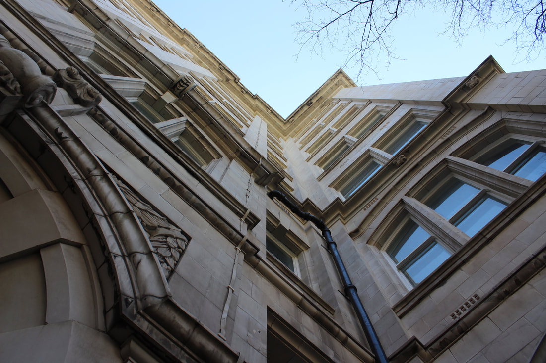
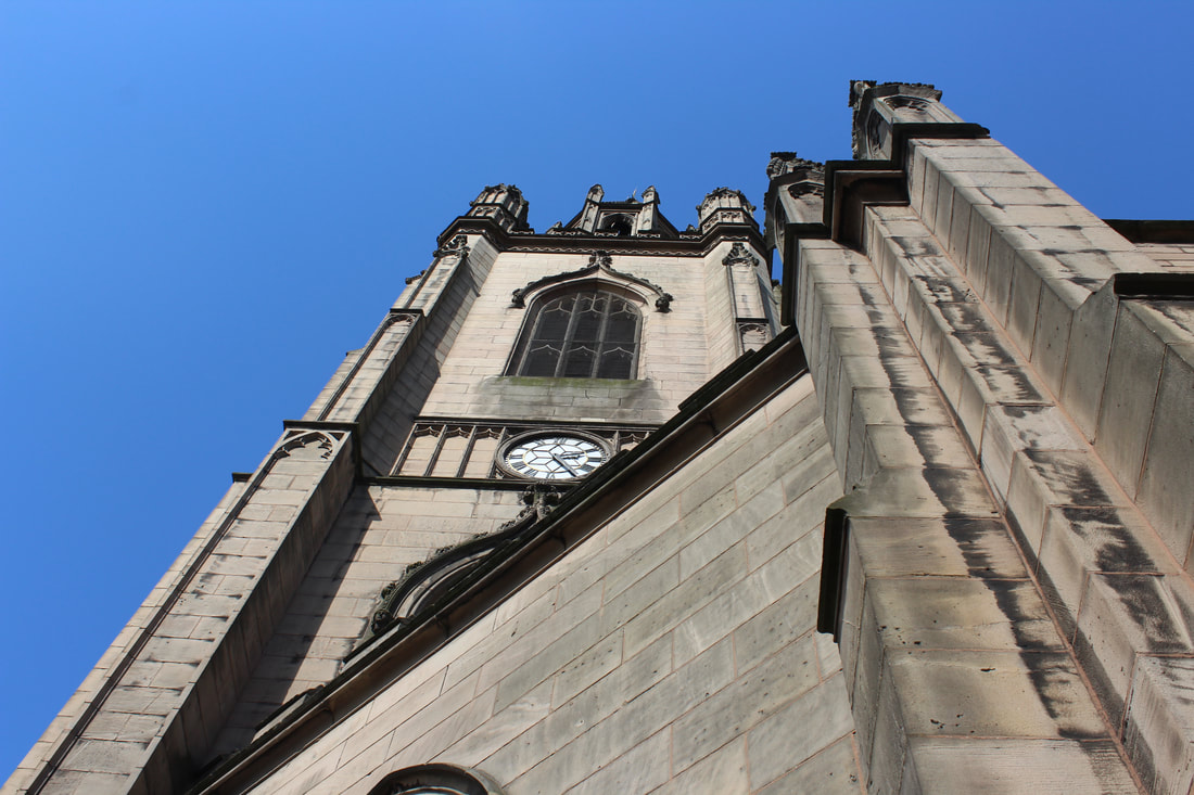
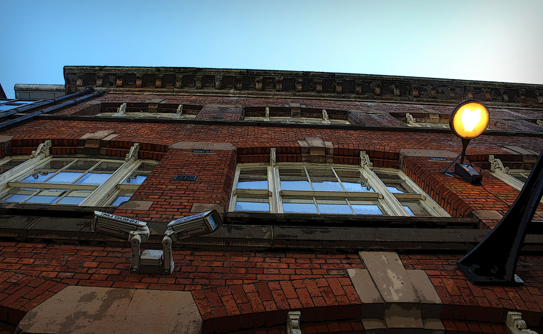
For my first hour I decided to use my work of Liverpool buildings, these buildings are very unique and have sentimental value to the people of Liverpool. I wanted to use these itches as they have a very unexpected feel to them and the way I have captured these pictures is very creative and shows a different perspective.
Edited Building Perspective
I started by editing a set of 6 black white images with high contrast and levels, I think this made the images work really well and thanks to the amazing day i went on the sky looks very clean and clear to see. The black and white effect complexity grabs the pictures fine details and make them look unique.
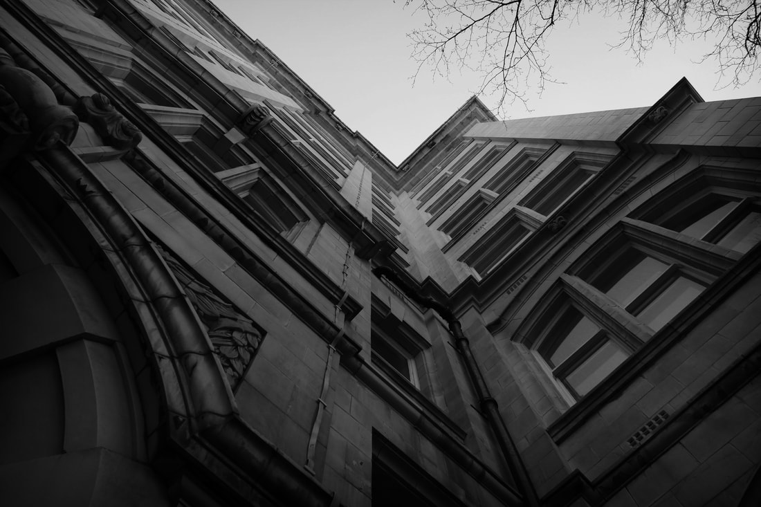
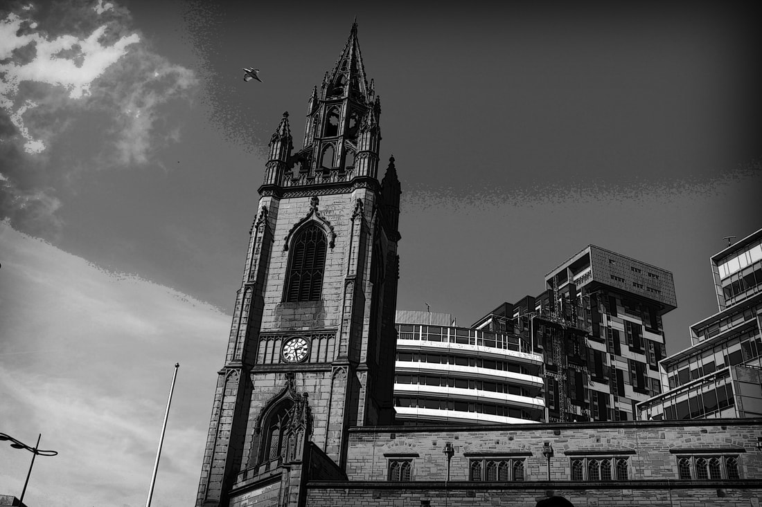
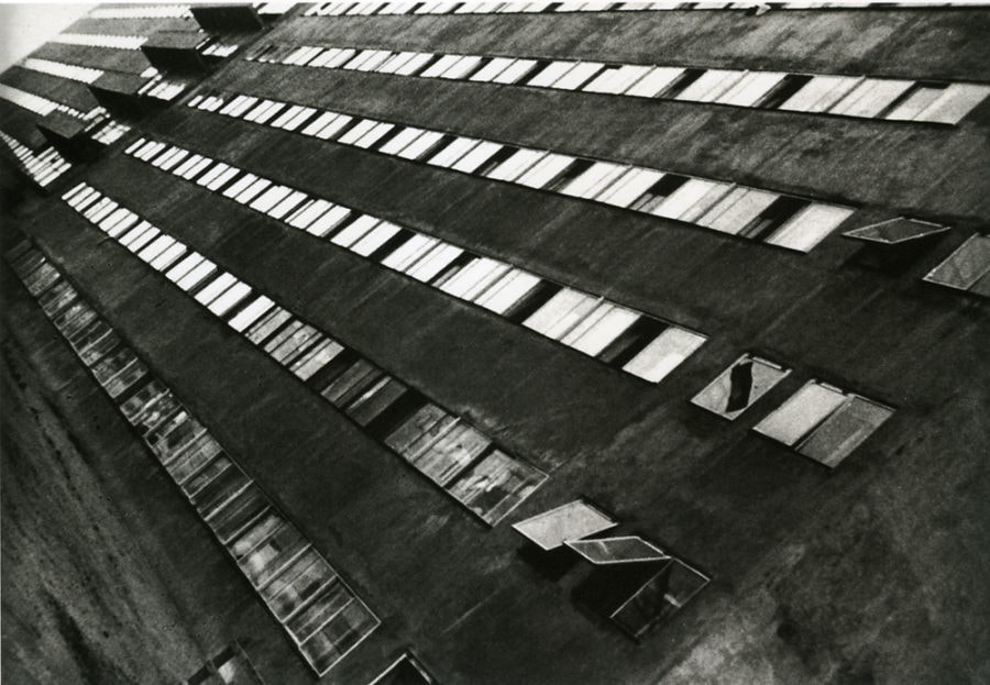
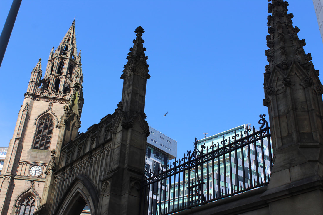
I then wanted to show big black and white images that show a wide shot of these detailed buildings, This image is very detailed and has a high contrast making the image look more inverted with the colours it has, as without the back and white effect the image would be a clear blue sky.
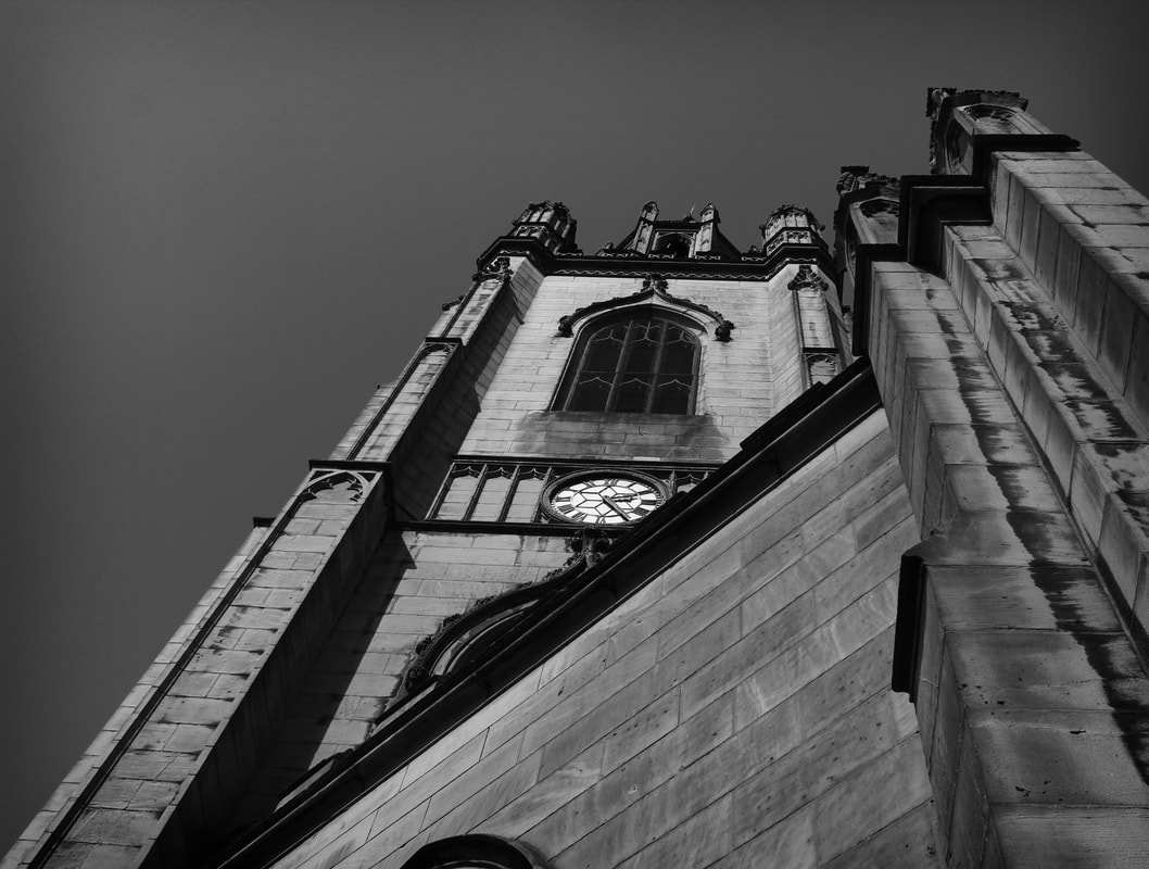
Using the method for the first black and white image i duplicated the development of the photoshop and used a similar structure to make this image of a clock tower look distinctive with the colours and have more blended colours using the black and white filter.
This big image is very detailed with contrast and shows levels of photoshop slicing making parts of the image black and white and parts in colour. This image looks very interesting and shows clear understanding of photoshop techniques such as black and white filters and slicing parts of the image to show a change in time or maybe days in which it was taken.
|
|
|
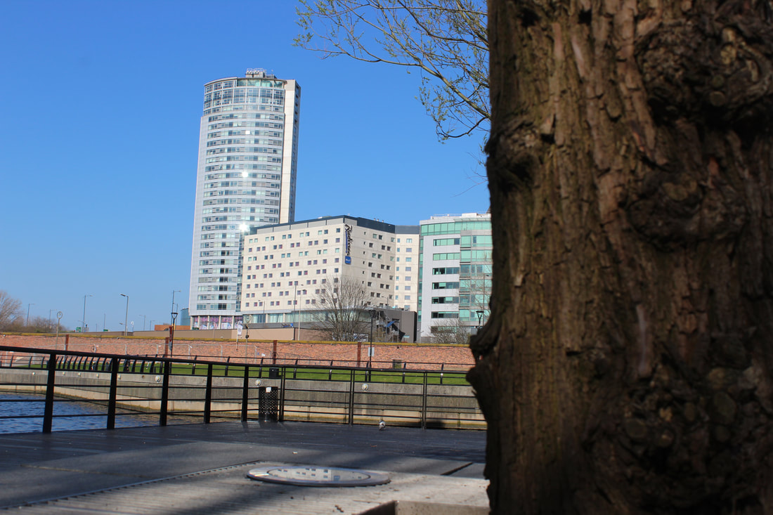
Next i done a set of 6 high boosted colour images that showcase a newly built office building with colourful windows and tall buildings surrounding the alert dock bridge. These images all have high colours and black and white vignettes. Then a hollywood style movie frame surrounding all the images to make them look better presented and well edited.
Finally two big frame images that that show experimentation in photoshop, first image has a poster edges filter applied to it to make it look more cut clean and stylish and has also been given a boost in the saturation to make it look more visible. Second big image has also got a boost in the saturation and a hint of blue paint sliced into the frame of the picture showing clear understanding of photoshop.
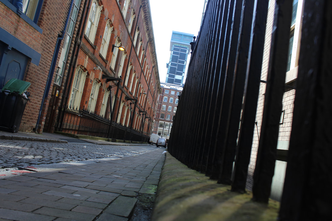
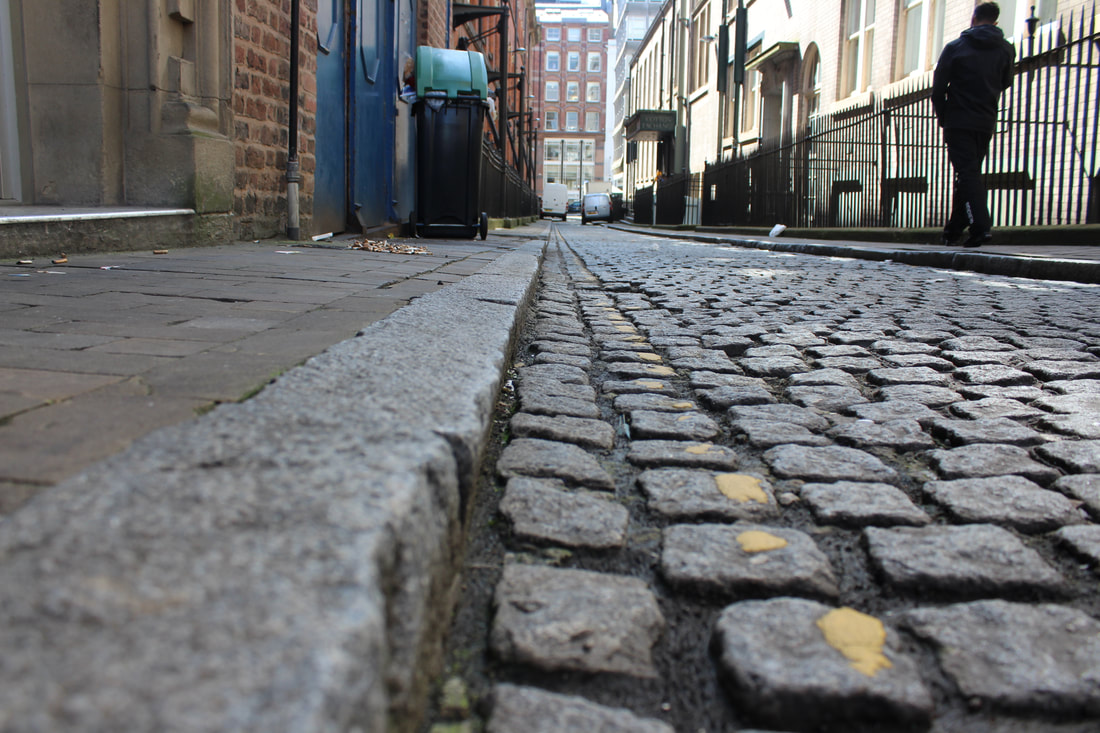
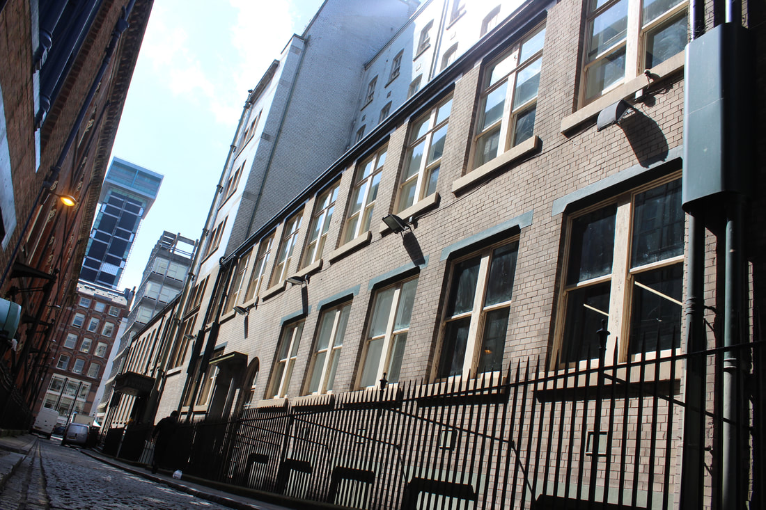
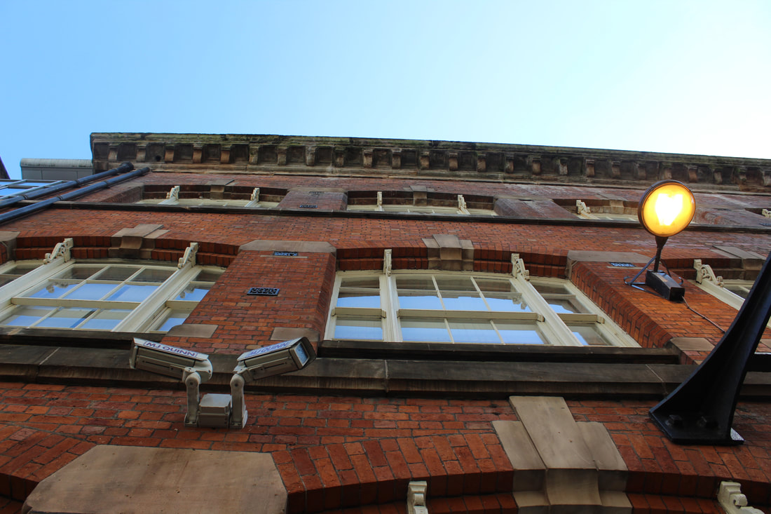
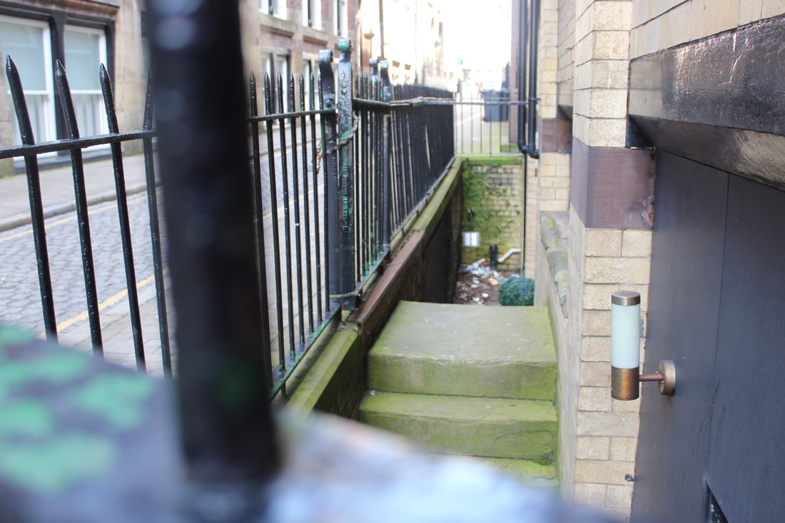
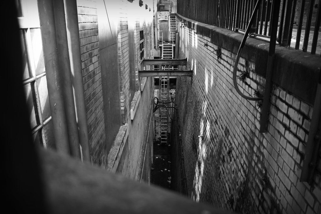
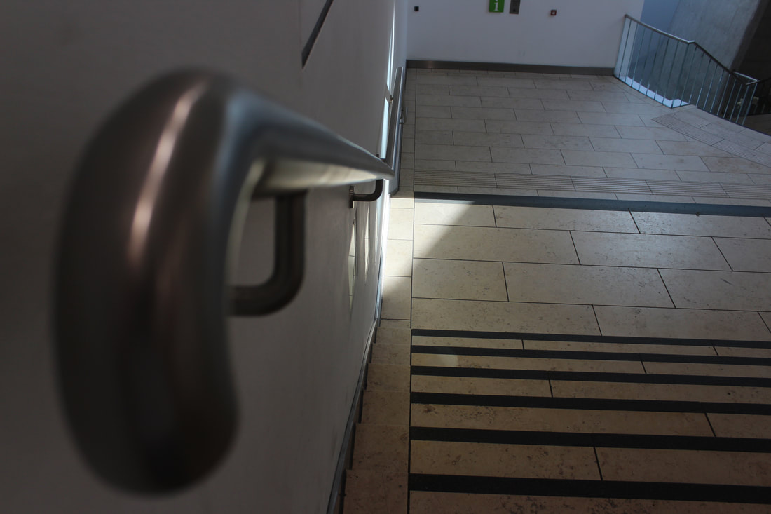
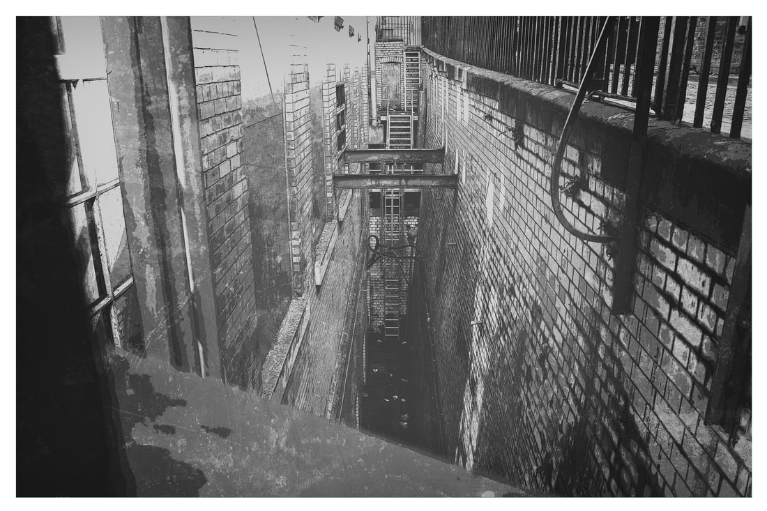
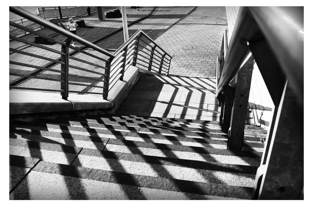
Side Street Perspective
Raw Images
For my second hour i decided i was going to look at some street photography as it links directly to my unexpected perspectives topic, for this i went into some of towns for old style side streets and took pictures of things that were unusual and unexpected.


Edited Side Street Perspective
Now in my second hour of my exam I am editing these pictures similar to my prep work at crosby beach or the bridges. Doing a simple set of high contrast black and white images with high opacity levels. These are very easy to make but are very effective and brigs out the detail in the floor and walls.
These are two big size images using this photoshop method, I took a bit more time on these images and used the zoom in feature to grey out blurred parts of the images. Added a small black and grey vignette to include the image.

I then wanted to show a bit of colour so I edited 4 of my park and open road images and used the brightness and contrast layer to add and take away parts of the image i did or didn’t like.This worked very well and shows how shadows can be manipulated to make rewarding pictures.
This image is a Bill Brandt style image as it it has high brightness and contract and uses black vignette to darken parts of the image, this makes the image look old and as the location was in a older side street with broken windows looks even nicer. Finally I added a filter option which makes the image look more sharp and cartoon like, called poster edges, it controls all the fine print details in the image and makes it look cleaner.
This is another strong style picture of my side streets looking directly up at a more up to date office building, i also used levels and hue saturation to make the image more brighter and allow more of the natural colours to shine. Finally similar to the image before this one added a poster edges effect tool, to controls all the fine print details in the image and makes it look cleaner.
Finally I decided to show more experimentation by taking a empty canvas of Polaroid pictures and putting some of own work here, i edited 4 images that i thought suited the side streets topic and cropped them to size on the canvas and used brightness and contrast to make the image look more professional.
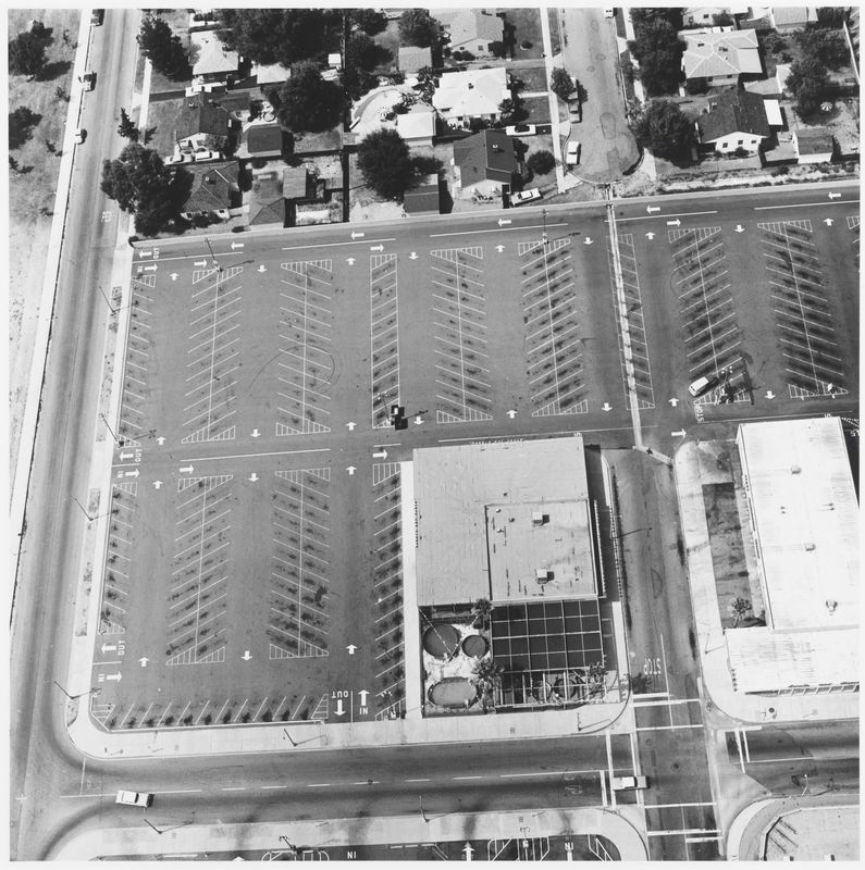
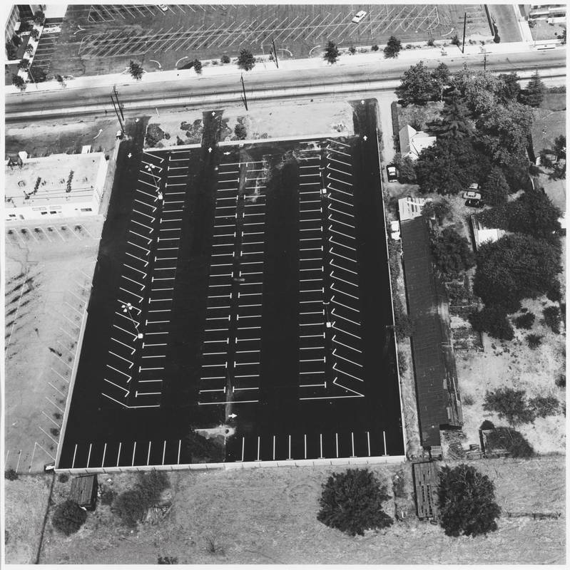
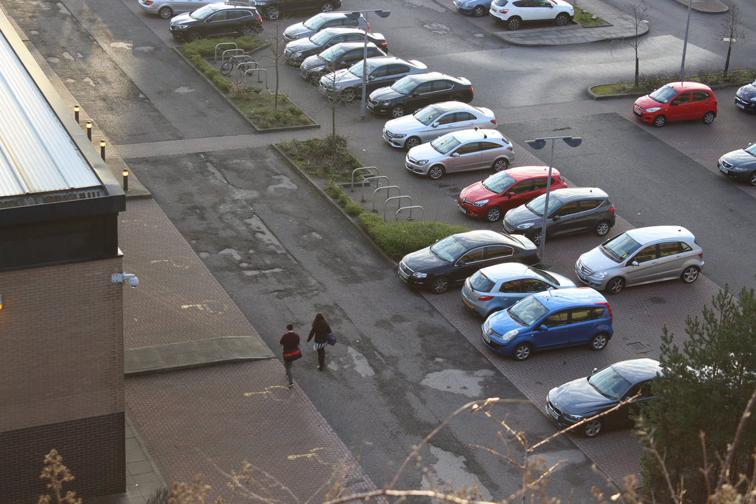
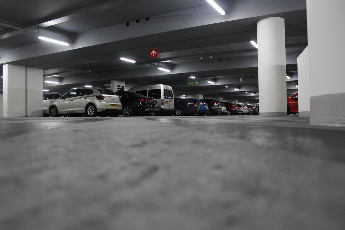
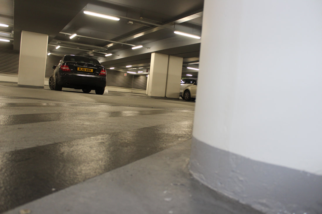
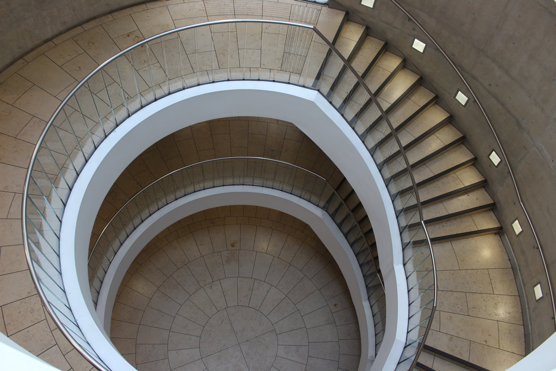
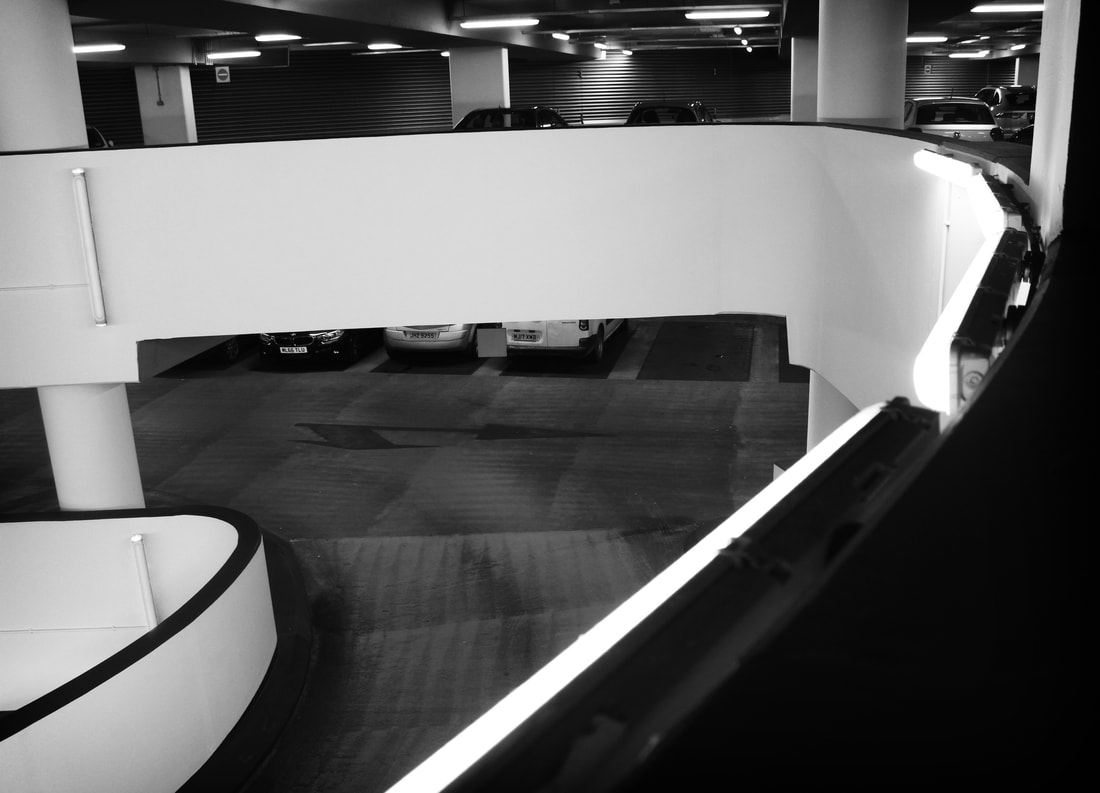
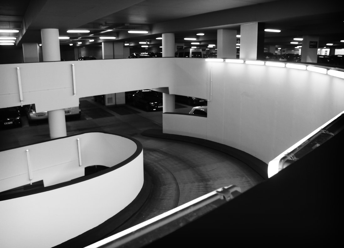
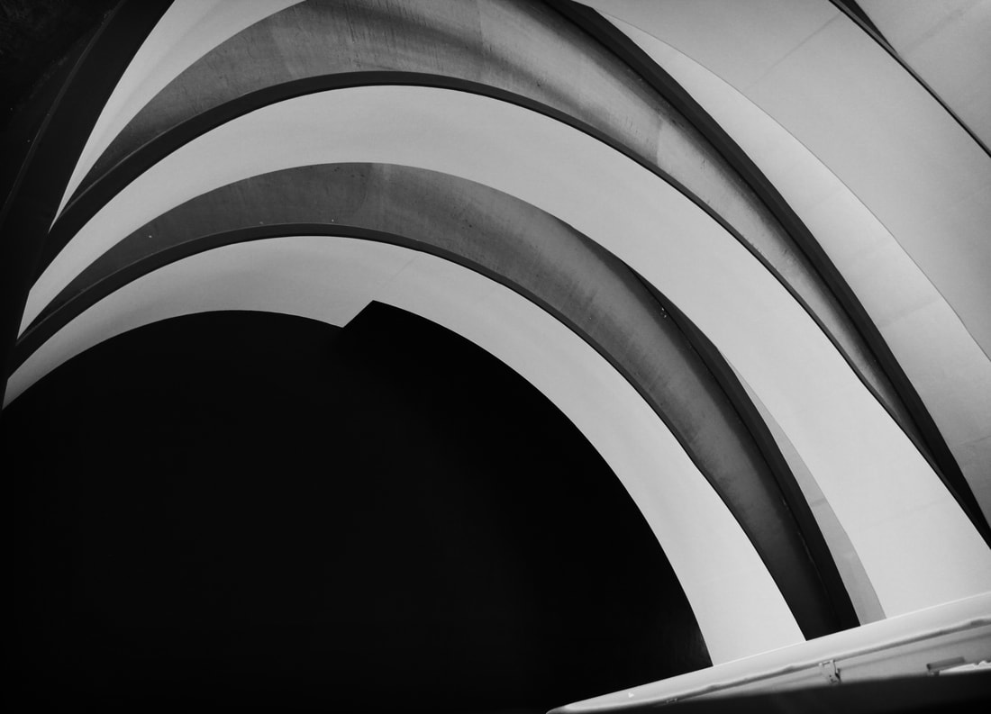
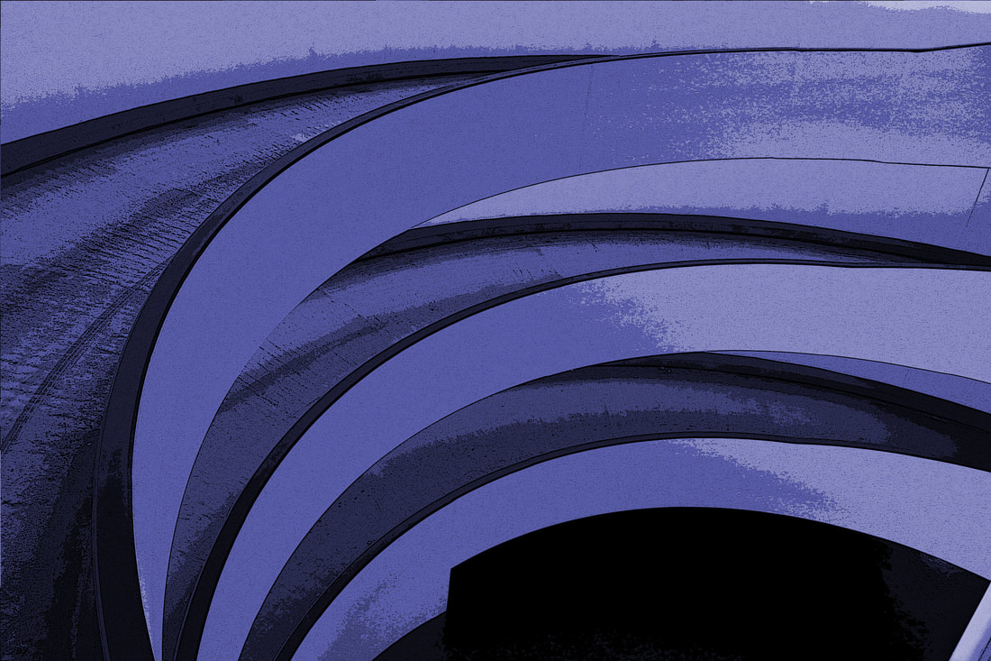
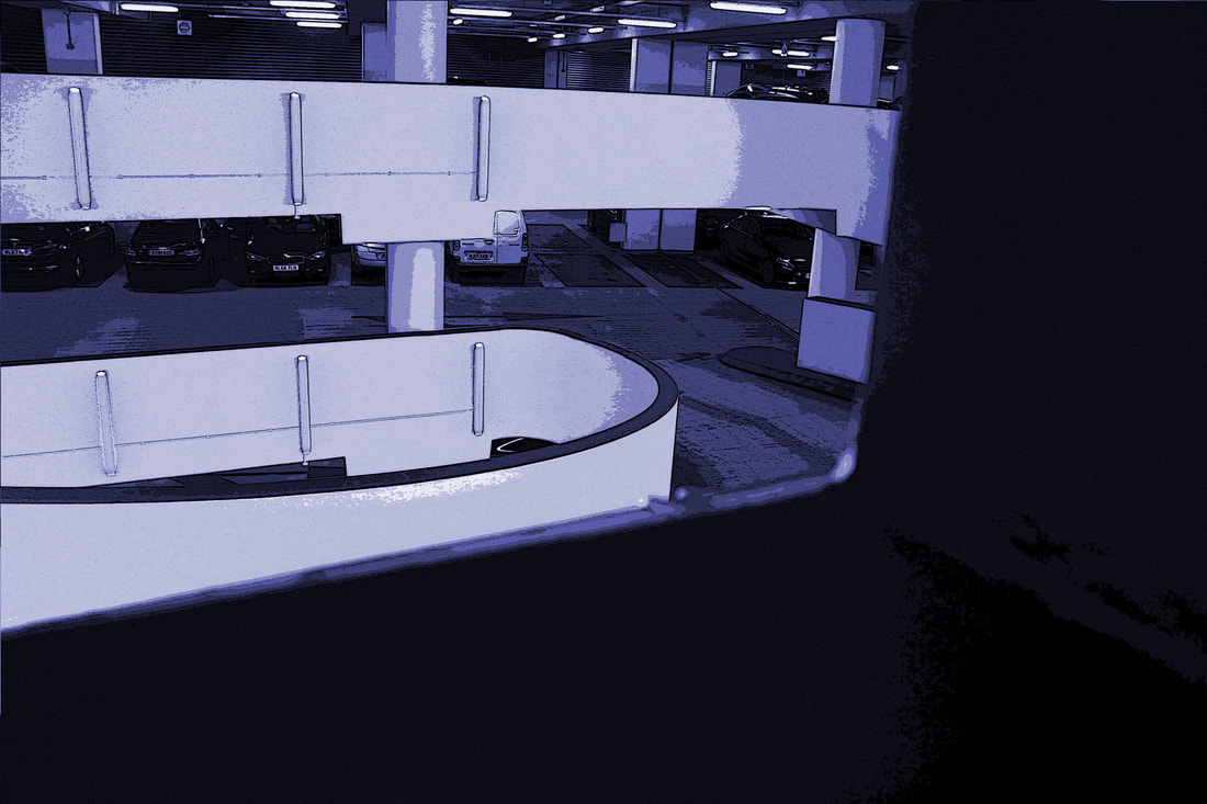
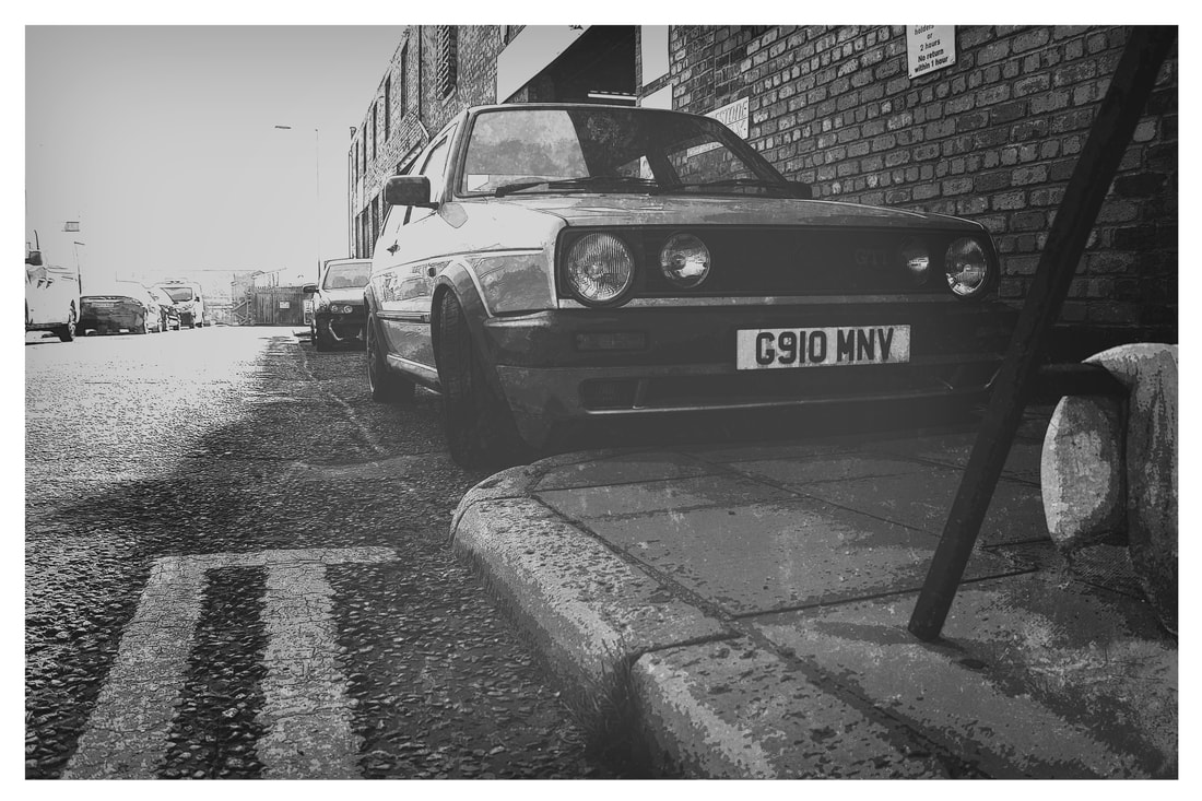
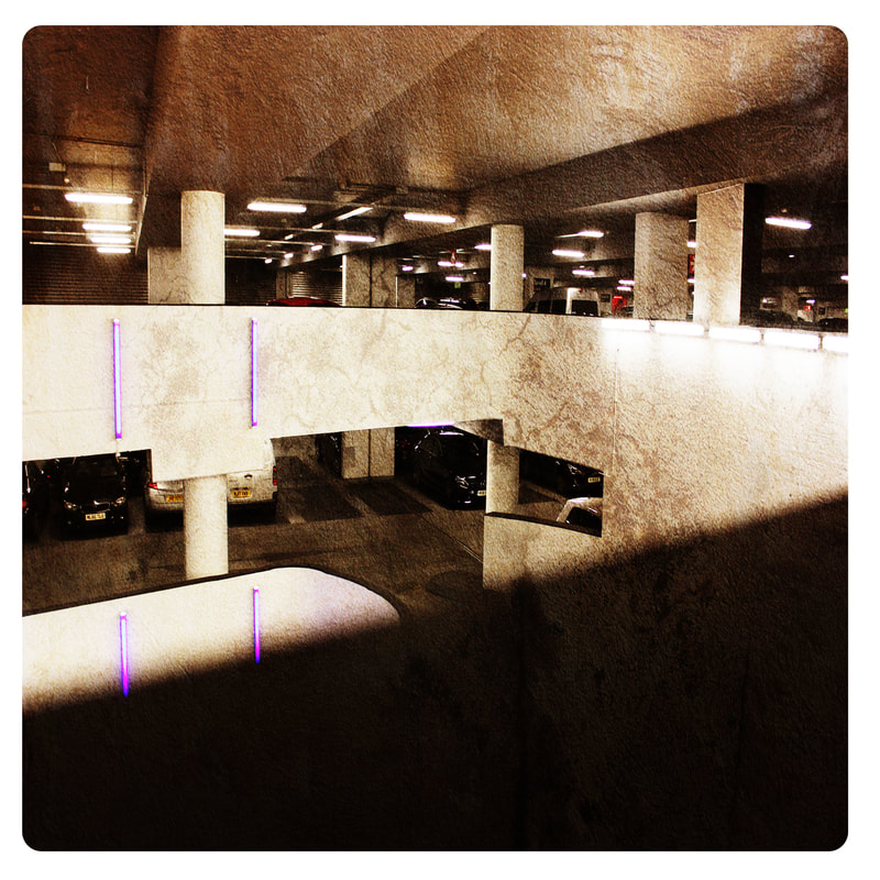
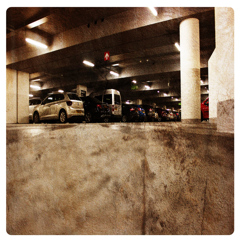
Car Park Perspective
Raw Images
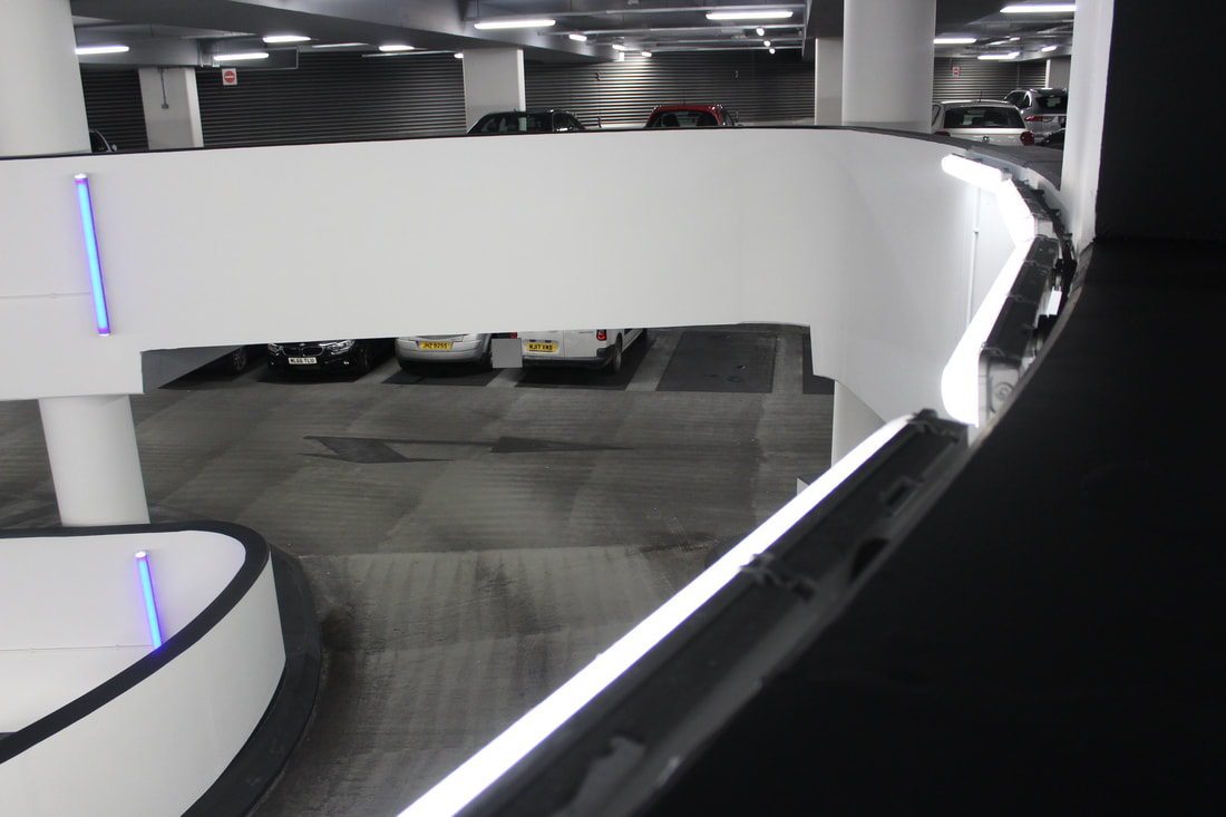
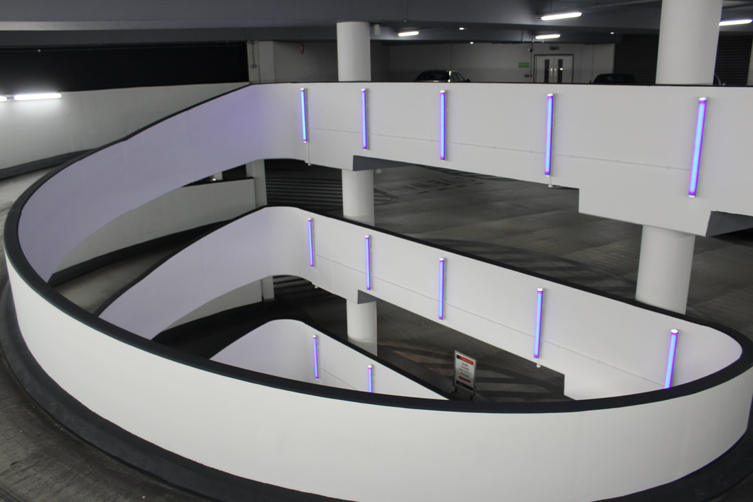
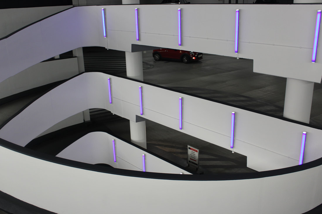
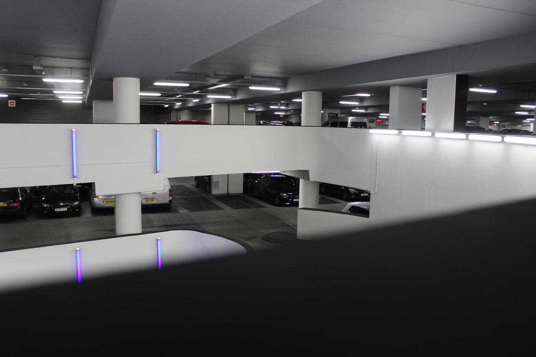
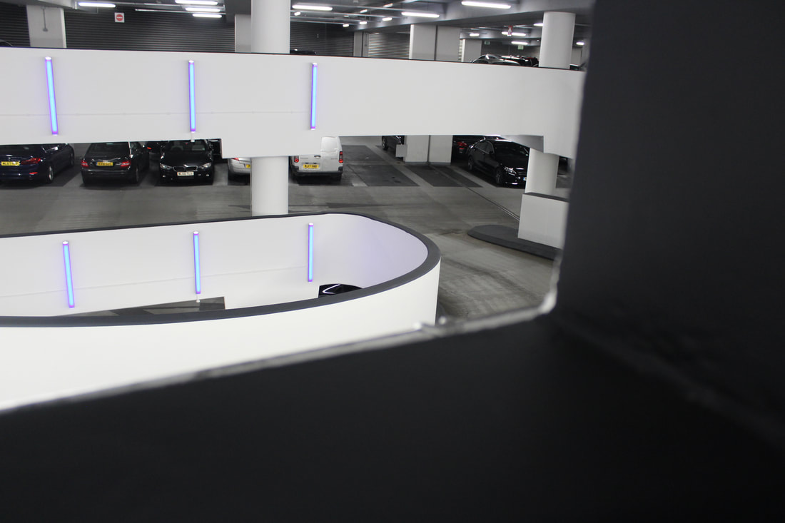
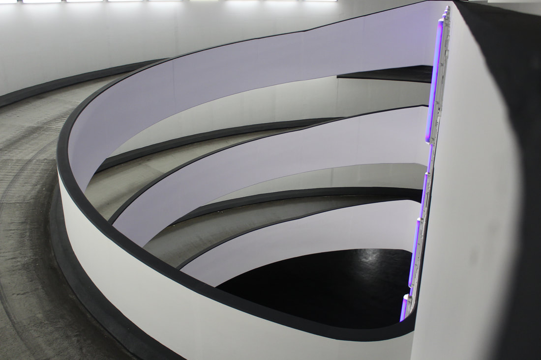
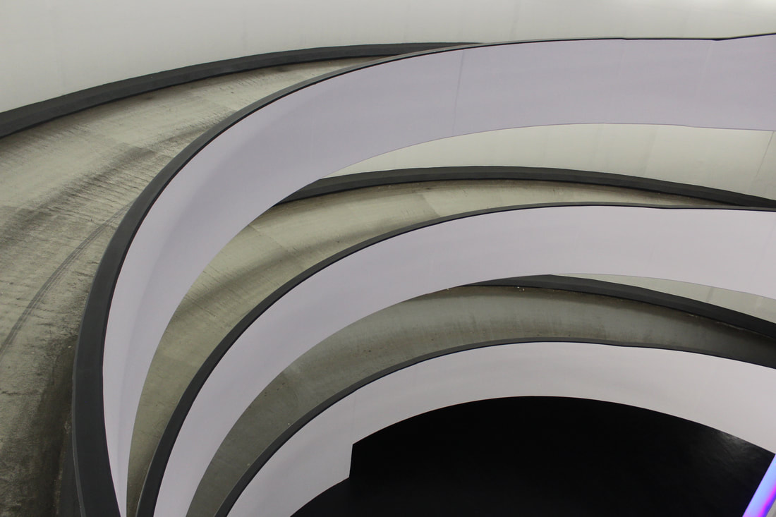

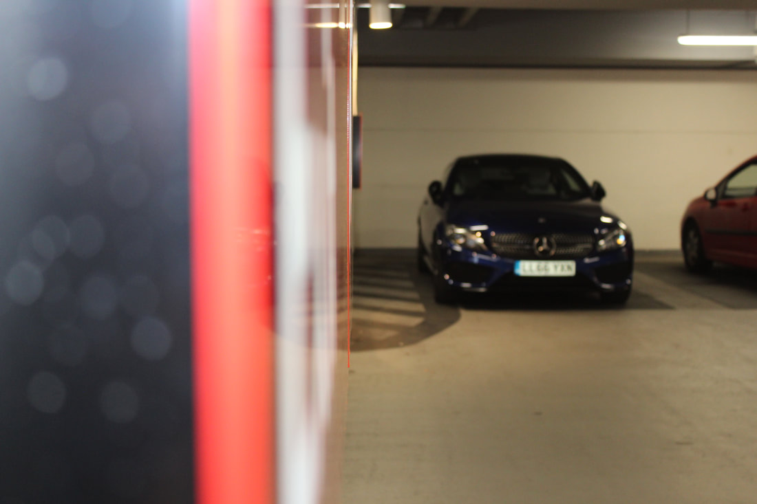
Car Park Perspective Edited
|
|
|
Firstly, I wanted to make some powerful black and white images with low saturation and detailed contrast, i started by making a set of 3 that focused on the entrance to the car park as they were very semicircle and looked very architectural. The stairs also had a great natural light environment making the images easier to see and edit around. I then used the same set of 3 black ad white and gave them a more professional look by adding a hollywood movie style back border which I made using different layer masks and shapes prior to the exam.
I then made another 3 black and white images using the same method as the first 3 but ran into an issue as these images were taken were the room was very bright making it harder to edit as the images were more white than black, this was a simple fix but took its time.
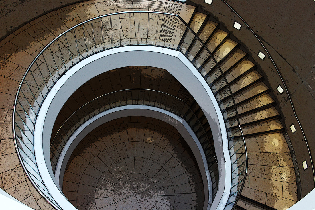
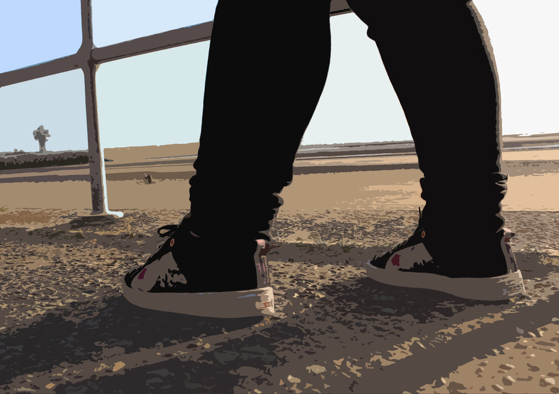
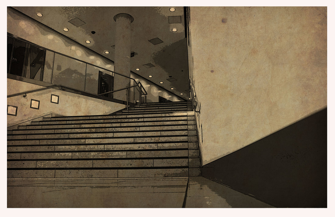
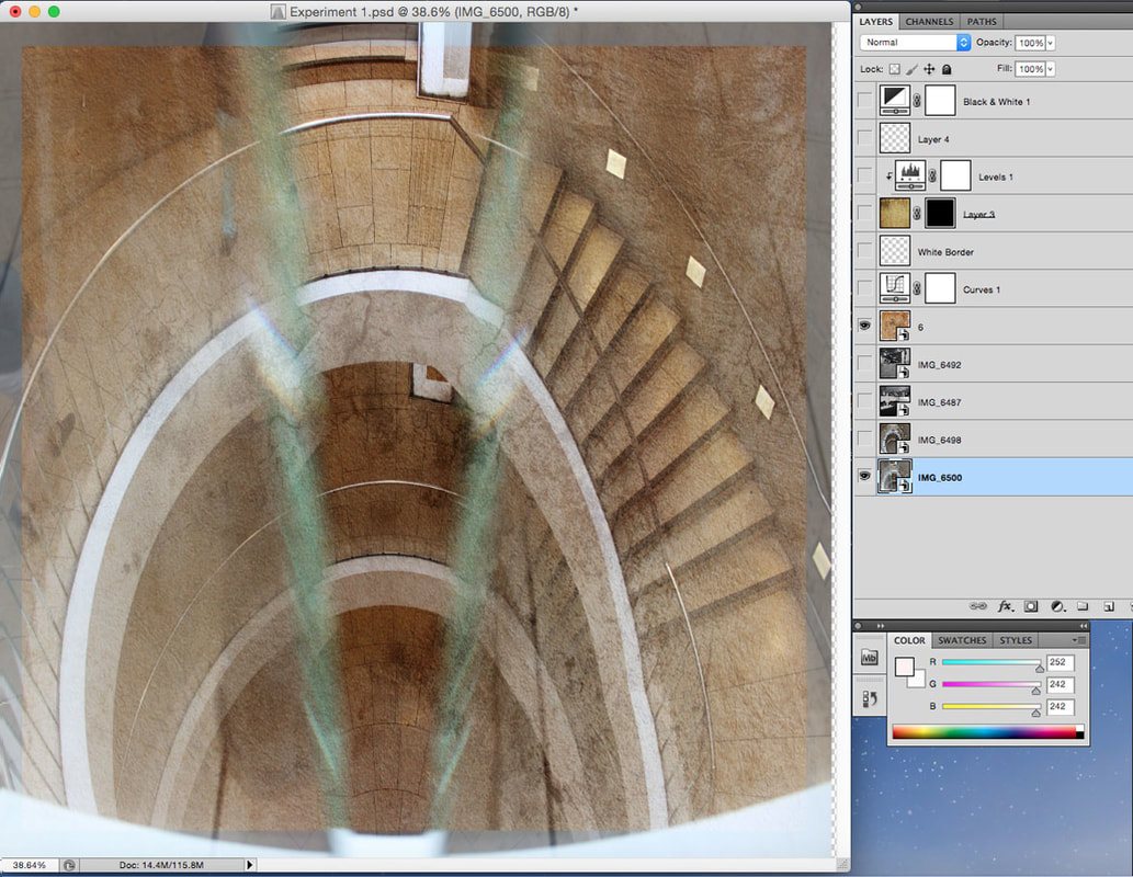
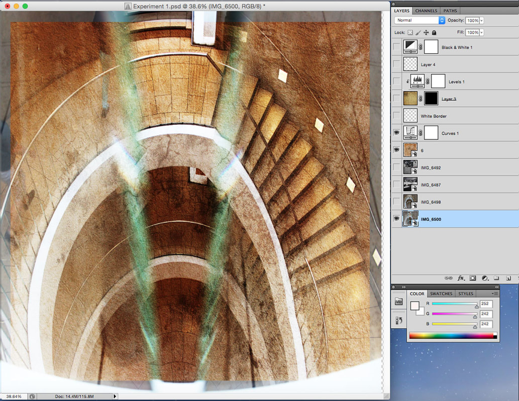
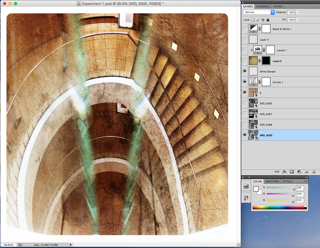
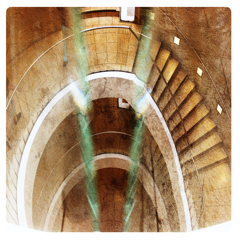
Above is the grand staircase to get up and down the stairs of car park if you didn’t want to take the elevator, I used this as it is a clear example of unexpected perspectives looking directly down a detailed staircase. I added a high contrast and levels to make the image more colourful and finally added a filter of poster edges to make the image look more sharp and stylish.
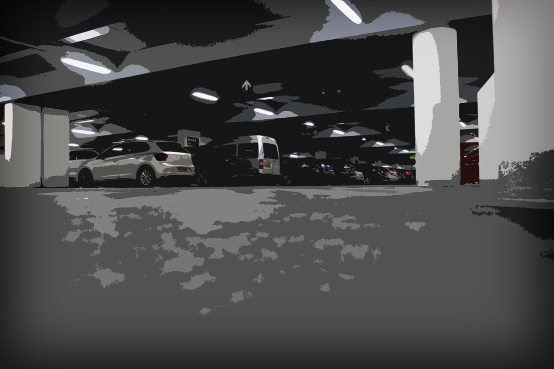
Next I took a ground level floor picture looking at the parked cars and lowered the brightness right down making it only light in places i wanted it to be, I then added a cutout filter effect to make the image blurry and unique.
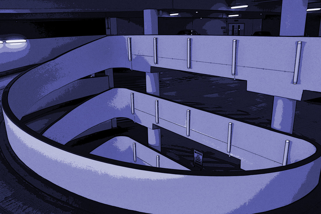
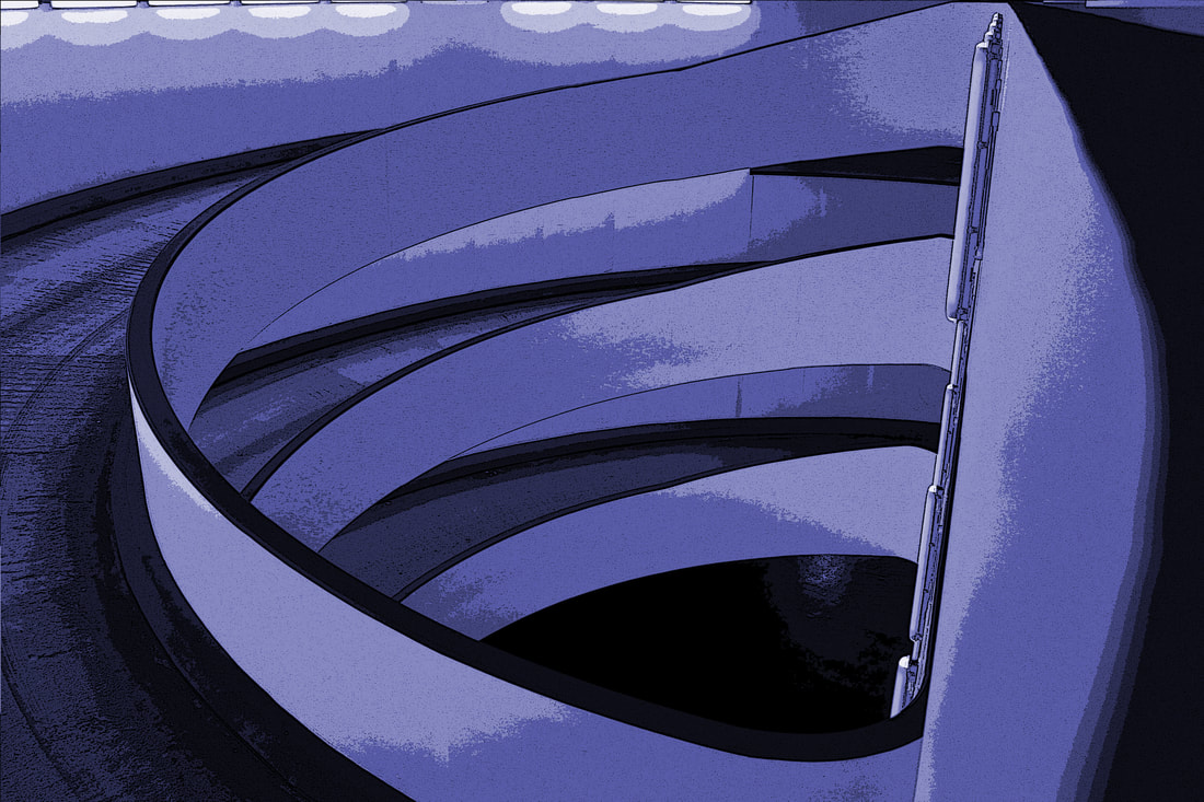
Finally I have created a very colourful blending set of images using the hue saturation feature to make this set look purple and dark giving it a distinctive look. These images were all from the car entrance of the car park in a very high up location from the third story over the edge looking down at the entrance, this first set of 6 are edited sets but the second set of 6 have another filet mode option called poster edges to make the image more stylish and sharp.
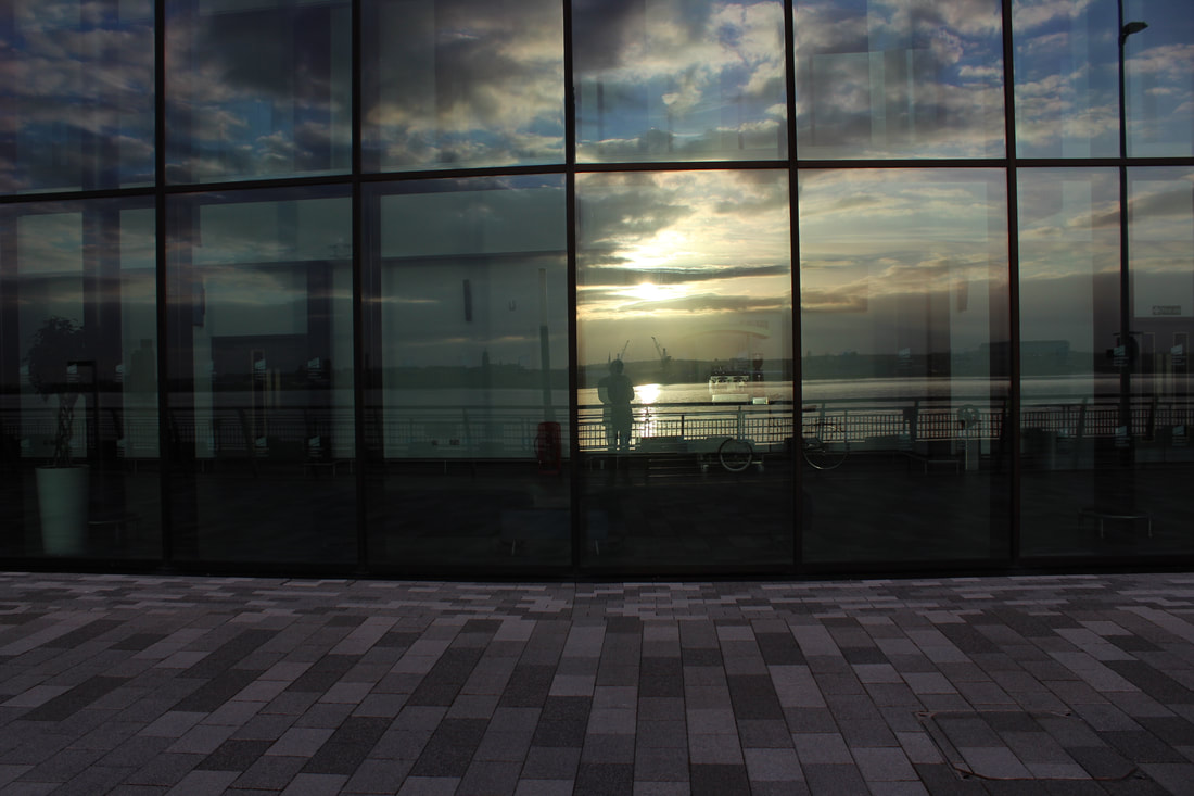
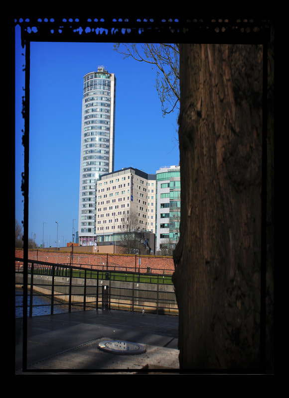
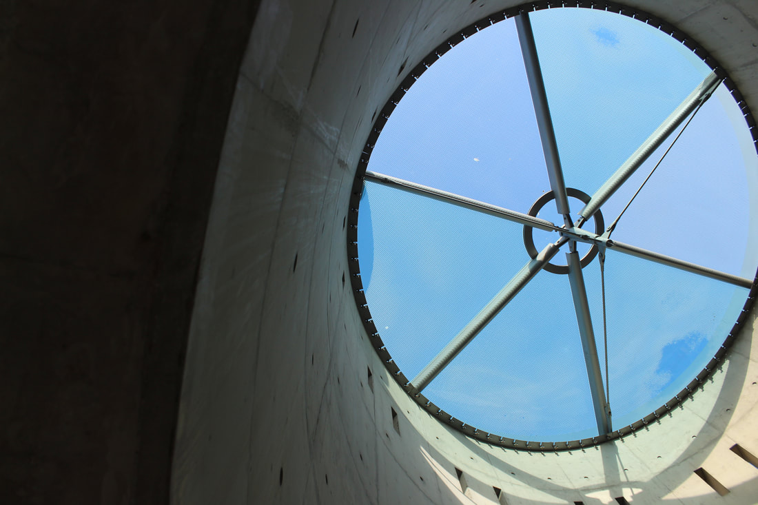
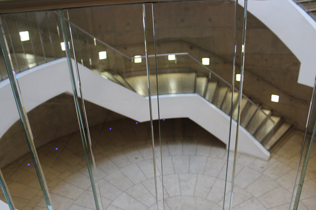
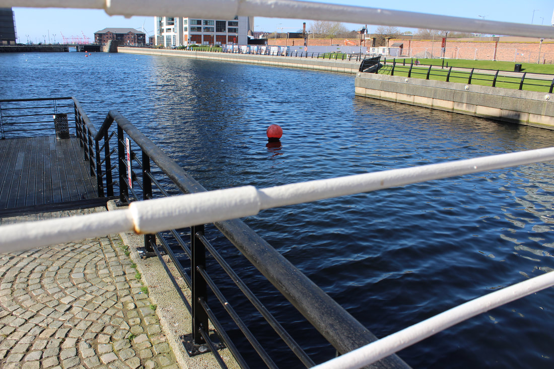
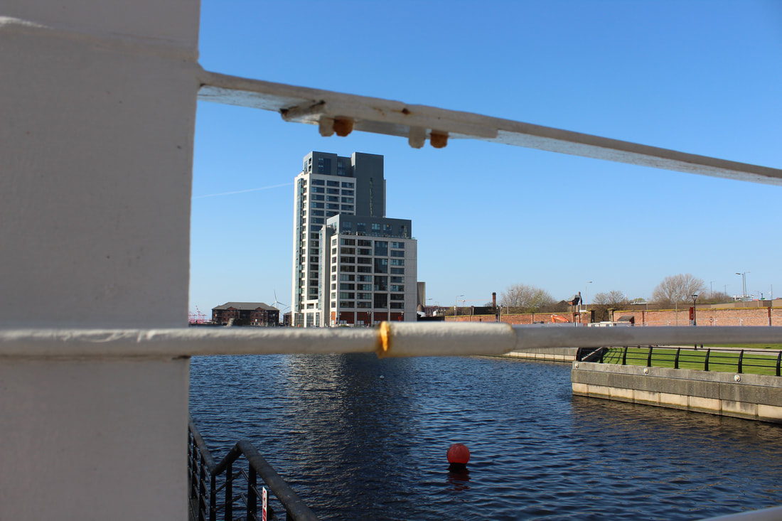
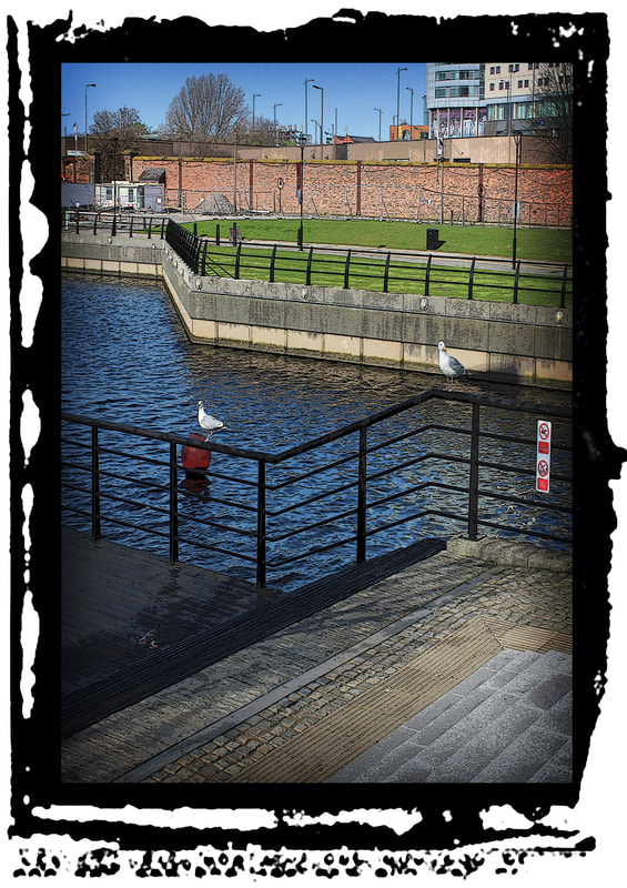
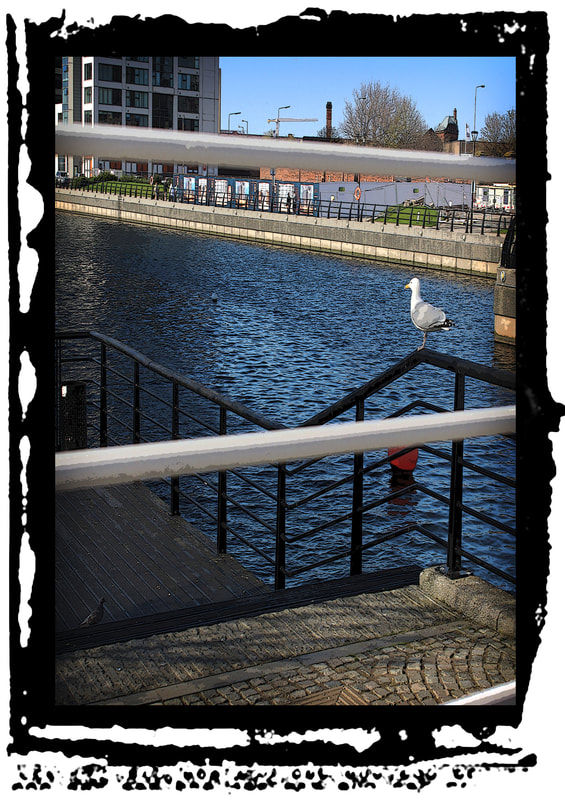
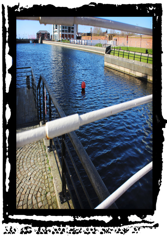
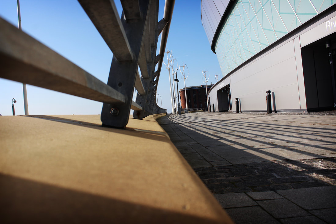
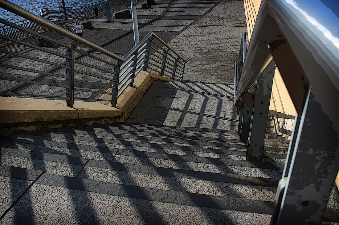
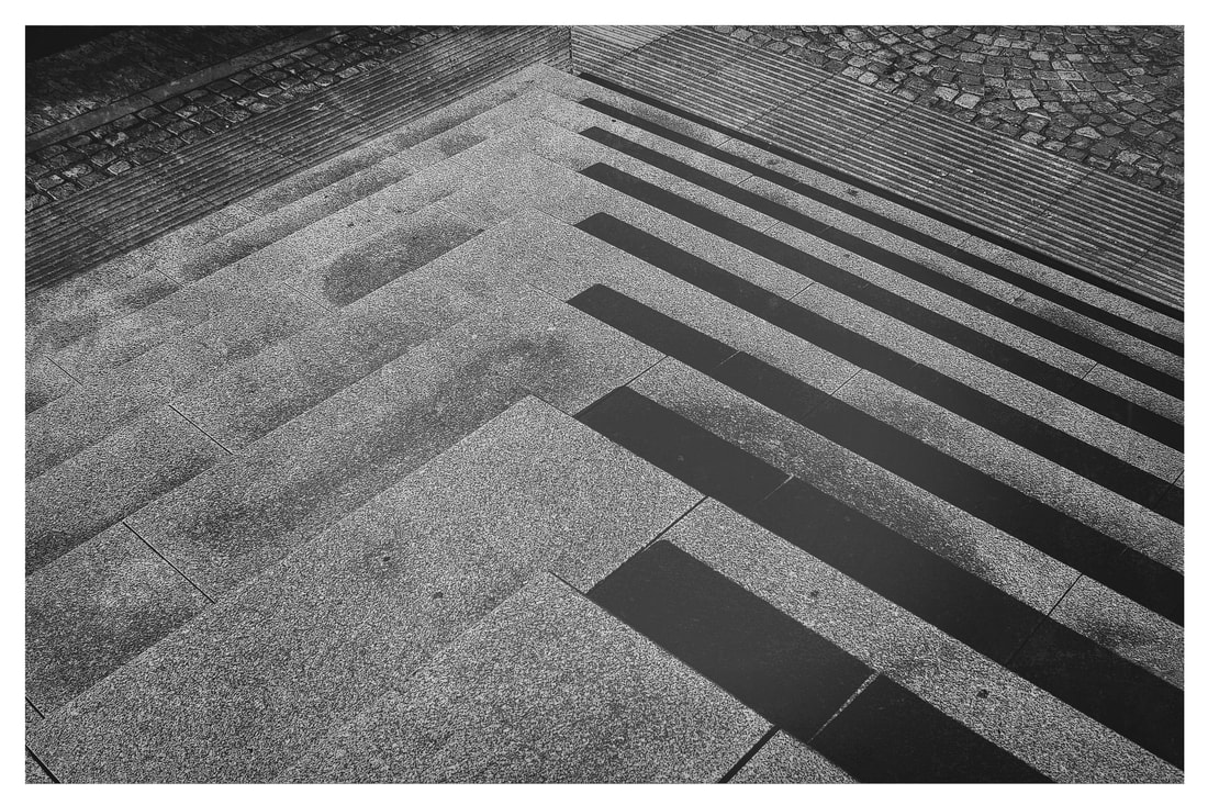
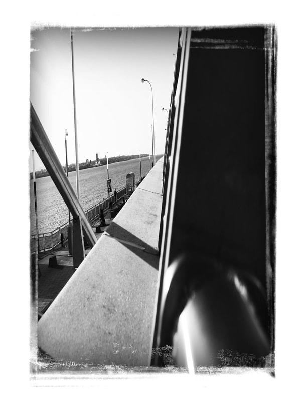
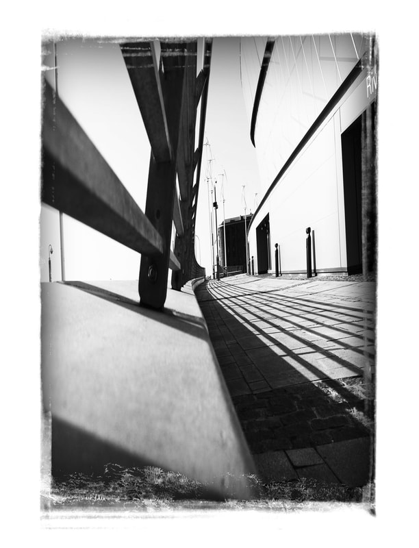
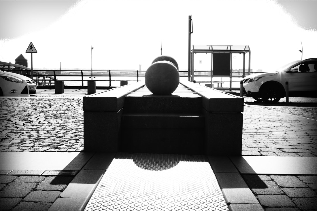
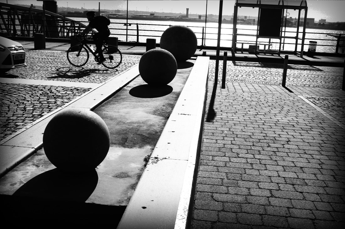
Albert Dock Perspective
Raw Images
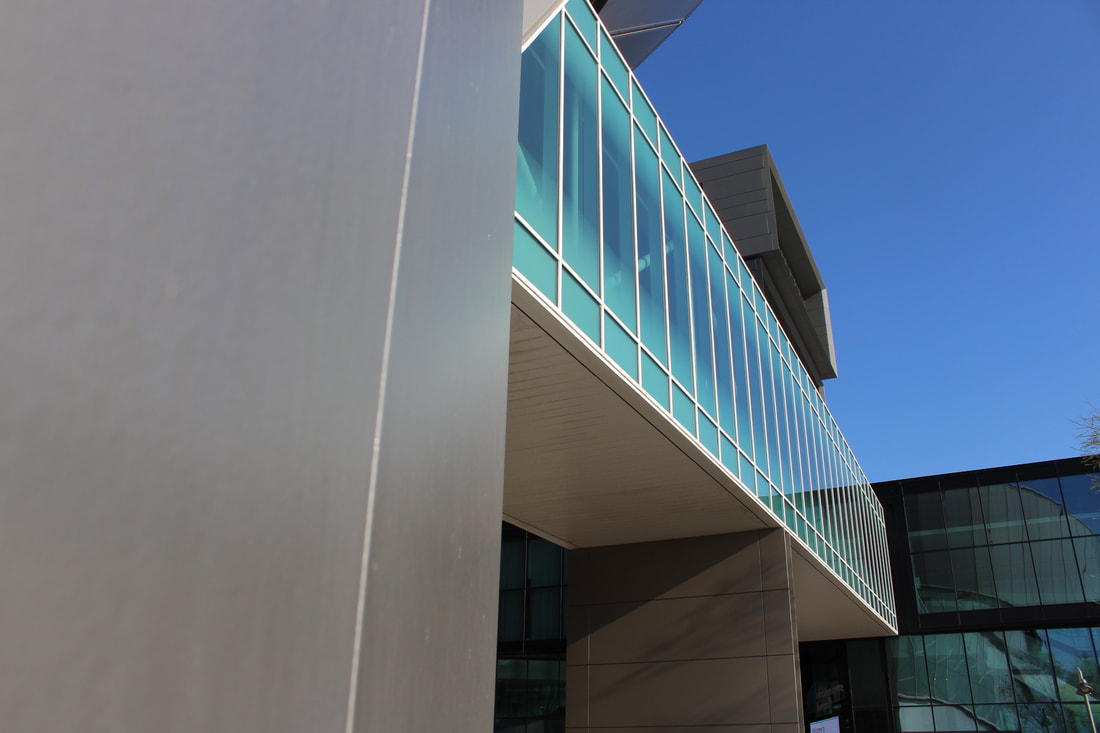
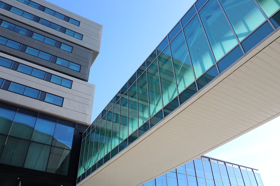
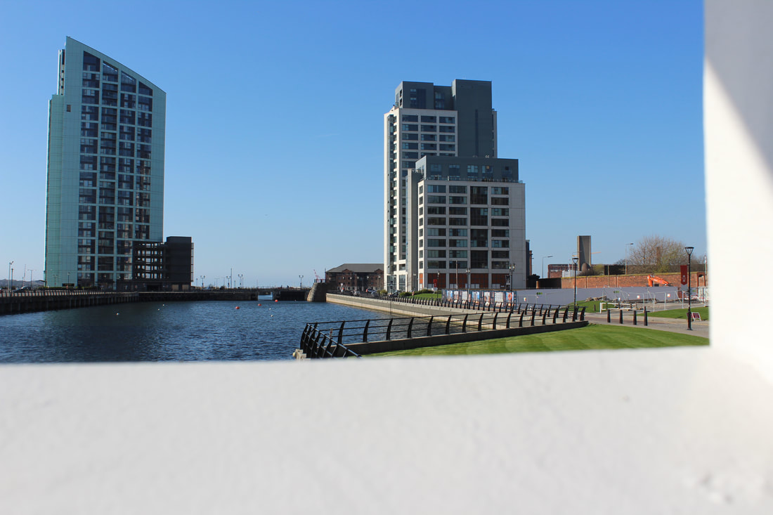
For my fourth hour I decided it was best to use this time to focus on the Albert dock, another memorable place for the people of Liverpool as there is plenty of opportunities to take really stunning pictures, there are plenty of high up stairs and bridges I can utilise as unexpected.

Albert Dock Edited
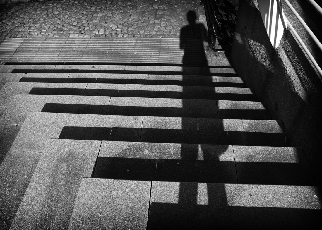
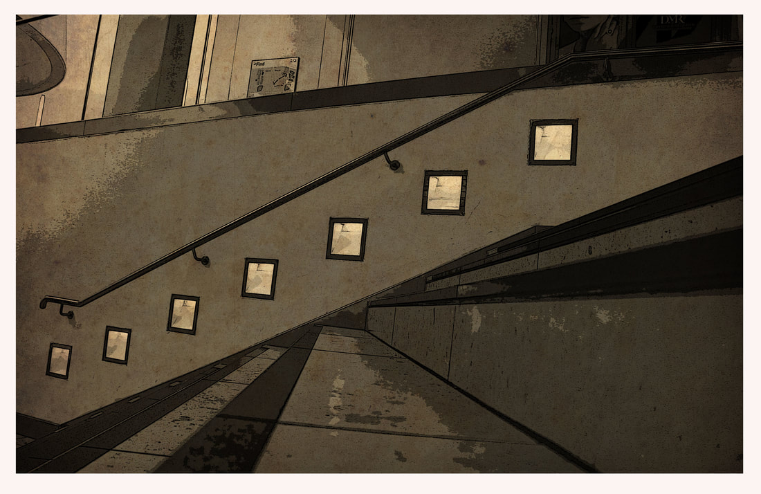
Firstly, I started by making a set of 6 black and white images that have boosted contrast and saturation to make them look old style, as well as high key lighting making the image look more clean. The first 3 images were taken from the west side bridge crossing the Albert dock making perfect opportunities for some really nice pictures. The second set of 3 are looking down a high up set of stairs that show a different perspective as it tricks the eye into thinking I’m looking up the stairs using the light and shadows.
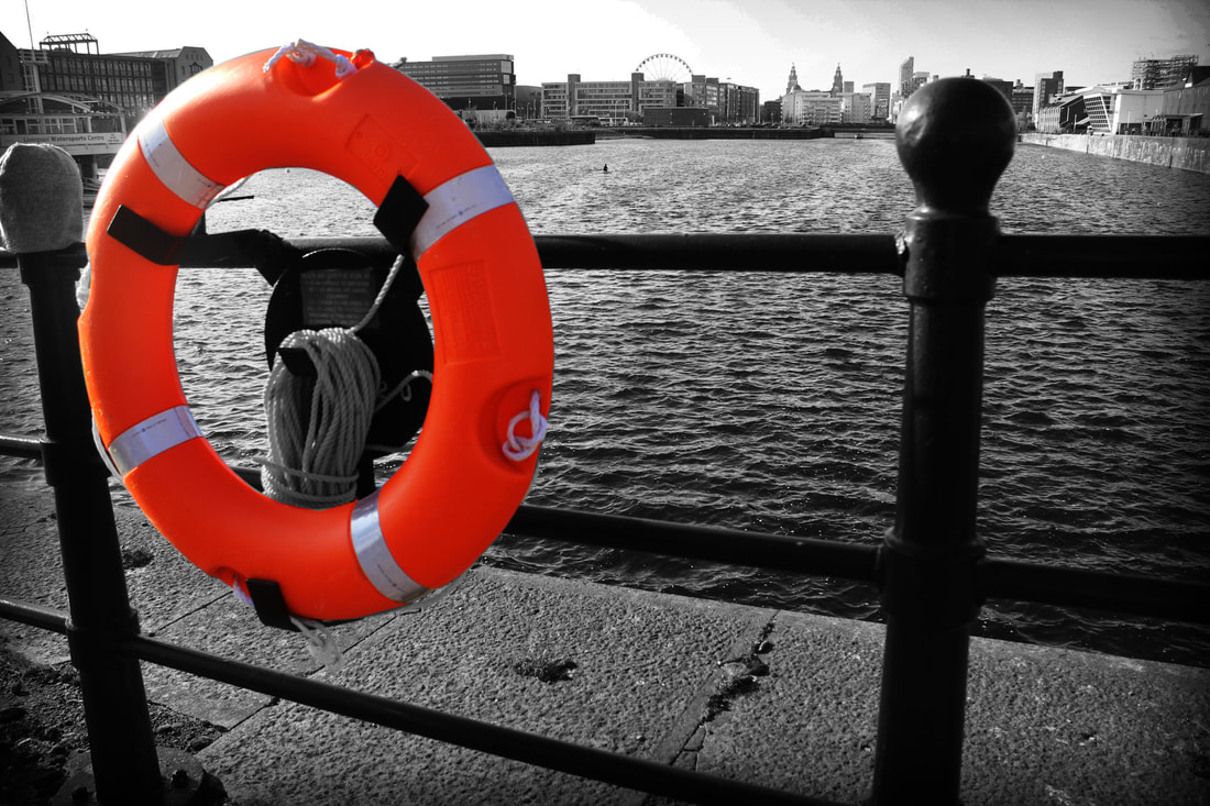
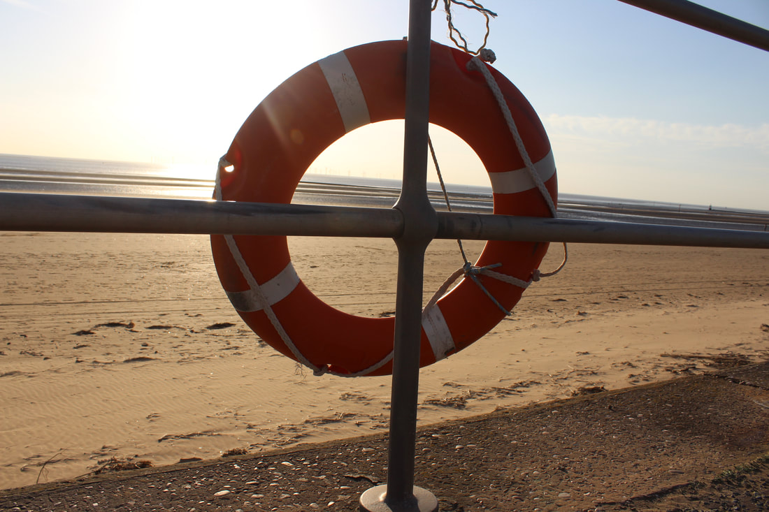
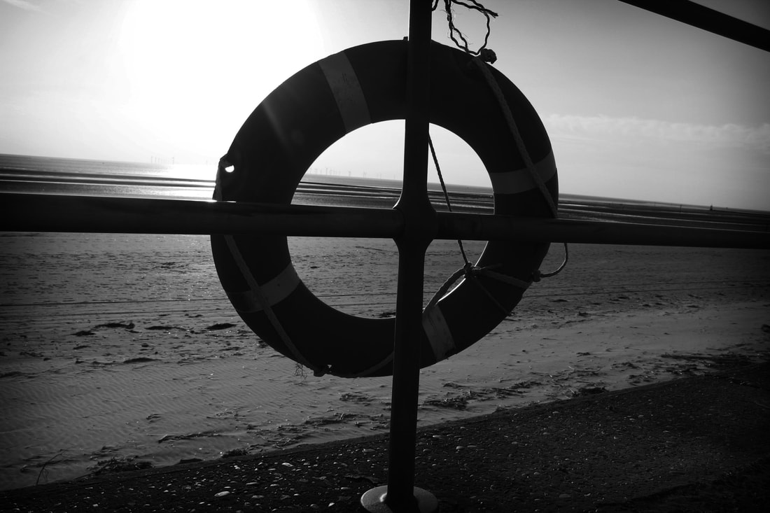
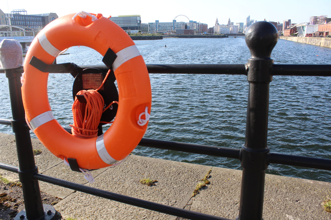
Next I presented a image of the pier head part of the Albert dock which looks directly at all the most famous buildings in Liverpool, so having them in the background gives the picture more depth and style. The image has been edited to look black and white and blurred except in the life saver ring which has been cut back into colour and boosted in contrast making it a stunning picture with clear photoshop development.
Next i wanted to do a Bill Brandt style piece of work and have my image very high key and contrasting with only black and white making it more unique as not many artists do this. The image is on west bridge of the alert dock looking toward the river mersey, i was able to have a passing bystander help in the image by walking towards me making a great silhouette, the image has been boosted all the way up in contrast and using curves to make the image appear bright but still able to see what is happening.
|
|
|
I decided I wanted to add some colour images so I edited a set of 3 images with boosted saturation and contrast, these images were taken from the west side wing of the Albert dock. The images look very well presented and show a unique look through the bridge. Finally, I added a hollywood movie style frame and spliced parts of it around these images to create a nice set.
|
|
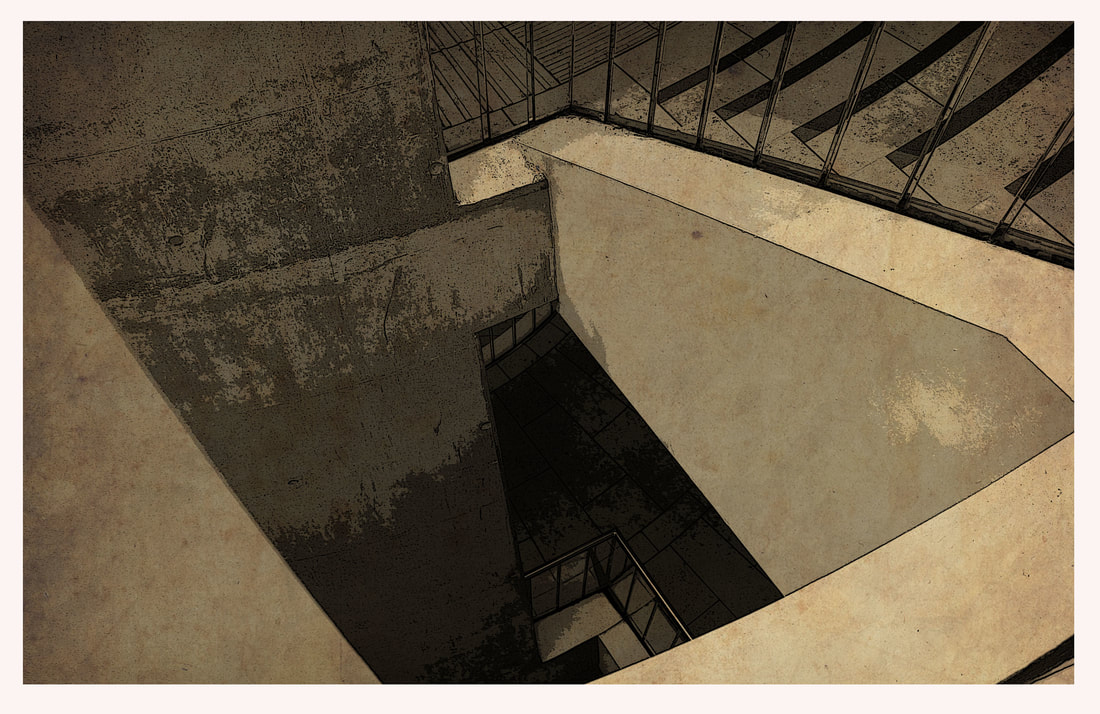
I then have presented a set of 4 images shown in double style, this is images of the back part of the Albert dock using nearby stairs, they have high amounts of contrast in them and give them a shadow effect from the natural light. These images are very unexpected and show a different perspective and look down the stairs.
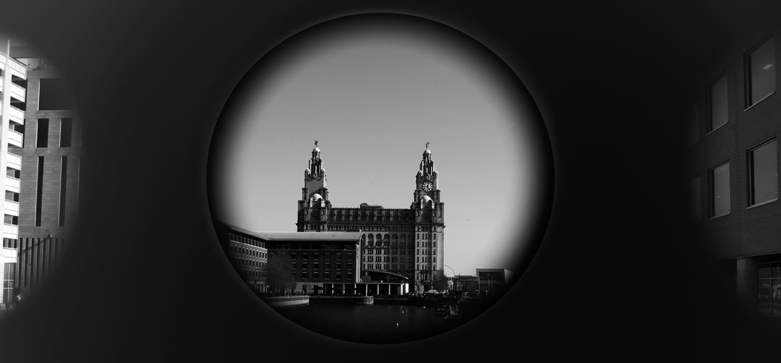
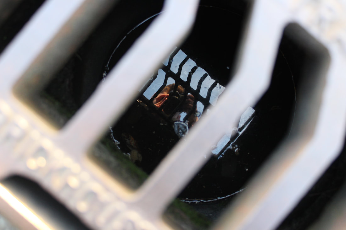
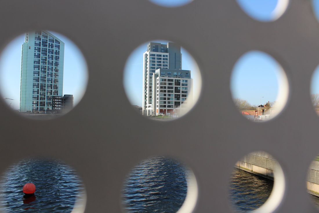
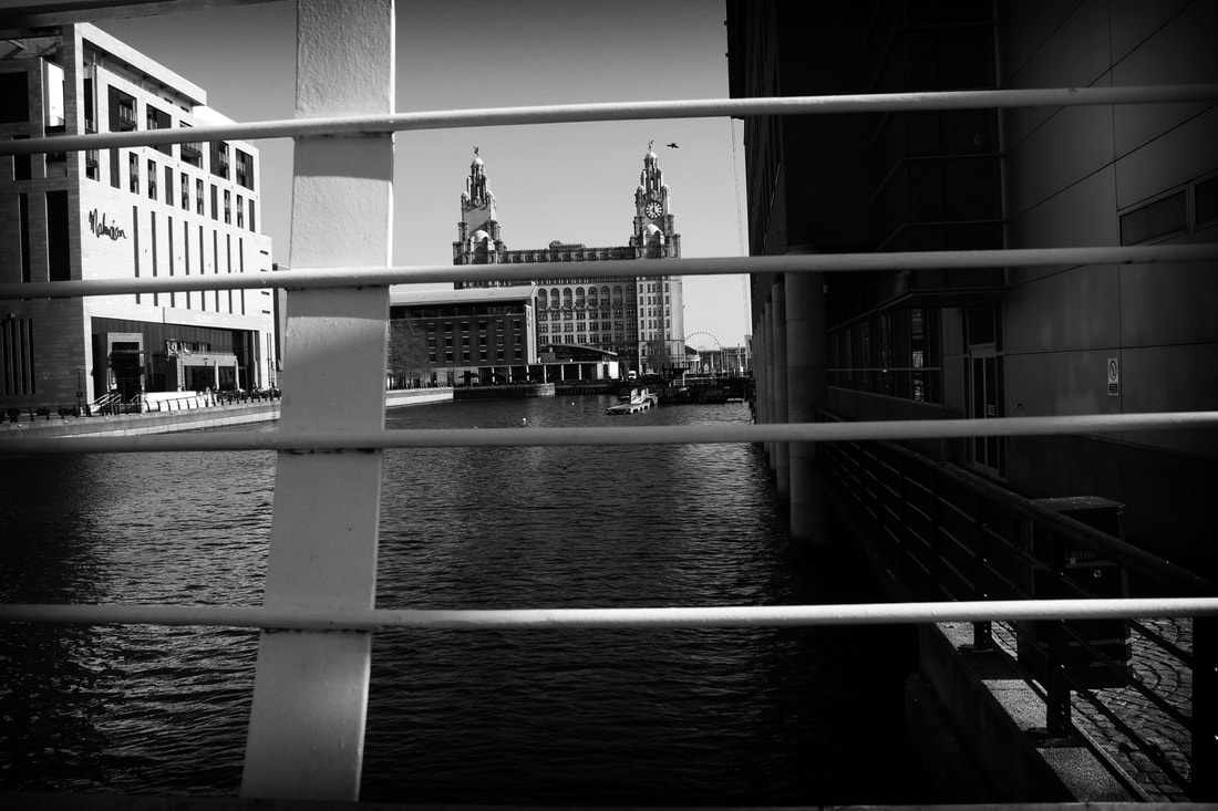
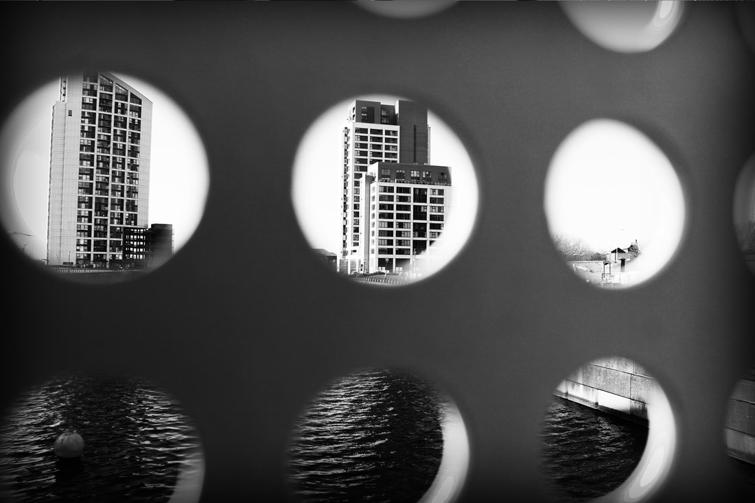
This image was the first of a set of 3 showing the perspective of looking through the holes of the bridge at the Liverpool liver building, this first image is completely black and whit and has been pushed to the max on contrast and saturation, this is to make the image not as clear to see around the circles making it better to look at whats inside of them
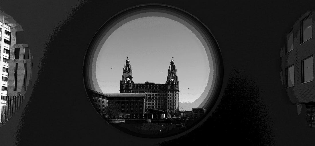
This image is the same as the one above except it has been modified to look more clean cut and have a unique style to it, it has been given a poster edges filter to make it look more like a cartoon. Also has been blurred around the centre circle making it easier to see whats inside of it.
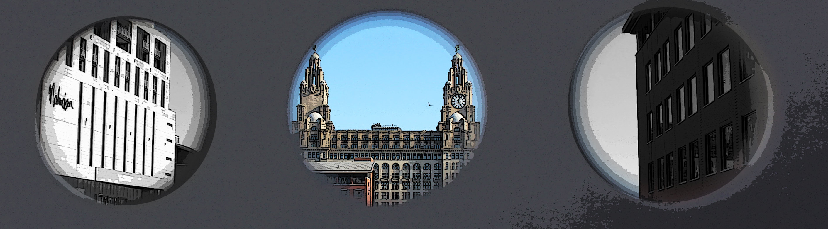
This last image in the set of 3 is a more wide version of the previous 2, not as cropped and shows more of the wing circles. The centre circle has been left in colour while the other circles have been put in black and white and given a grainy texture to make them look old. The centre image has been given a poster edges filter to make it look more stylish and unique.
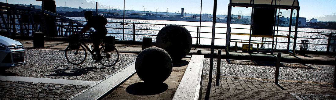
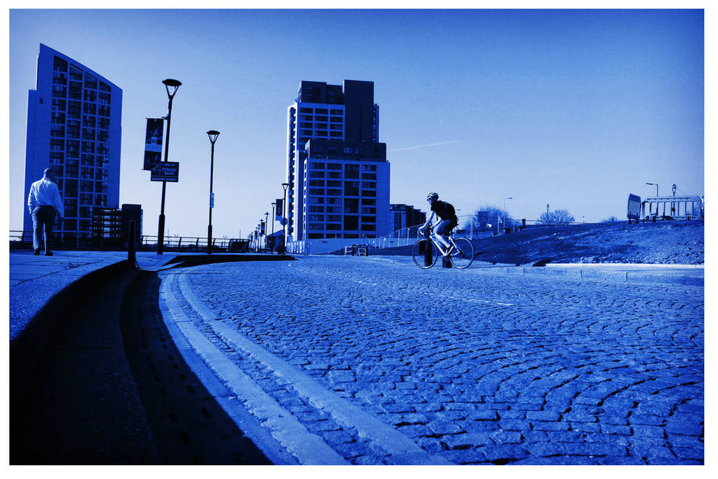
Finally, this image is a blurred motion picture as it shows the speed the cyclist in the image is going, this image was taken very quickly to capture the cyclist making not as focused. The image has been given a simple but effective vignette making the image look more inclosed. The contrast has been pushed right the way up and given a old style texture.
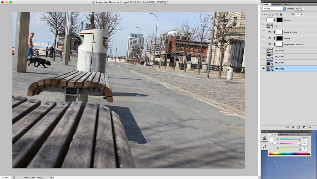
Alexander Rodchenko's Style Work
Recreation 1
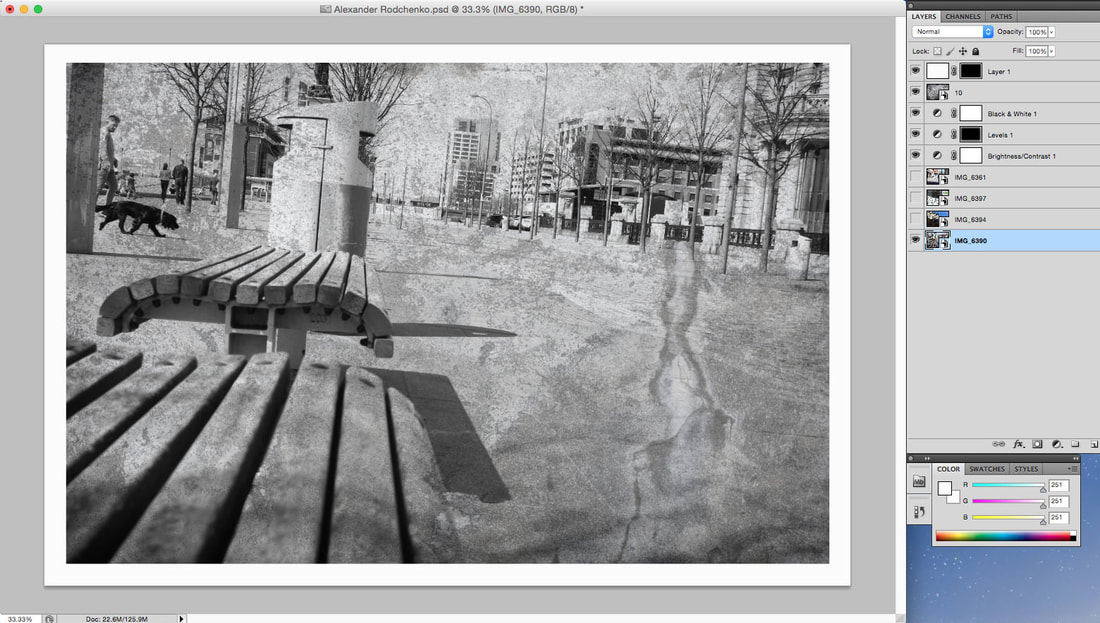
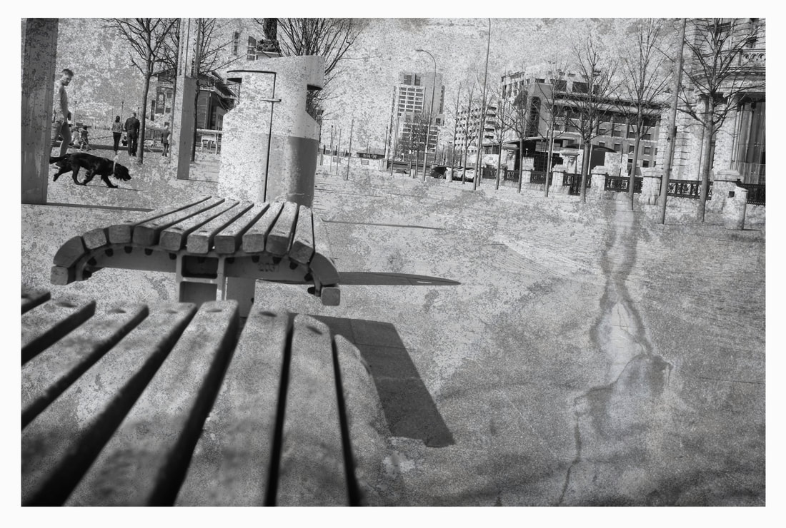
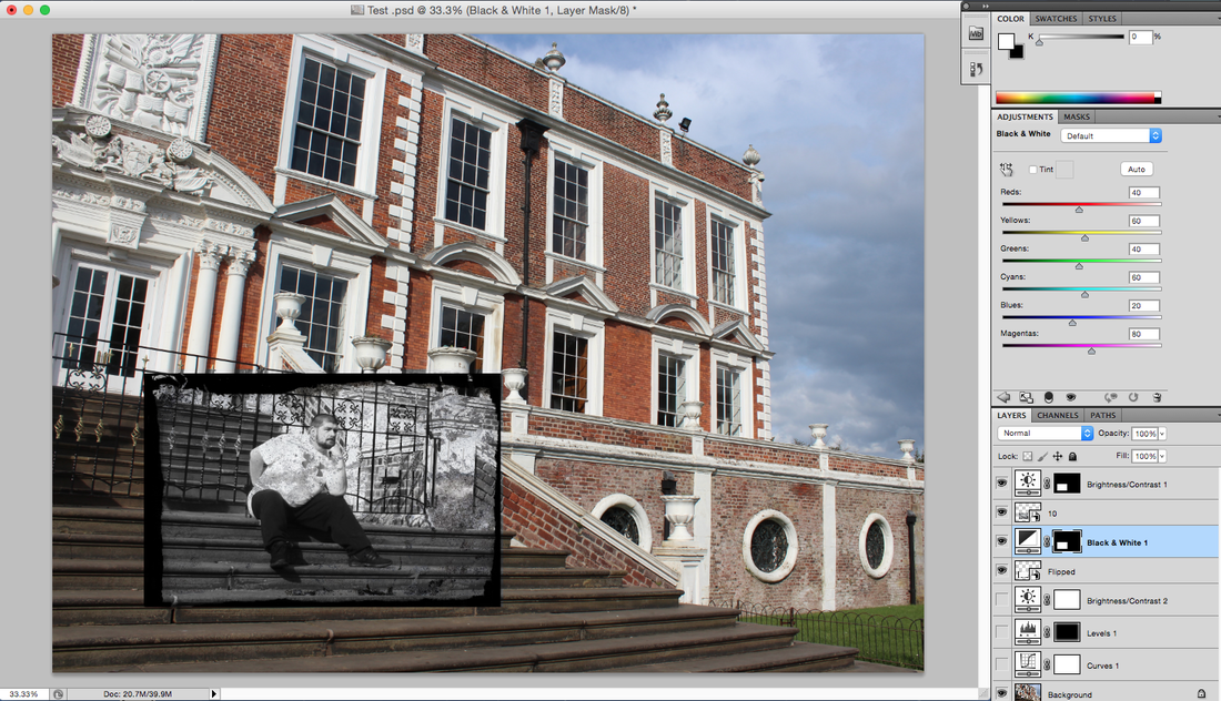
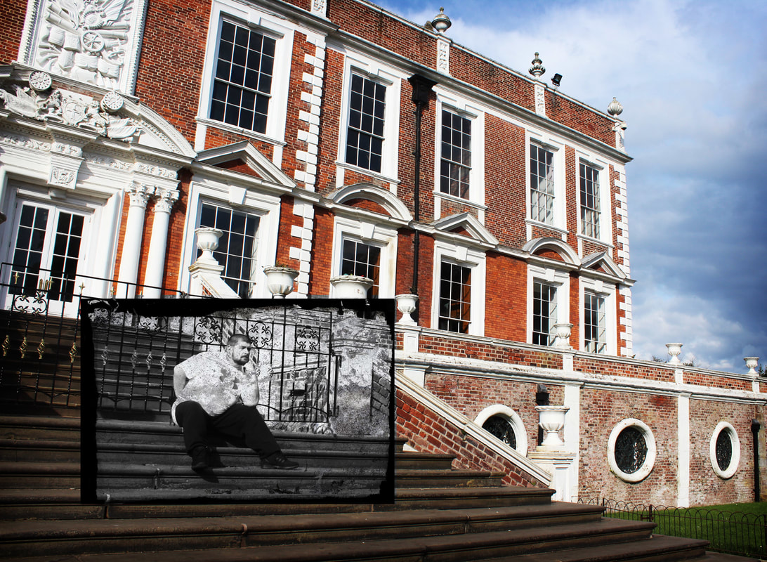
I decided in my 5th hour I wanted to try and use some of my pictures with my artist research and try and replicate there work stye, starting with Alexander Rodchenko. I took some really advantageous side street photographs from unusual angles and positions to make my images stand out but also look similar to his style.
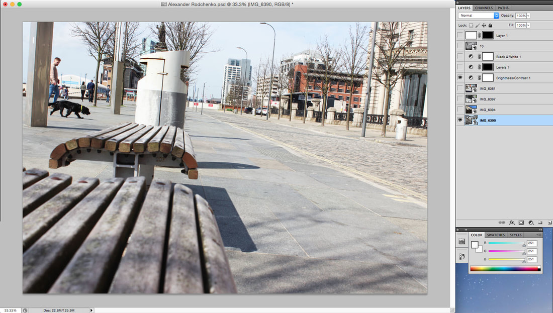
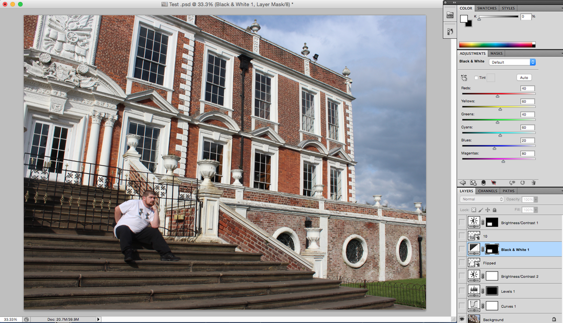
To show my thought process in this recreation I have taken screenshot evidence from photoshop to show the in level detail provided to make this style.
To show my thought process in this recreation I have taken screenshot evidence from photoshop to show the in level detail provided to make this style.
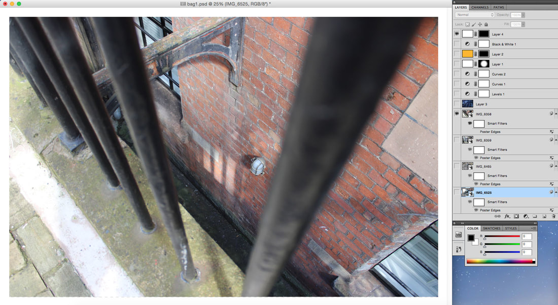
Firstly, I Chose my photo and placed it into photoshop and cropped it into frame for editing.
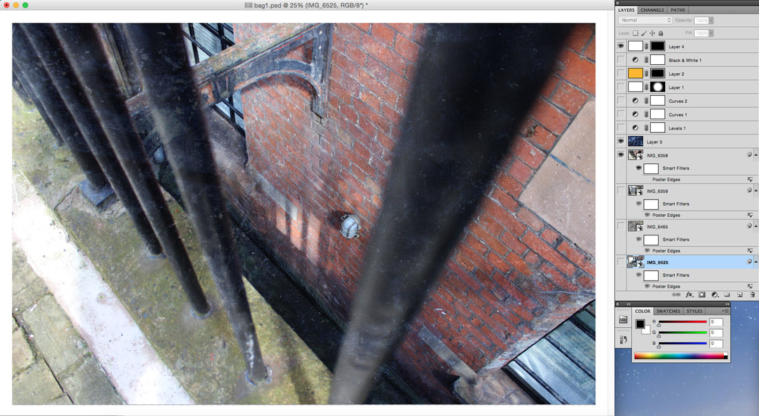
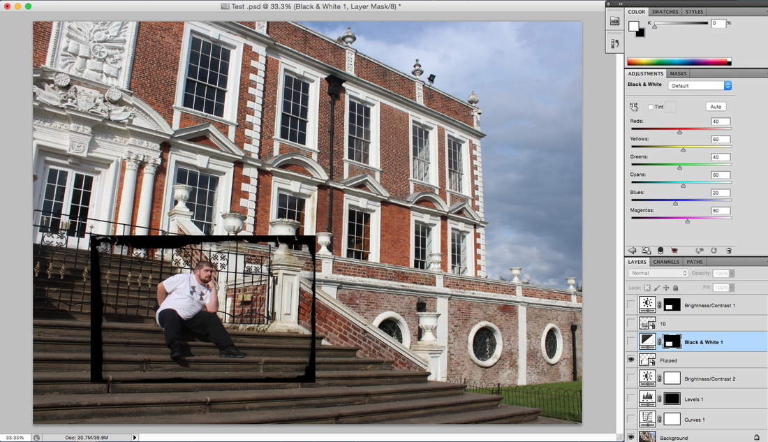
I then added a glazed texture that I had saved before the exam started off google, this image looks very mystical and provided a only ripple text into the image.
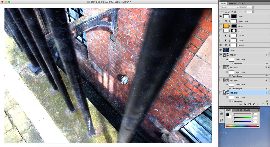
Next, I used the levels tool combined with modified feather and created a glowing edge effect using the marque tool, this makes the mage look more inclosed and blend with its colours.
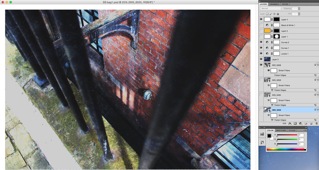
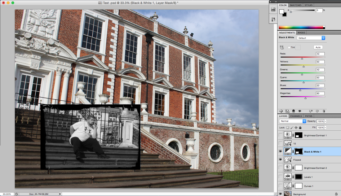
I then used the curves tool to increase the contrast and brightness of the image making it more unique and stylish.
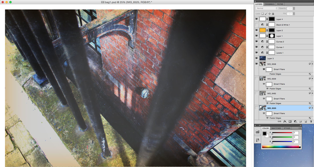
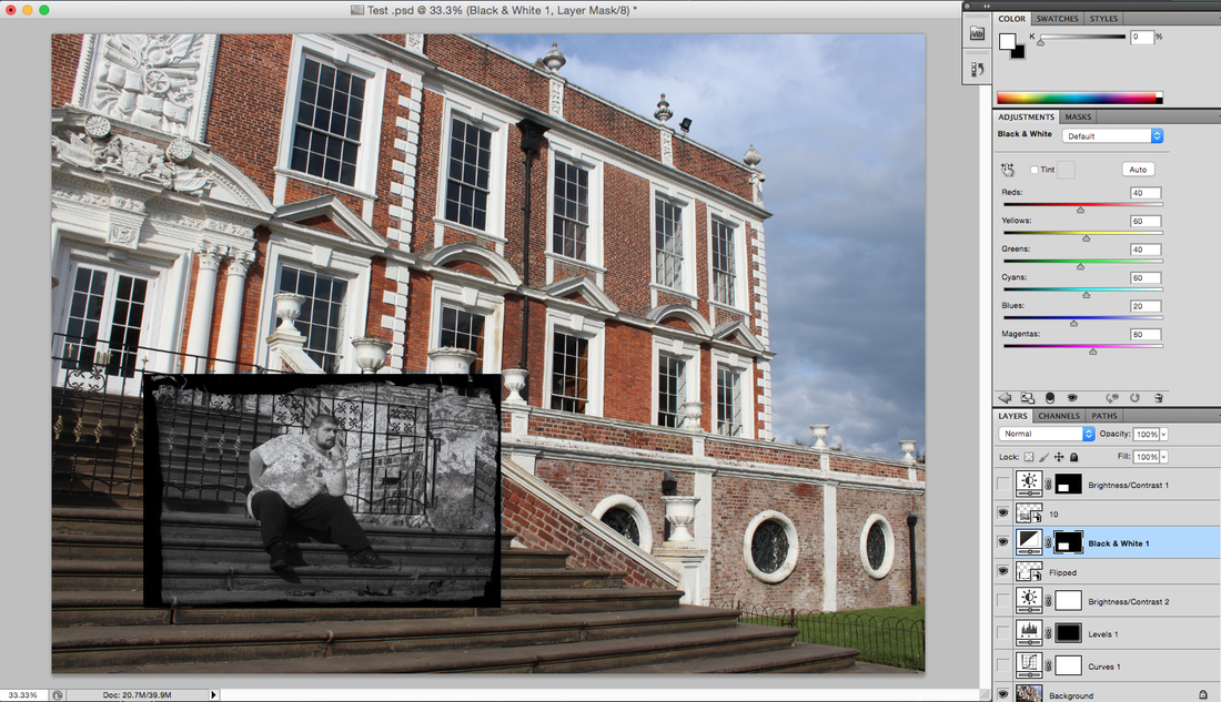
Next I used a more photoshop advanced tool and blurred the centre of the image with a painted orange texture to increase the opacity of the image making it look more shinny.
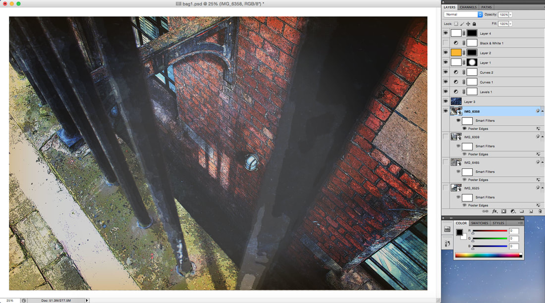
Next I used the smart filter tool and added the poster edges effect to make it look like a newspaper cut out version of the picture, this worked really well and recreated the style of his work.
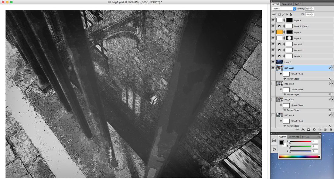
Finally, I added a black and white effect to make the image look more older and stylish.
Final Edit Using This Style
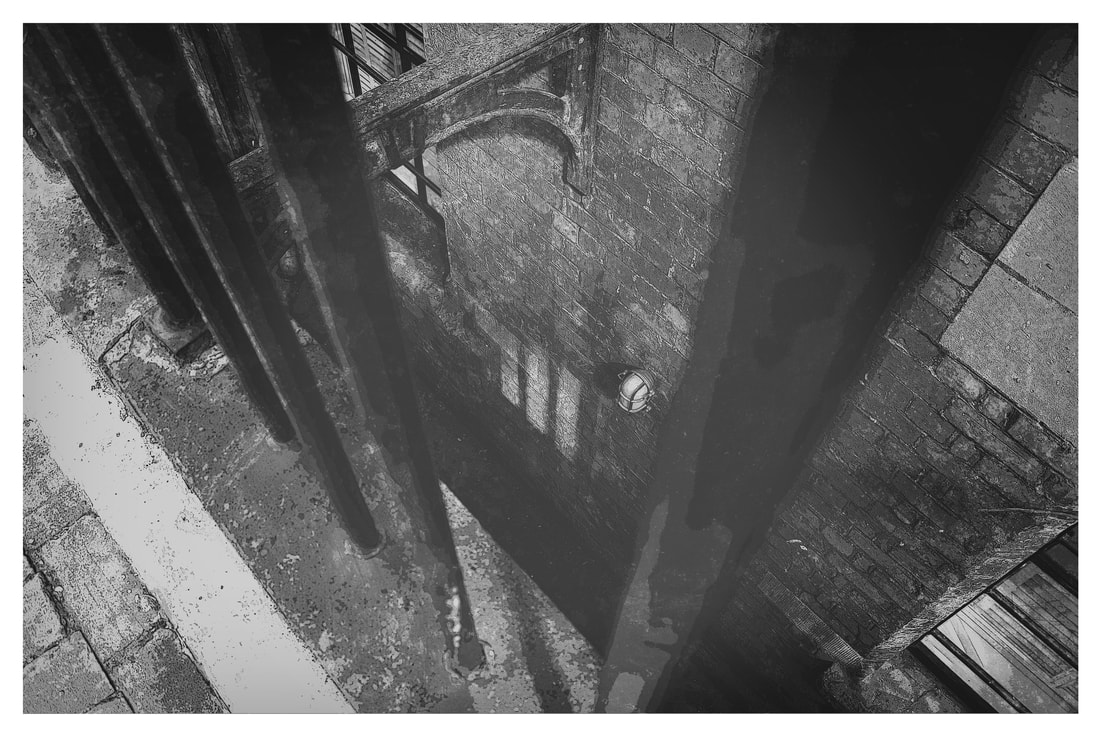
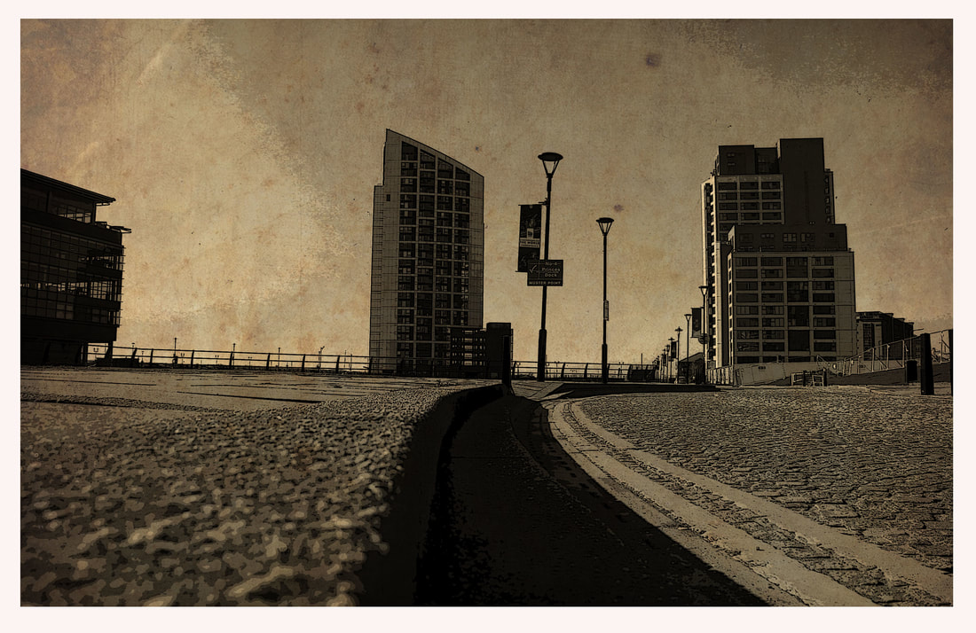
Presenting them I decided to use this type on 3 more images giving me 4 complete images of Alexander Rodchenko’s style.
More Work Using This Style
Recreation 2
I decided in my 6th hour I wanted to try and use some of my pictures with my artist research and try and replicate there work stye, starting with Alexander Rodchenko. I took some really advantageous side street photographs from unusual angles and positions to make my images stand out but also look similar to his style.
To show my thought process in this recreation I have taken screenshot evidence from photoshop to show the in level detail provided to make this style.
To show my thought process in this recreation I have taken screenshot evidence from photoshop to show the in level detail provided to make this style.
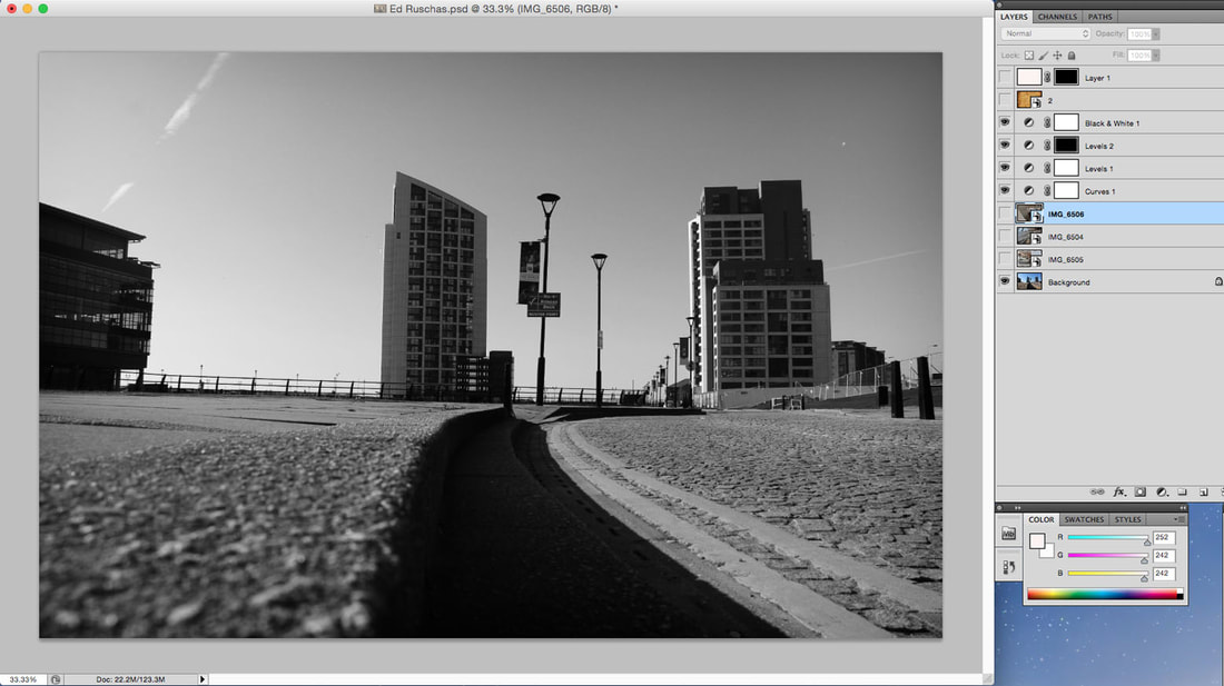
Firstly I chose my picture that I was going to recreate the style with, this image was on the water front of the Albert Dock and is a perfect example of Alexander Rodchenko’s work.
To start the editing process I placed my image into photoshop and cropped it into frame for editing.
Next I added a brightness and contrast filter to make the image more stylish and easier to see.
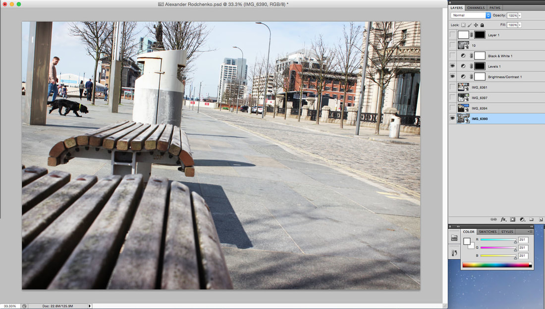
Next I used the levels tool to make the image have more contrast and loom stylish.
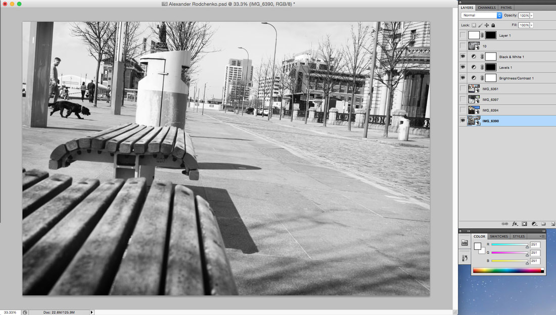
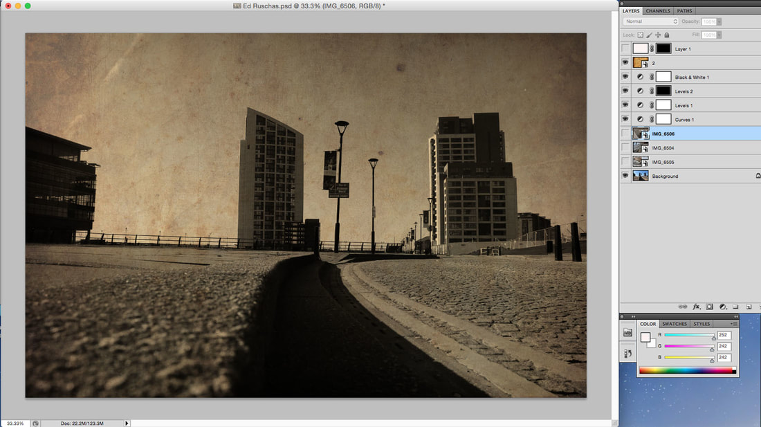
I then wanted it clean the image up so I added a black and white effect to make the image look more like his style.
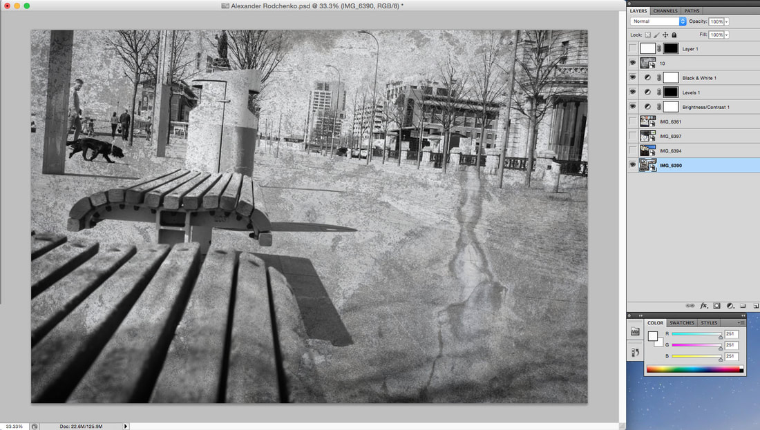
I then added a glazed texture that I had saved before the exam started off google, this image looks very mystical and provided a only ripple text into the image.
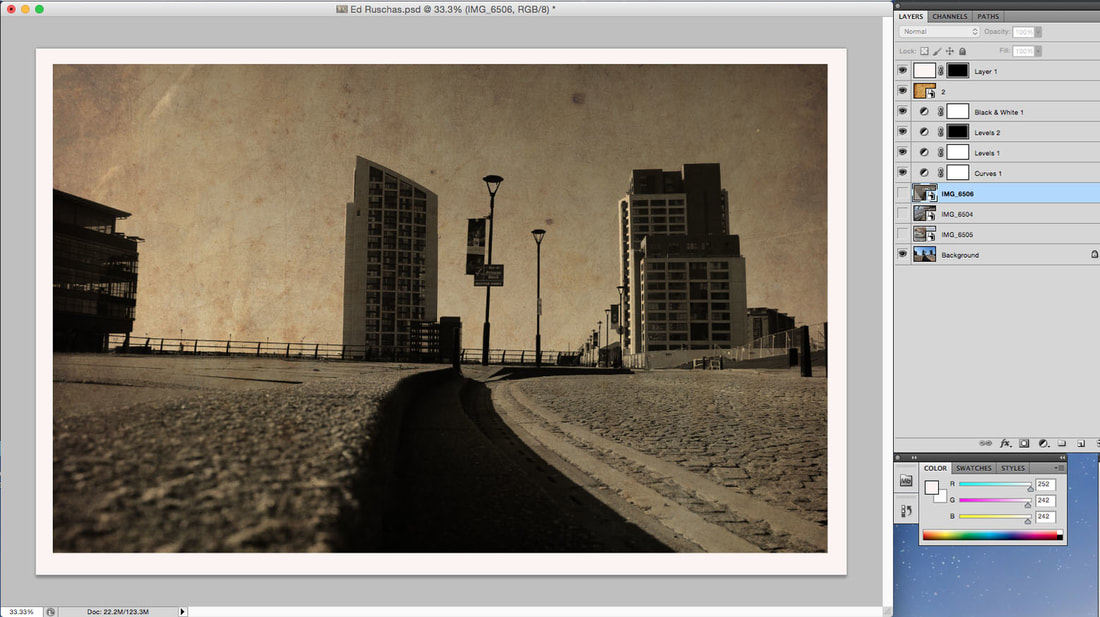
Finally, I used the paint rule of thirds technique and added a simple square white border to present the image better.
Final Edit Using This Style
Presenting them I decided to use this type on 3 more images giving me 4 complete images of Alexander Rodchenko’s style.
More Work Using This Style
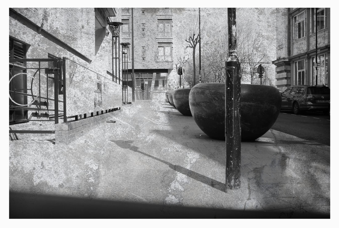
Ed Ruscha's Style Work
Recreation 1
I decided in my 7th hour I wanted to try and use some of my pictures with my artist research and try and replicate there work stye, continuing with Ed Rushca. I took some really advantageous car park photographs from unusual angles and positions to make my images stand out but also look similar to his style.
To show my thought process in this recreation I have taken screenshot evidence from photoshop to show the in level detail provided to make this style.
To show my thought process in this recreation I have taken screenshot evidence from photoshop to show the in level detail provided to make this style.
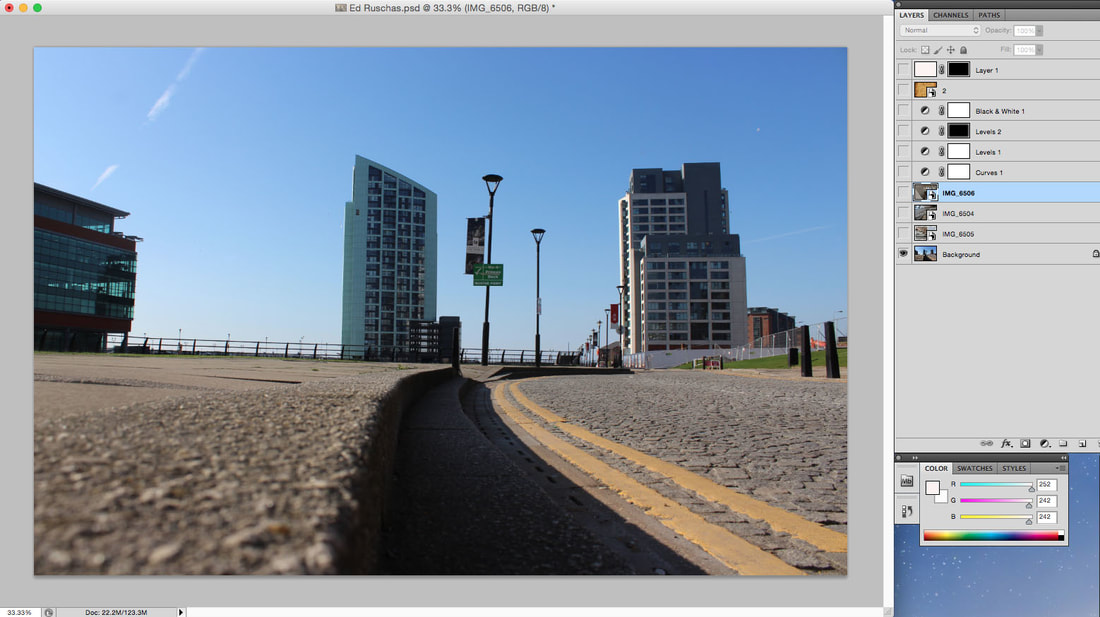
Firstly, I Chose my photo and placed it into photoshop and cropped it into frame for editing.
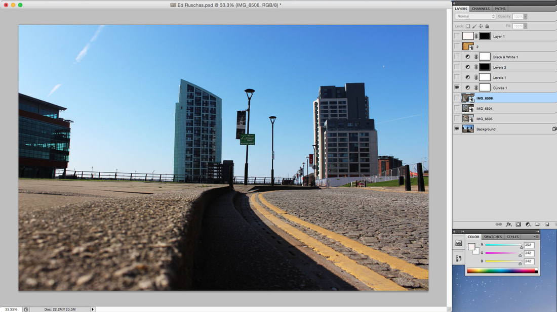
I then used the curves tool to increase the contrast and brightness of the image making it more unique and stylish.
Next I used the levels tool to make the image have more contrast and look stylish.
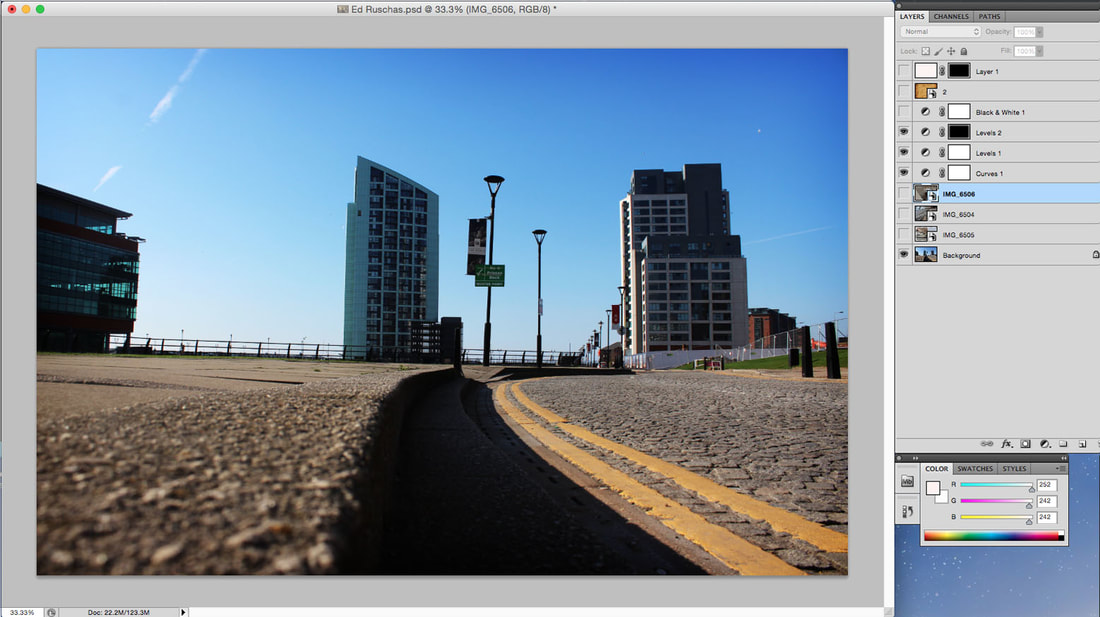
I then added a black and white effect to make the image look more older and stylish.
I then added a glazed texture that I had saved before the exam started off google, this image looks very mystical and provided a old atmosphere into the image.
Finally, I used the paint rule of thirds technique and added a simple square white border to present the image better.
Final Edit Using This Style
Presenting them I decided to use this type on 3 more images giving me 4 complete images of Ed Rushca’s. style.
More Work Using This Style
Recreation 2
I decided in my 8th hour I wanted to try and use some of my pictures with my artist research and try and replicate there work stye, continuing with Ed Rushca. I took some really advantageous car park photographs from unusual angles and positions to make my images stand out but also look similar to his style.
To show my thought process in this recreation I have taken screenshot evidence from photoshop to show the in level detail provided to make this style.
To show my thought process in this recreation I have taken screenshot evidence from photoshop to show the in level detail provided to make this style.
Firstly, I Chose my photo and placed it into photoshop and cropped it into frame for editing.
I then added a glazed texture that I had saved before the exam started off google, this image looks very mystical and provided a old atmosphere into the image.
I then used the curves tool to increase the contrast and brightness of the image making it more unique and stylish. Also used the levels tool to make the image have more contrast and look stylish.
Finally, I used the paint rule of thirds technique and added a simple square white border to present the image better.
Final Edit Using This Style
Presenting them I decided to use this type on 3 more images giving me 4 complete images of Ed Rushca’s. style.
More Work Using This Style

Bill Brandt's Style Work
I decided in my 9th and 10th hour I wanted to try and use some of my pictures with my artist research and try and replicate there work stye, ending with Bill Brandt. I took some really advantageous photographs at the Albert Dock from unusual angles and positions to make my images stand out but also look similar to his style.
To recreate Bill Brandt’ style was easy but tricky at the same time, using tools like curves and contrast made it look similar to his work.
To recreate Bill Brandt’ style was easy but tricky at the same time, using tools like curves and contrast made it look similar to his work.
|
|
|
Firstly I decided to choose 3 really high contrasting high key lack and white images and use a hollywood movie style white chopped border and present them as a gallery of 3.
Using this same method also got me a big image which i felt used this recreation technique the best.
I then wanted to boost the colours all the way up and see how far i could go with the brightness and levels, I took 3 really intricate images and pressed them as a gallery.
I then wanted to boost the colours all the way up and see how far i could go with the brightness and levels, I took 3 really intricate images and pressed them as a gallery.
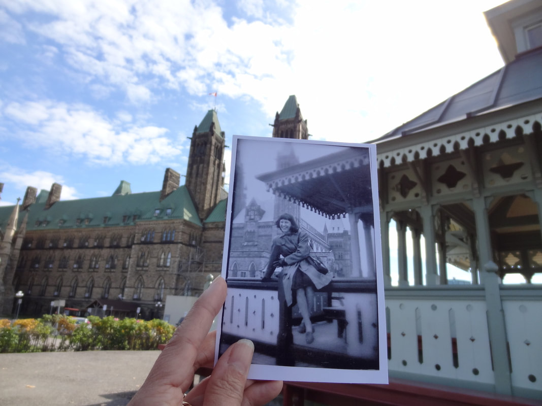
Past to Present Photography
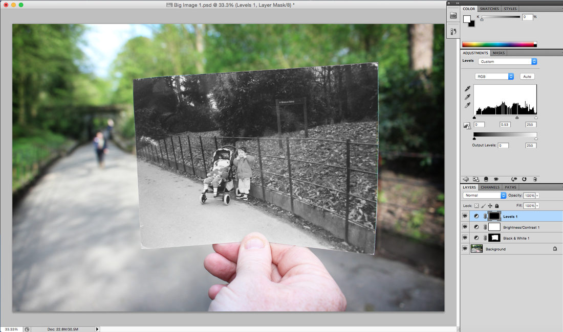
Now in my hours 11 and 12 i have decided to start editing my style research inspired photos of past to present photography. To show my thought process in this work I have taken screenshot evidence to illustrate the photoshop process to make this style.
Image 1
Raw Image
Photoshop Edit 1
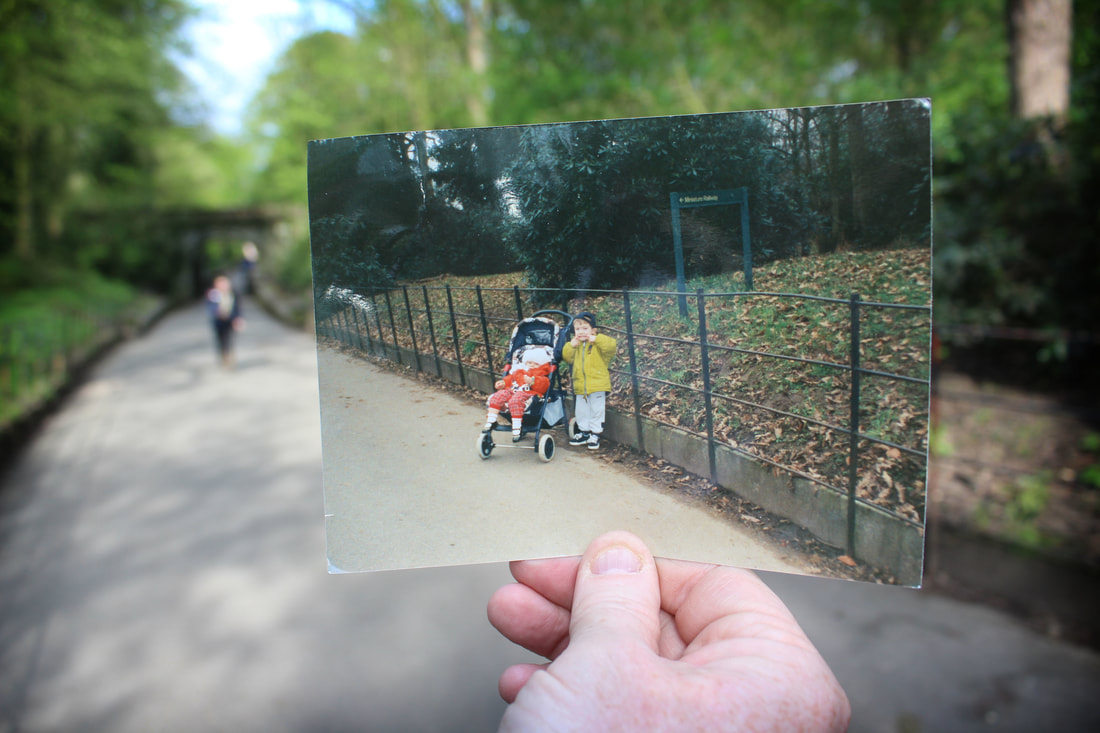
Firstly I used an old picture of me and my younger sister in a park near our house which was taken over 10 years ago, this image for me looked very cool and interesting when planning this components response. To re create this same photo i had to go back to were this picture was taken and frame it perfectly to were it was taken. Something I didn’t realise until i got there was we had to depend on light being on our side our we wouldn’t be able to see the image we were trying to take.
Edited Image

To start my editing process I placed the version of this image I felt worked best and aligns correctly to the frame required. I cropped it into size and began editing.
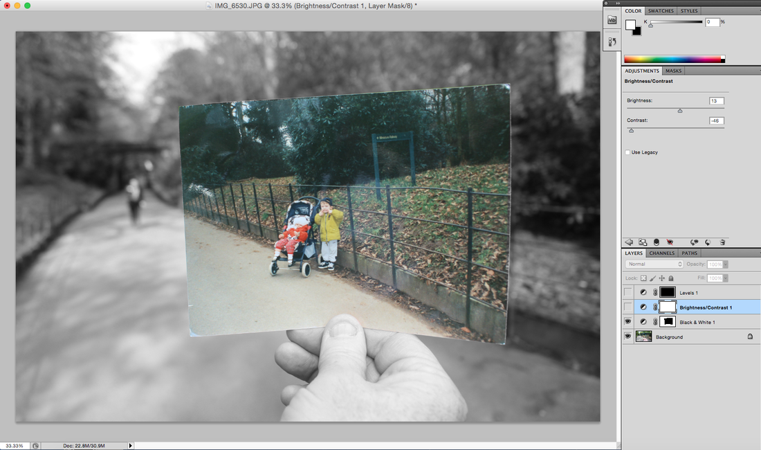
I wanted to do 2 seperate edits of this 1 photograph using different colours and editing techniques to make it look nice, I started by making the old polaroid black and white by using the cropper tool to carefully align a square around the old polaroid and then using levels and saturation to turn it black and white and raise the brightness so we could still see it.
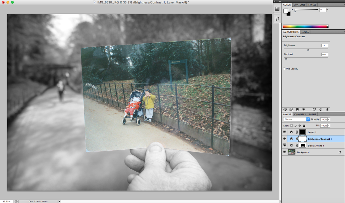
Next I wanted to make the image look sharp so I added a contrast and brightness and pushed all the levels up to make it as visible as possible, then to finish this image off added a black and white vignette around the image to draw the attention of the viewer towards the centre of the image.
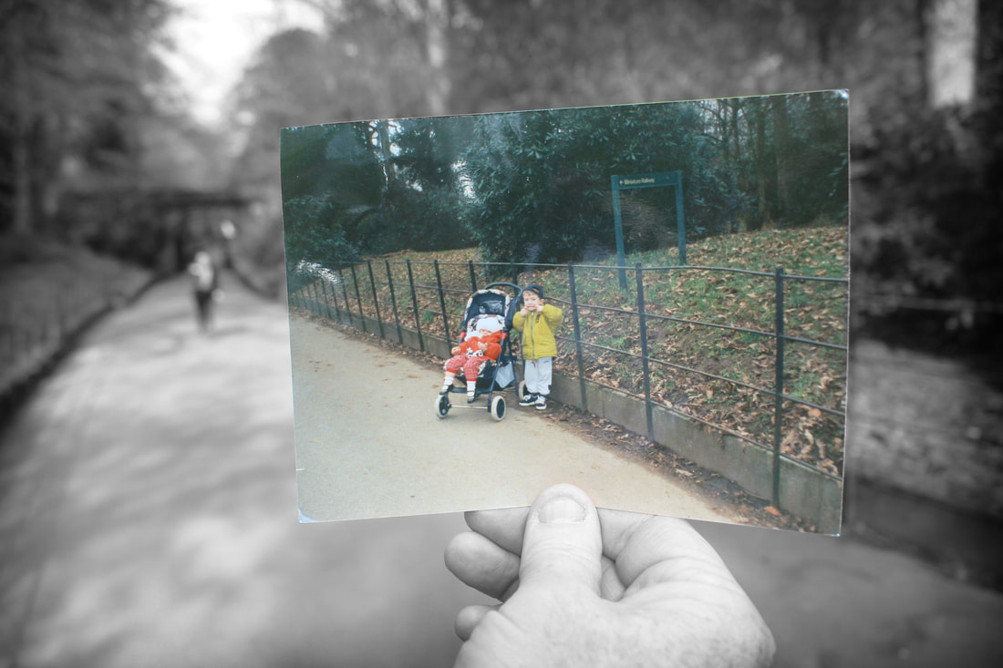
Final Edit Using This Style
Here is the finished version of this editing process.
Raw Image
Photoshop Edit 2

Firstly I used an old picture of me and my younger sister in a park near our house which was taken over 10 years ago, this image for me looked very cool and interesting when planning this components response. To re create this same photo i had to go back to were this picture was taken and frame it perfectly to were it was taken. Something I didn’t realise until i got there was we had to depend on light being on our side our we wouldn’t be able to see the image we were trying to take.
Edited Image
For my next editing process I decided to do similar methods as the one above but invert what I did, To start my editing process I placed the version of this image I felt worked best and aligns correctly to the frame required. I cropped it into size and began editing.
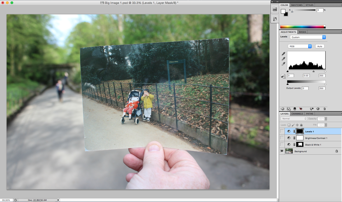
For my next editing process I decided to do similar methods as the one above but invert what i did, To start my editing process I placed the version of this image i felt worked best and aligns correctly to the frame required. I cropped it into size and began editing.
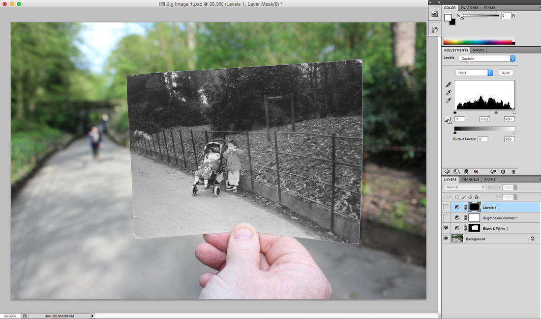
I started by making the old polaroid only in colours while the rest of the picture was black and white by using the cropper tool to carefully align a square around the old polaroid and then using levels and saturation to turn the outside black and white and raise the brightness so we could still see it.
I wanted to make the image look sharp so I added a contrast and brightness and pushed all the levels up to make it as visible as possible, then to finish this image off added a black and white vignette around the image to draw the attention of the viewer towards the centre of the image.
Final Edit Using This Style
Here is the finished version of this editing process.
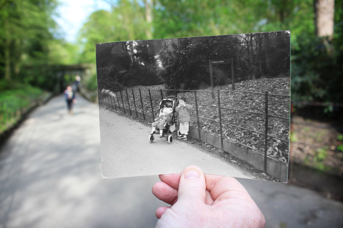
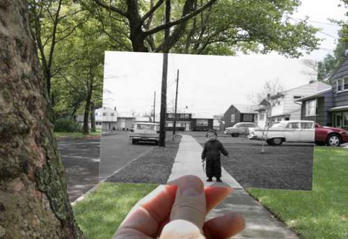
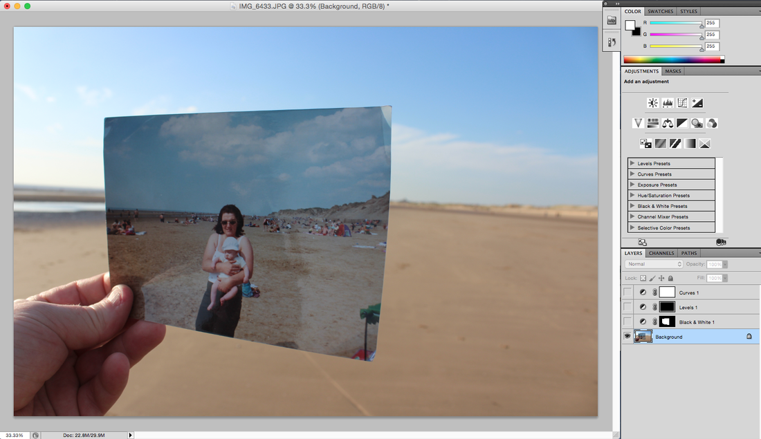
Image 2
Raw Image
Photoshop Edit 1
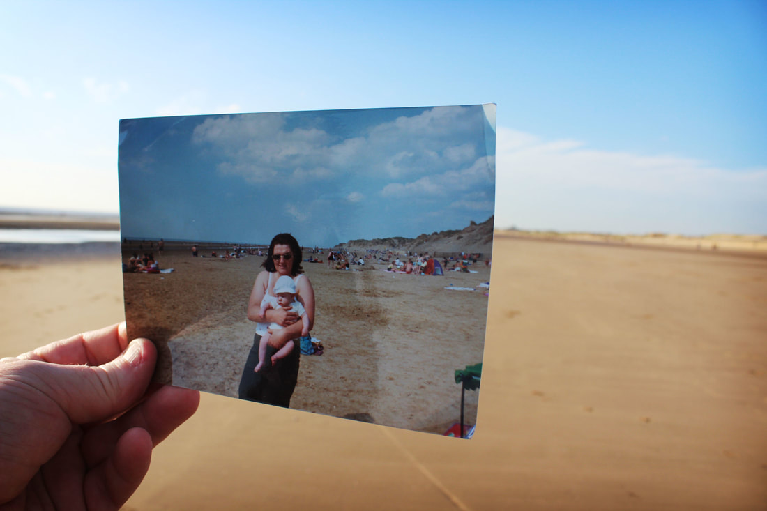
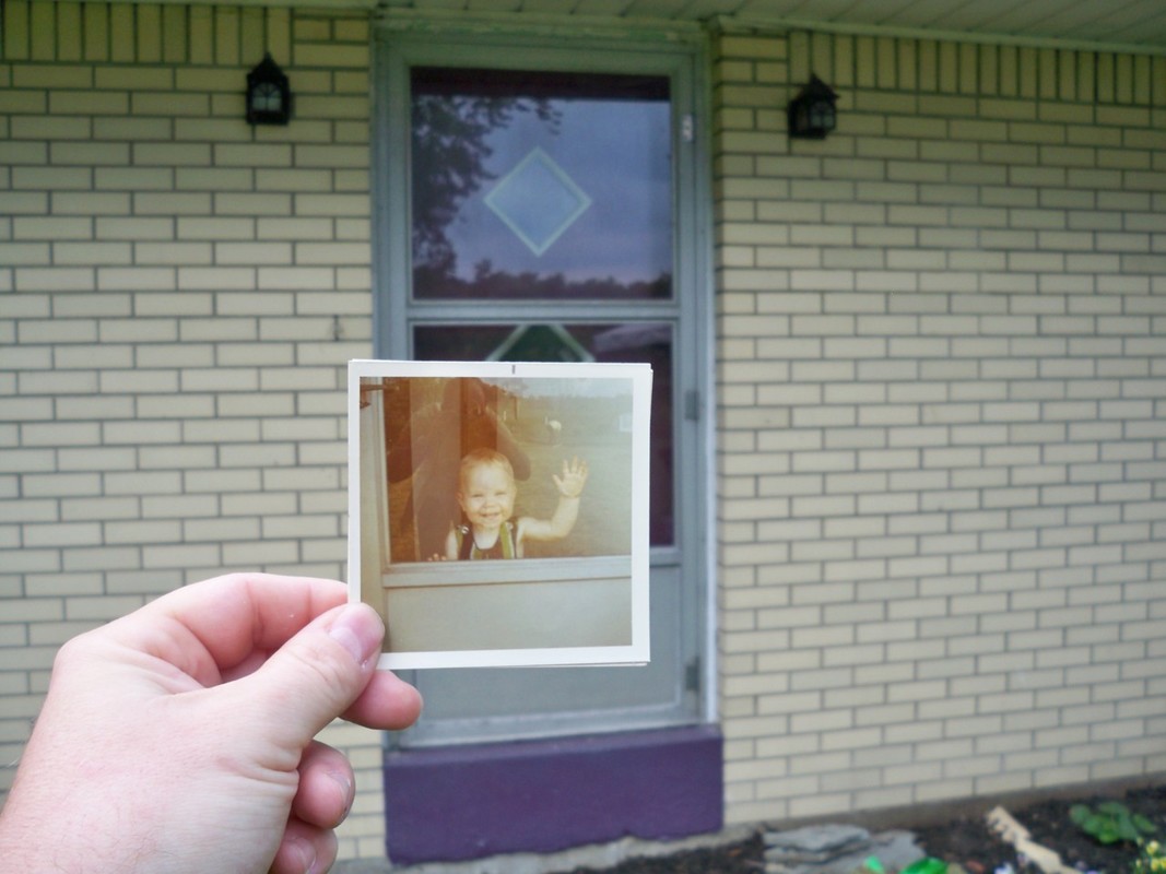
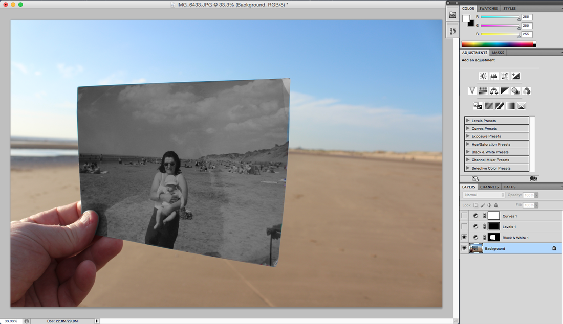
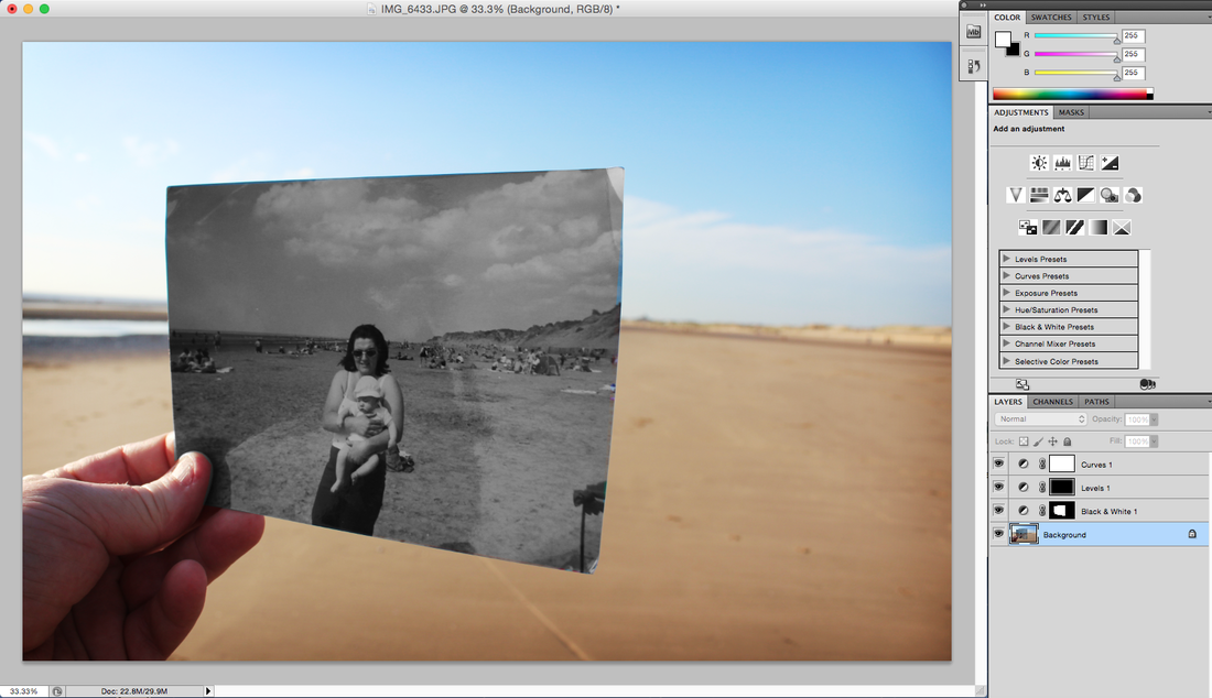
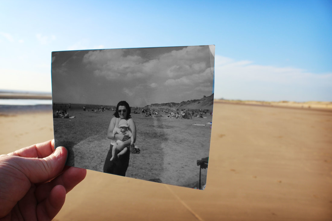
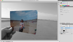
This image was taken at Crosby Beach in Liverpool, the polaroid image in this picture was taken over 12 years ago and is a baby picture of myself, it was taken with me and my mum so to recreate this image I went back to the same location it was taken and held it up at the right angle using composition methods and took the picture.
Edited Image
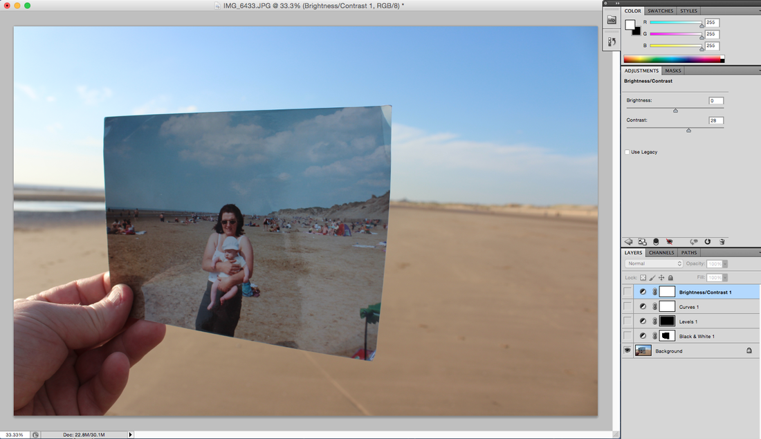
For my next editing process I decided to do similar methods as the one above but invert what I did, To start my editing process I placed the version of this image I felt worked best and aligns correctly to the frame required. I cropped it into size and began editing.
I started by making the old polaroid only in colours while the rest of the picture was black and white by using the cropper tool to carefully align a square around the old polaroid and then using levels and saturation to turn the outside black and white and raise the brightness so we could still see it.
I wanted to make the image look sharp so I added a contrast and brightness and pushed all the levels up to make it as visible as possible, then to finish this image off added a black and white vignette around the image to draw the attention of the viewer towards the centre of the image.
Final Edit Using This Style
Here is the finished version of this editing process.
Raw Image
Photoshop Edit 2

This image was taken at Crosby Beach in Liverpool, the polaroid image in this picture was taken over 12 years ago and is a baby picture of myself, it was taken with me and my mum so to recreate this image I went back to the same location it was taken and held it up at the right angle using composition methods and took the picture.
Edited Image
For my next editing process I decided to do similar methods as the one above but invert what I did, To start my editing process I placed the version of this image I felt worked best and aligns correctly to the frame required. I cropped it into size and began editing.
I started by making the old polaroid only in colours while the rest of the picture was black and white by using the cropper tool to carefully align a square around the old polaroid and then using levels and saturation to turn the outside black and white and raise the brightness so we could still see it.
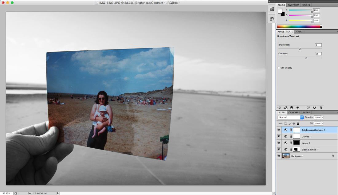
I wanted to make the image look sharp so I added a contrast and brightness and pushed all the levels up to make it as visible as possible, then to finish this image off added a black and white vignette around the image to draw the attention of the viewer towards the centre of the image.
Final Edit Using This Style
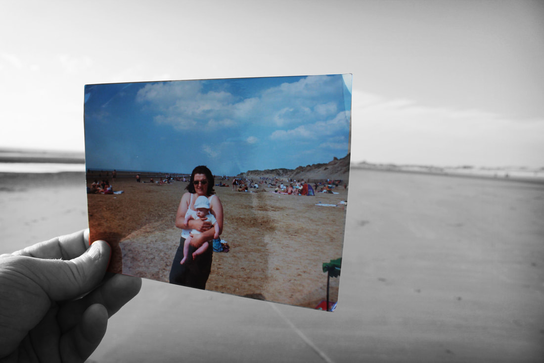
Image 3
Raw Image
Photoshop Edit
This image was taken by a very old public library which was used during the 18th century within a nearby park to Liverpool, the image itself was taken on the grand staircase to this building singly model to show the level of emotion this building has. This is not the traditional style to making past to present photography but i wanted to try something new and try make the polaroid myself, which is what i did.
Edited Image
To start my editing process i placed my image in photoshop and cropped to size and planned where my polaroid was going to go.
Next I added a old style hollywood frame that looks old and torn making it look realistic towards the polaroid.
To continue this process i made my image inside the polaroid back and white.
I then added a grainy destroyed texture to make the image look old and not something that was in colour.
I felt like you couldn't see the image so I added a brightness and contrast to enlighten the image.
Finally, I made the outside of the polaroid image a brightness contrasted colour to make them look like separate days.
Final Edit Using This Style
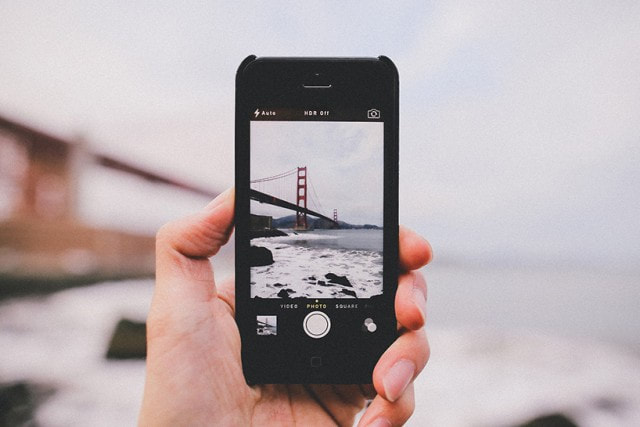
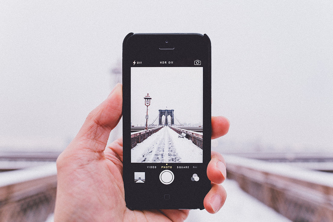
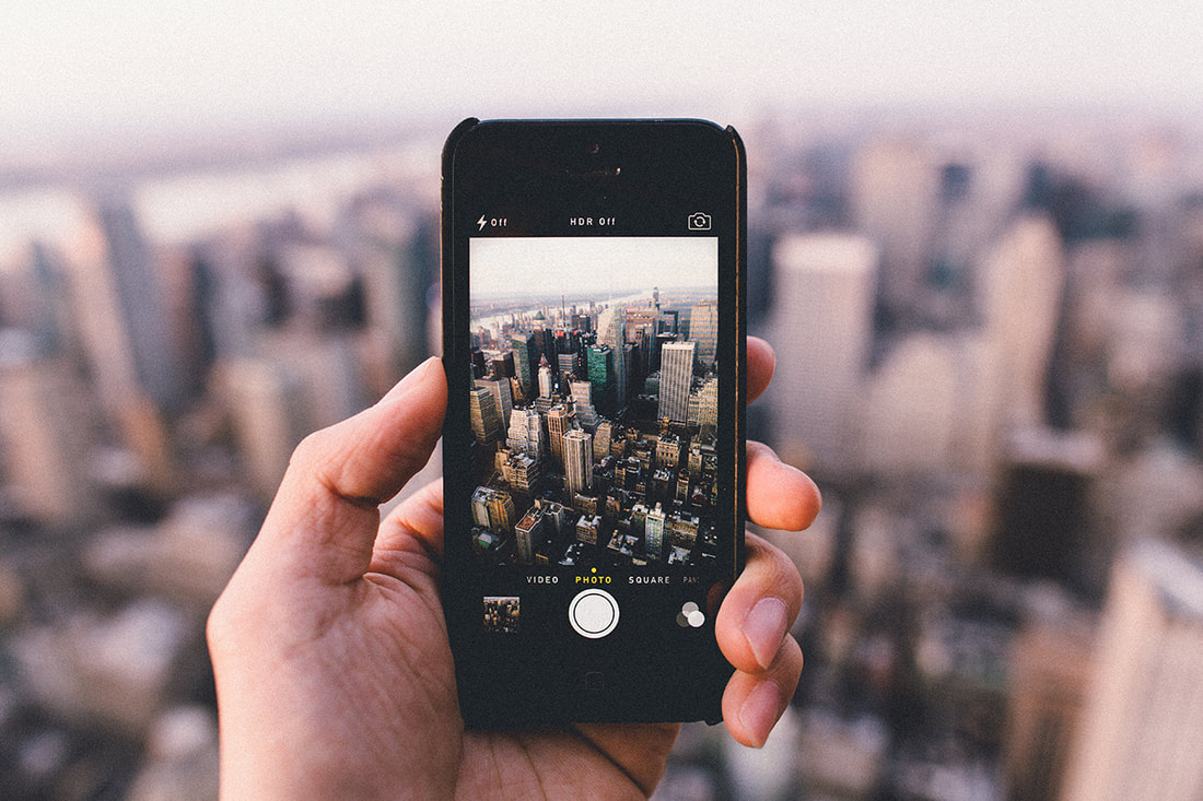
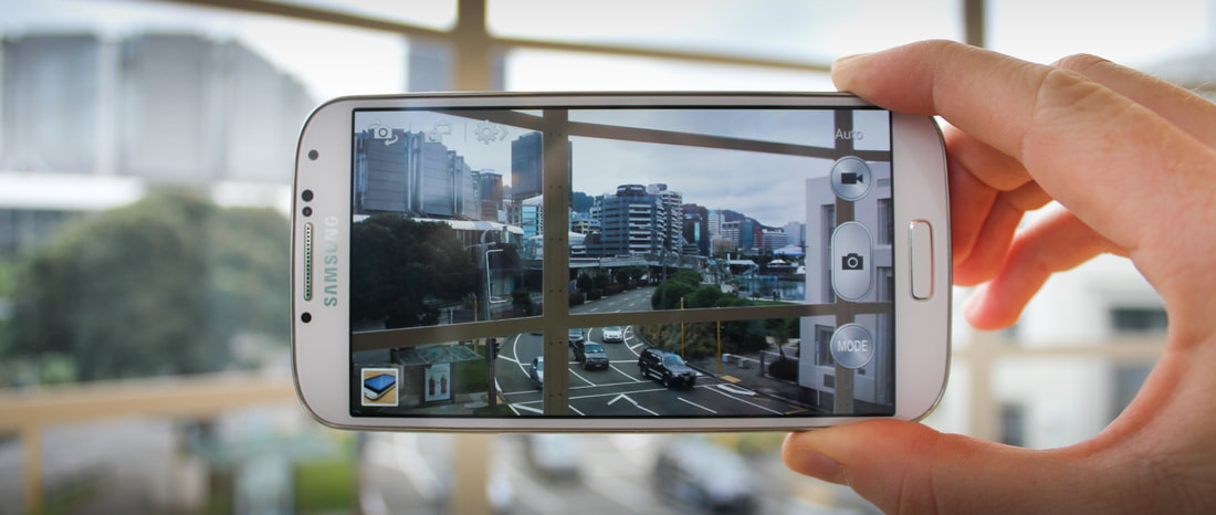
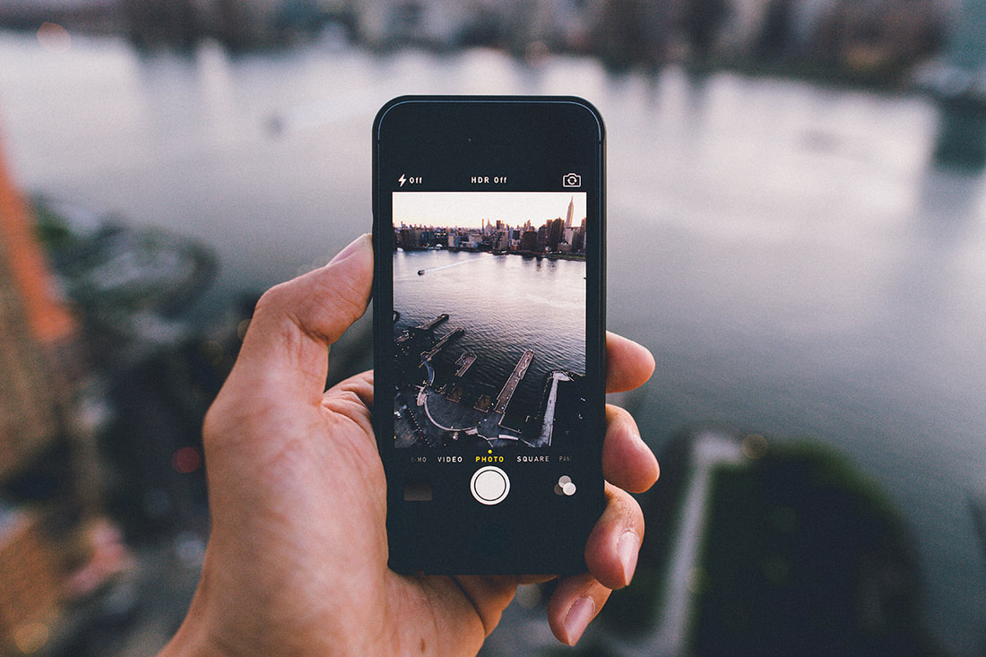
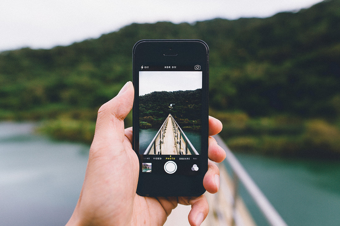
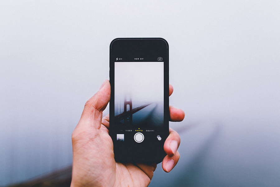
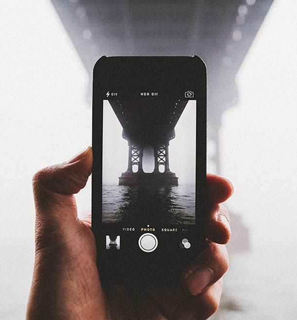
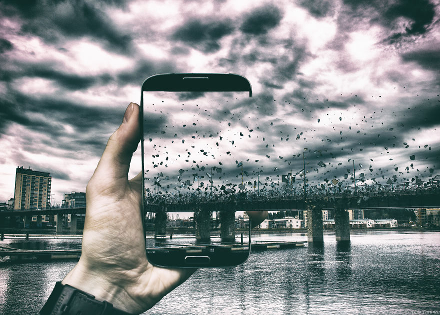
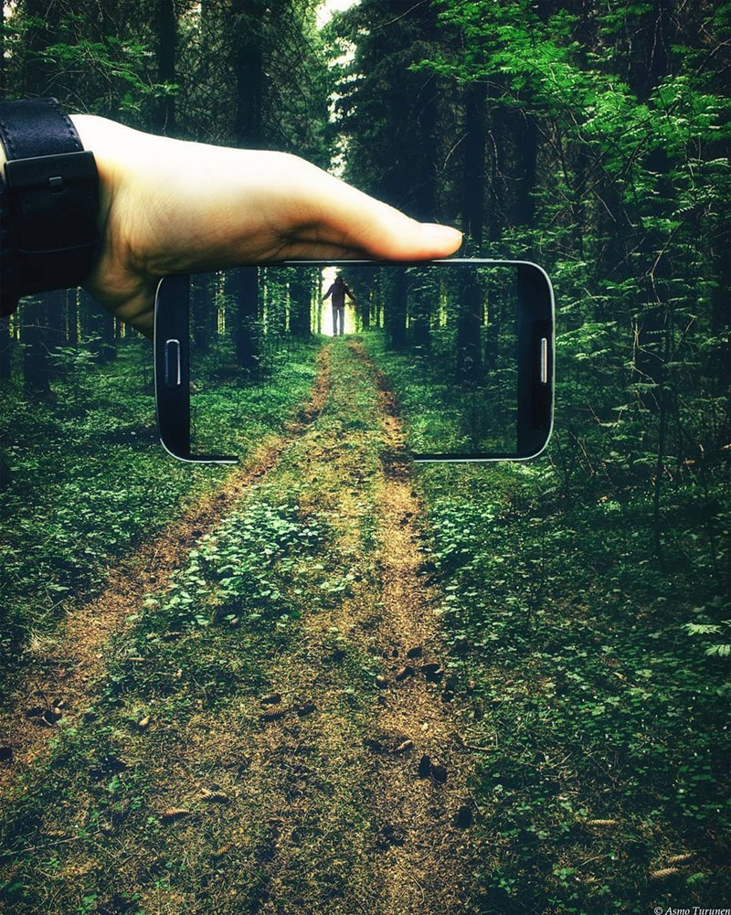
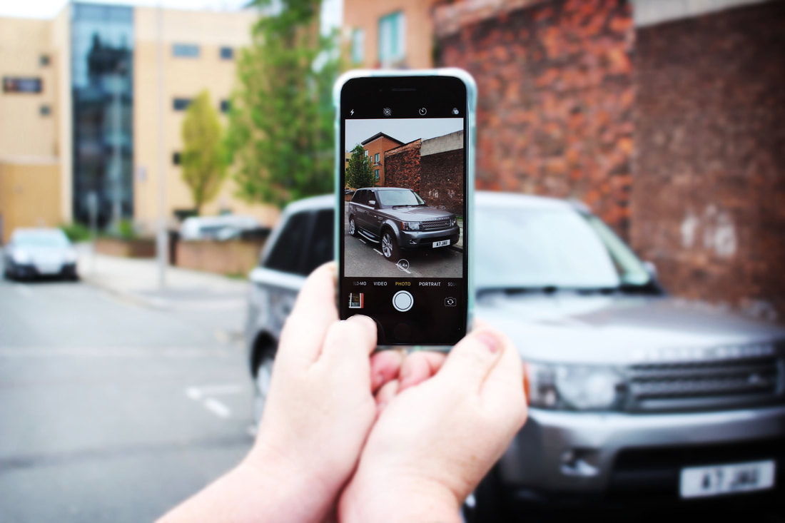
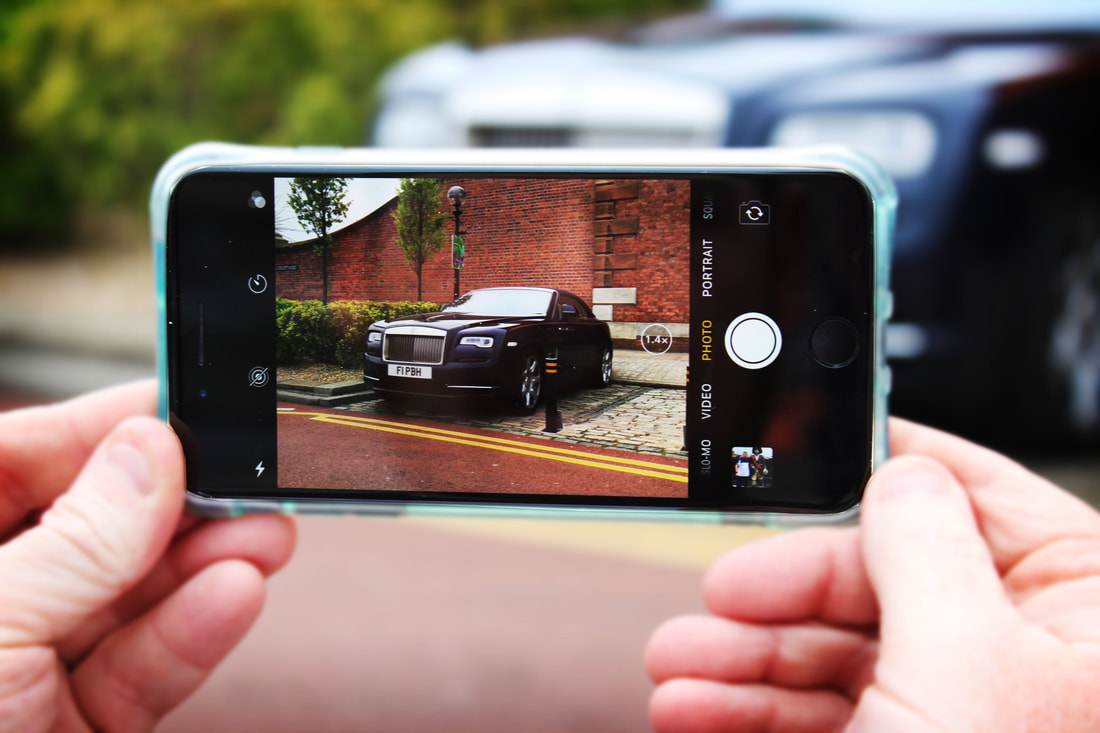
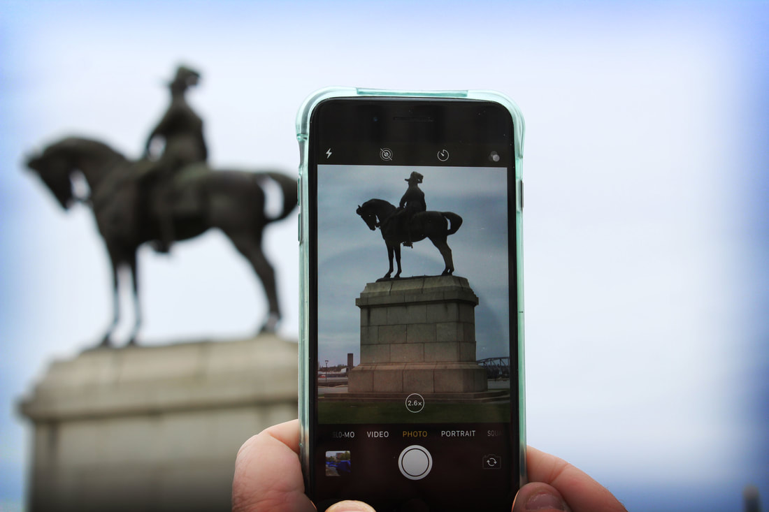
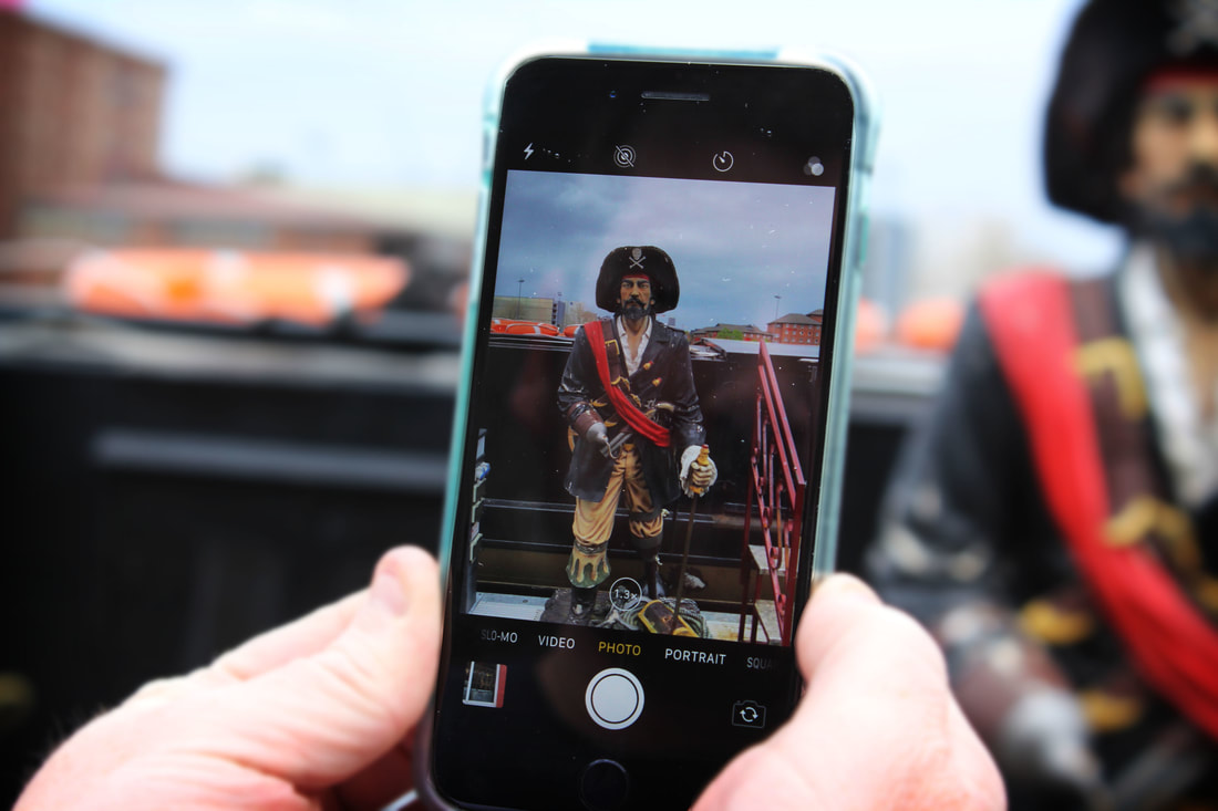
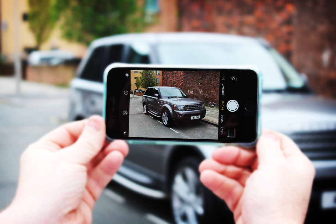
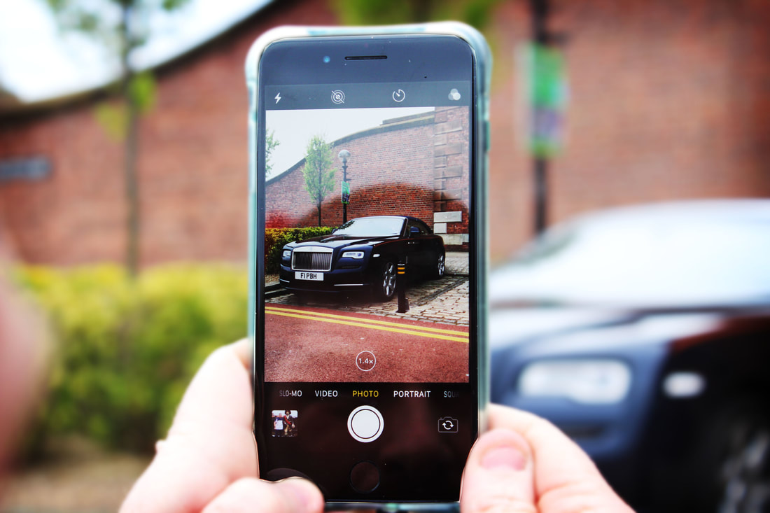
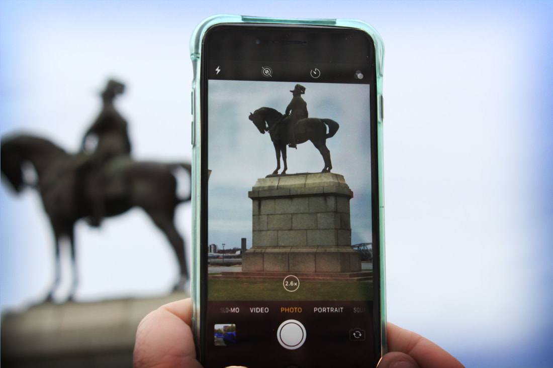
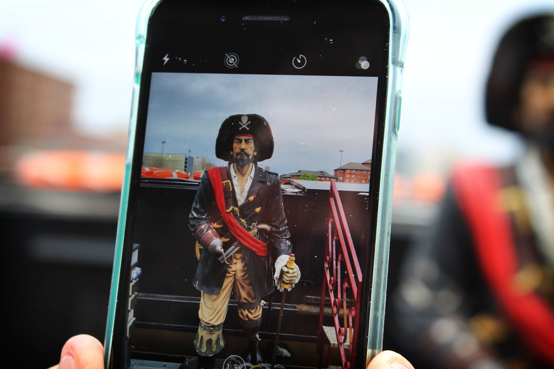
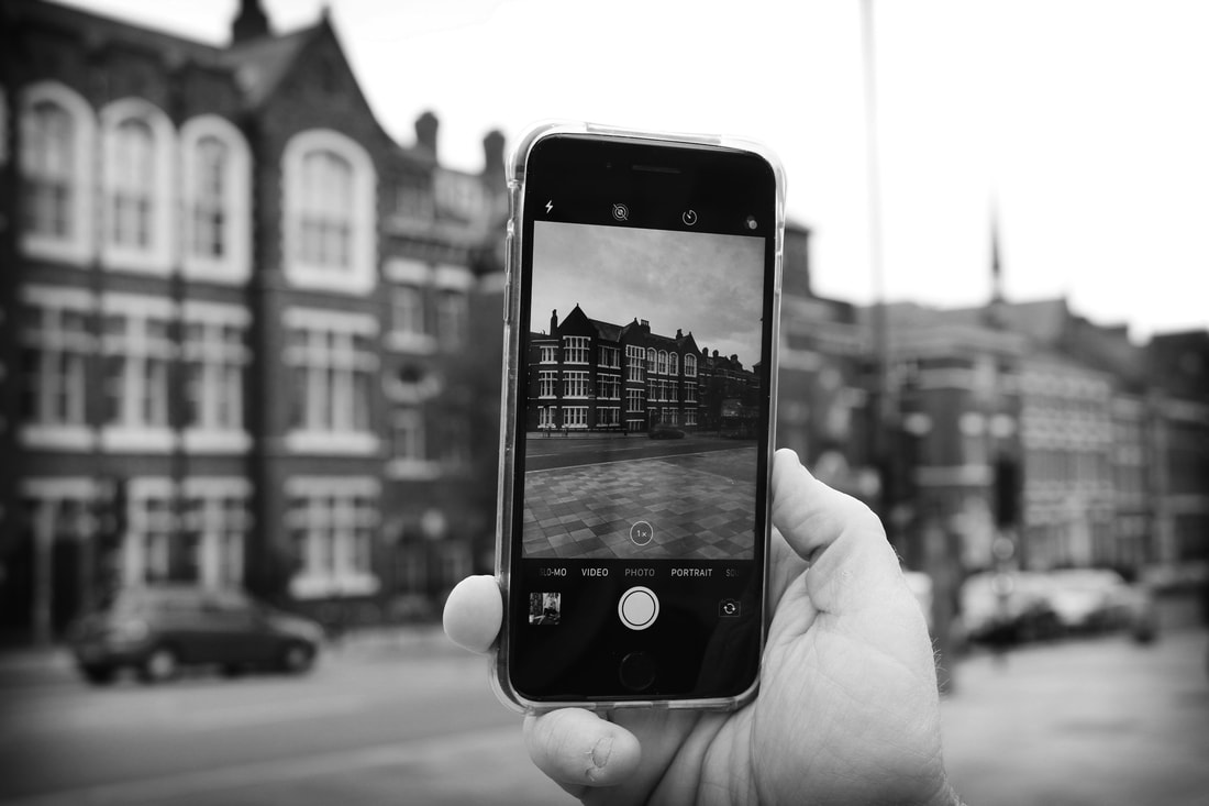
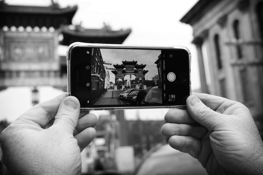
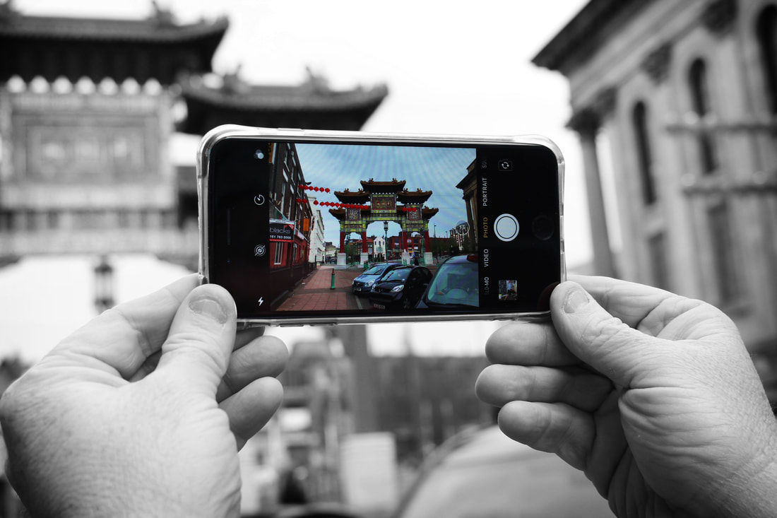
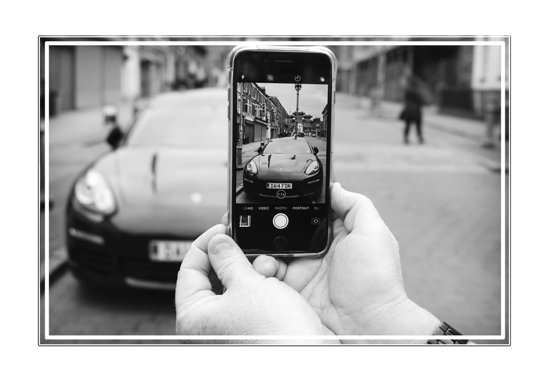
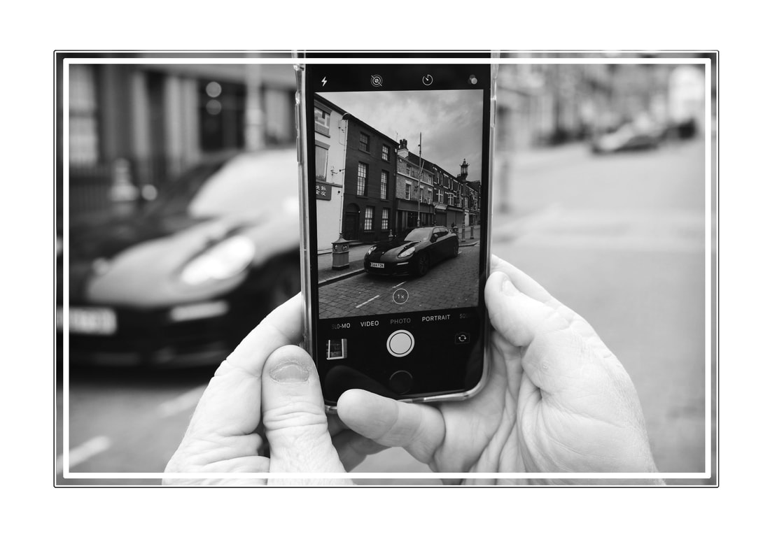
Phone Perspective Photography
Now in my 13th and 14th hour I decide to do my final style research work, this is phone perspective photography. Phone perspective to me was the most interesting topic with in unexpected perspectives as it was easy to do and created the most rewarding images. I really like the simplicity to this technique.
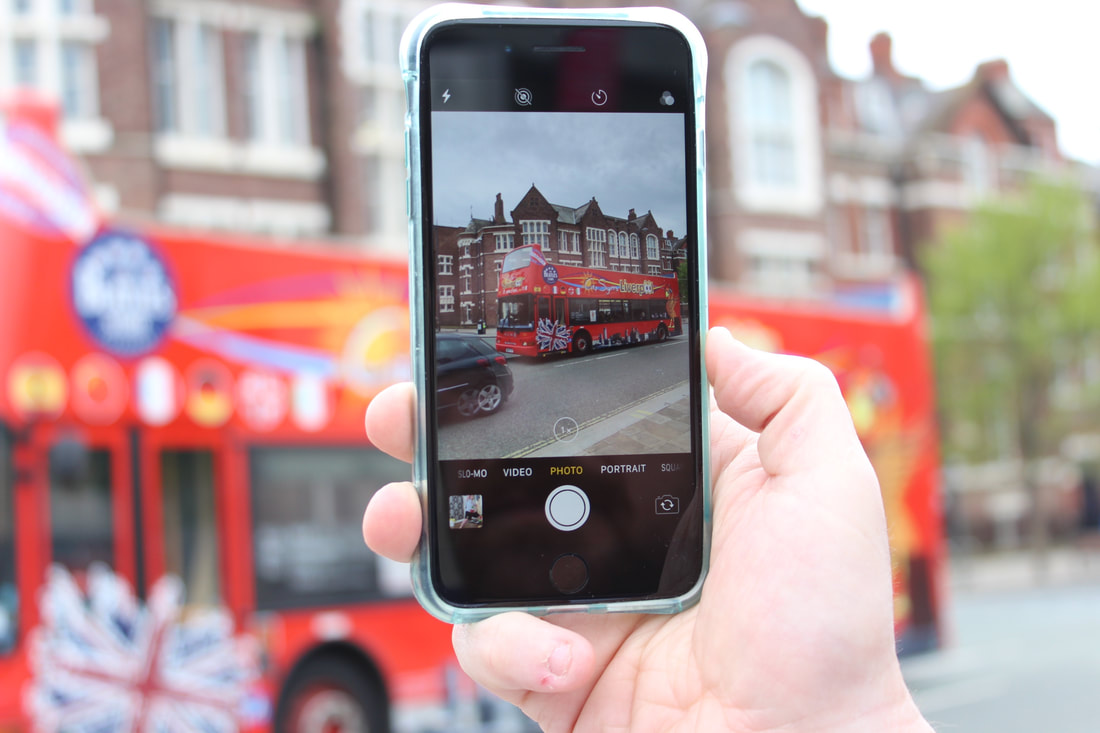
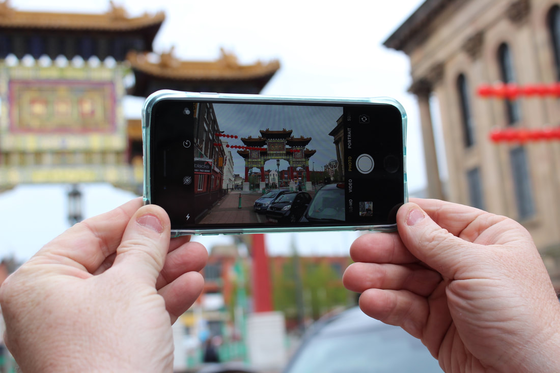
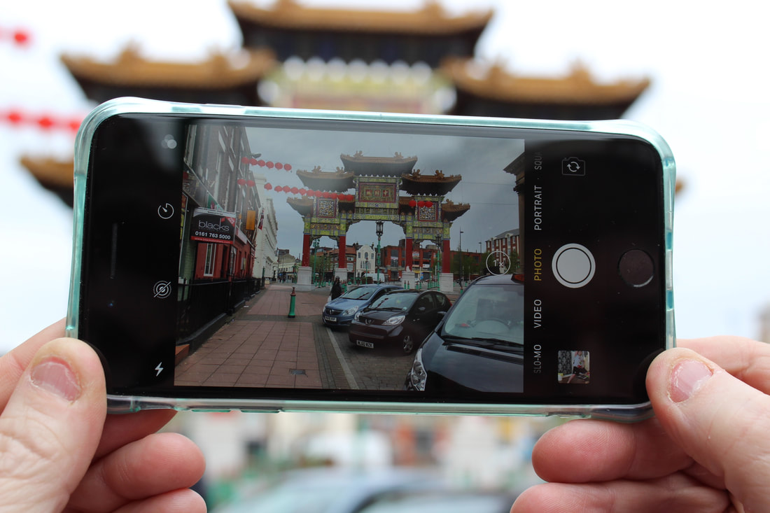
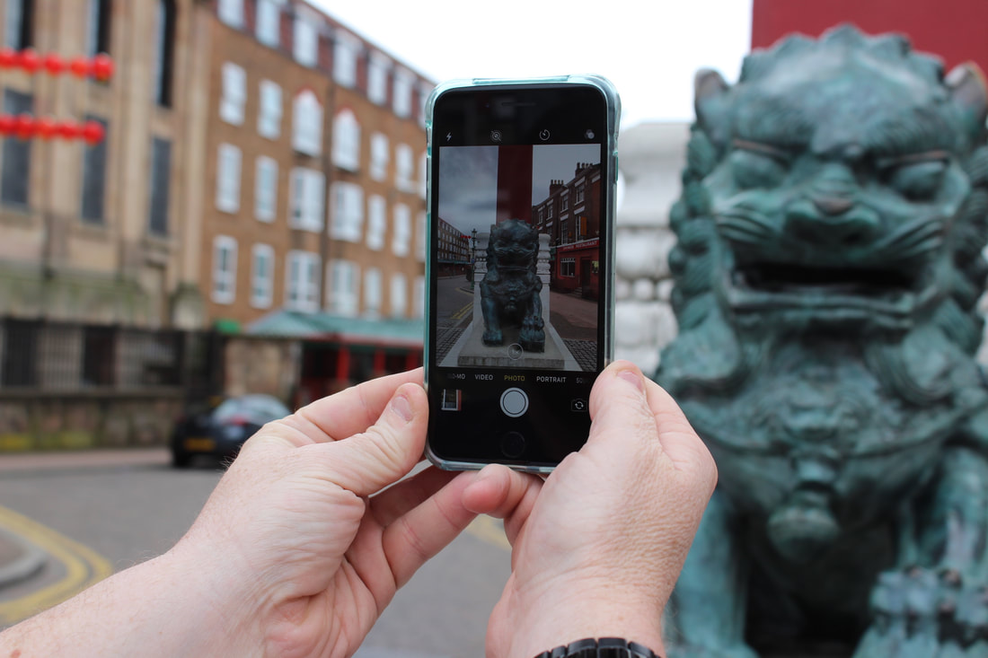
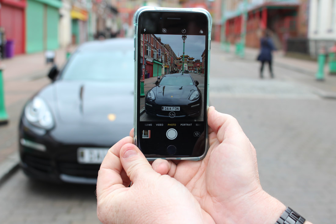
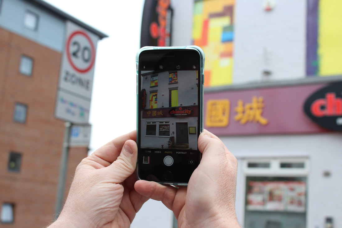
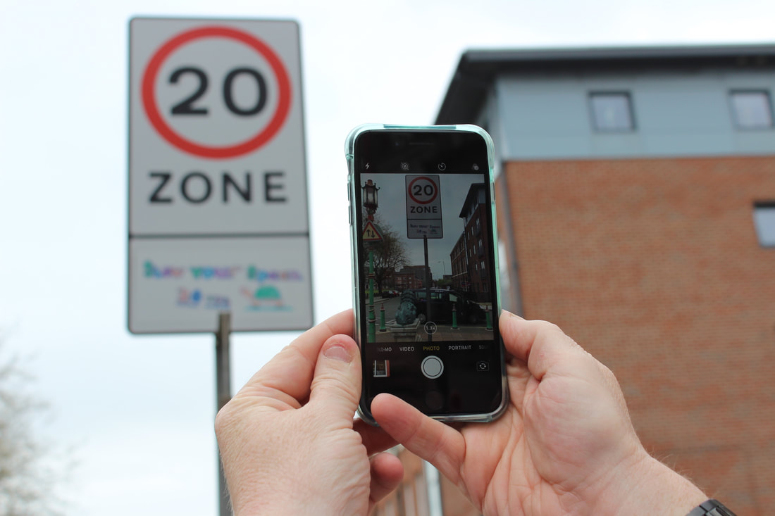
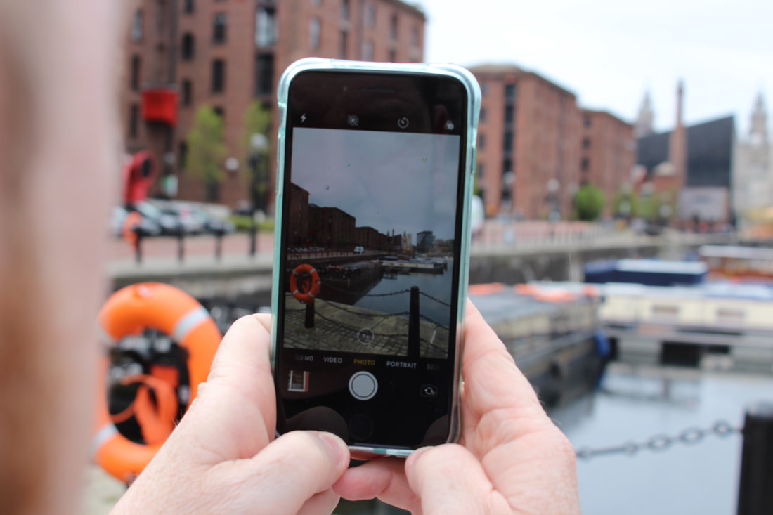
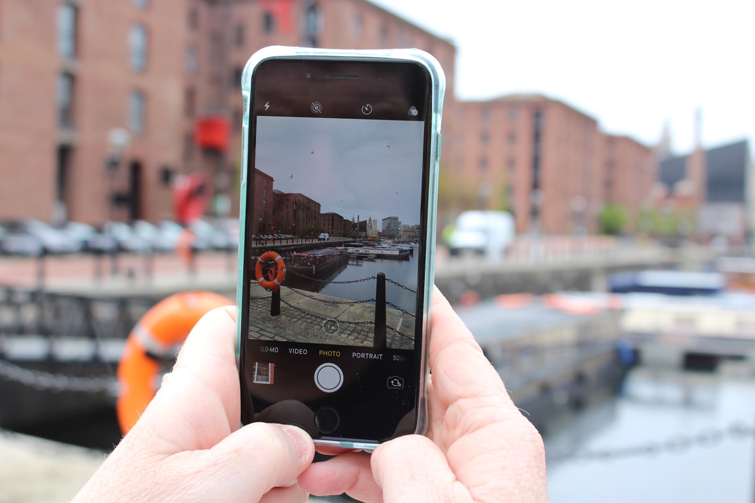
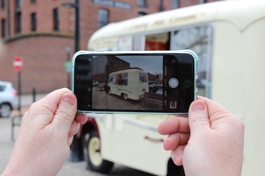
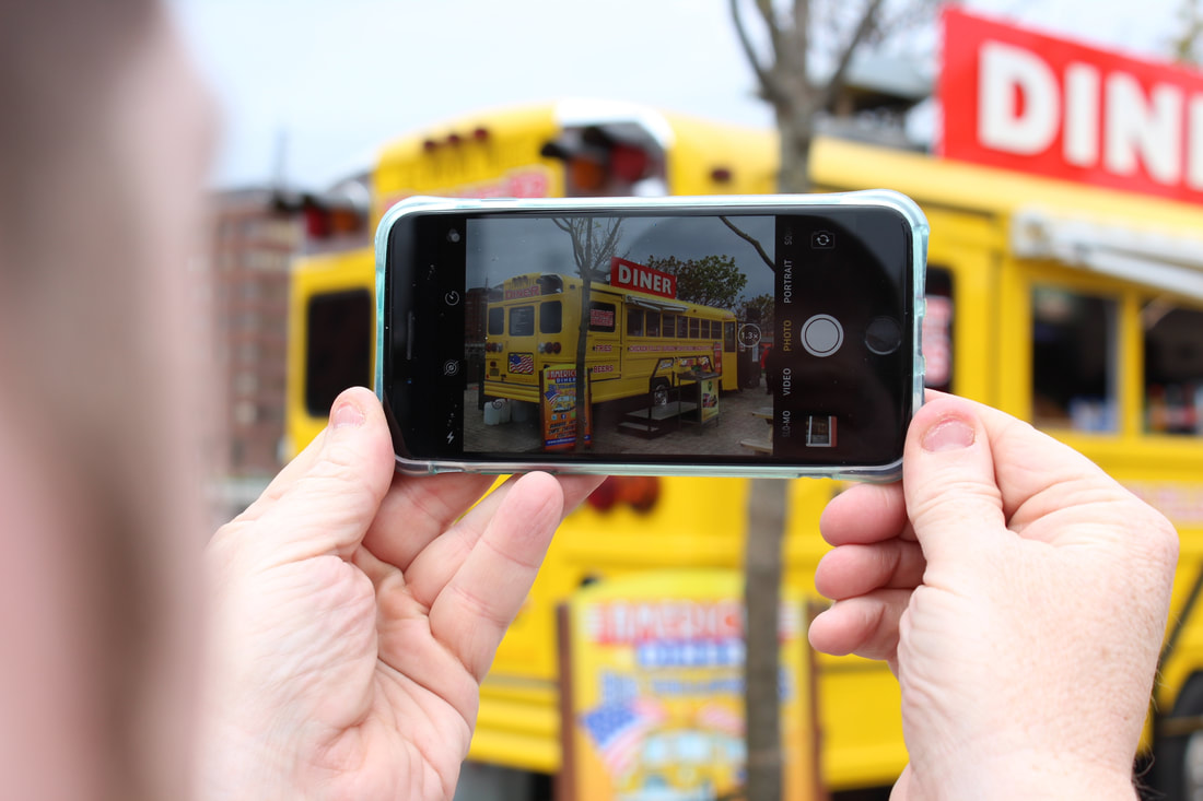
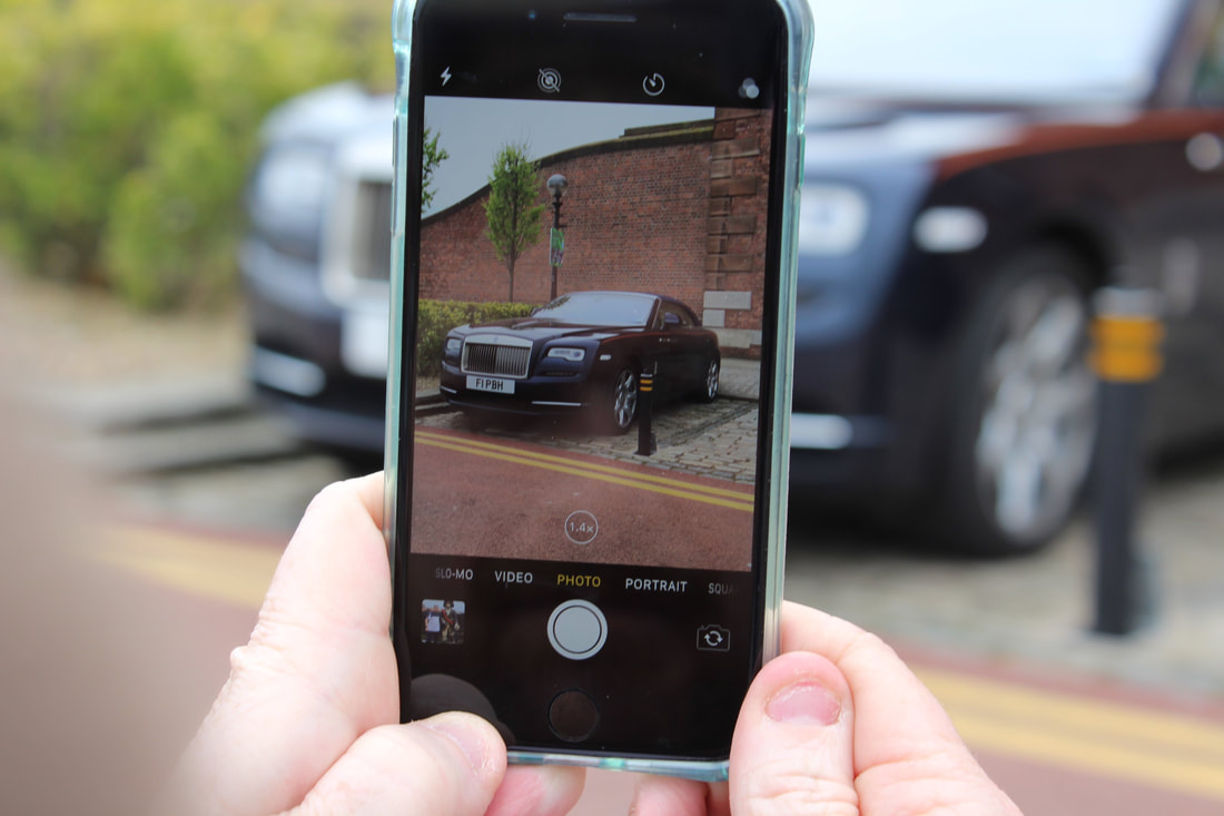
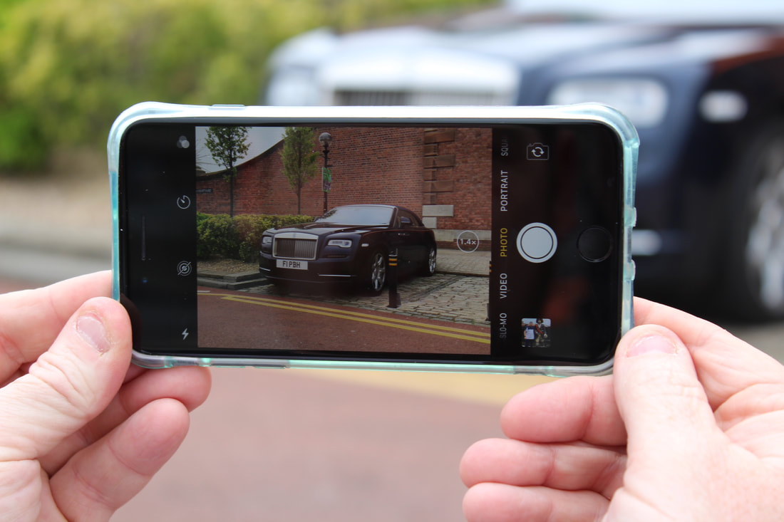
Phone Perspective Edited
To present these images I placed big images next to each over in 2 by 8 frames downwards. The actual editing to these images was boosting the brightness and contrast of the image and blurring the outer edges of the phones perspective to draw attention to the focus of the phone.
|
|
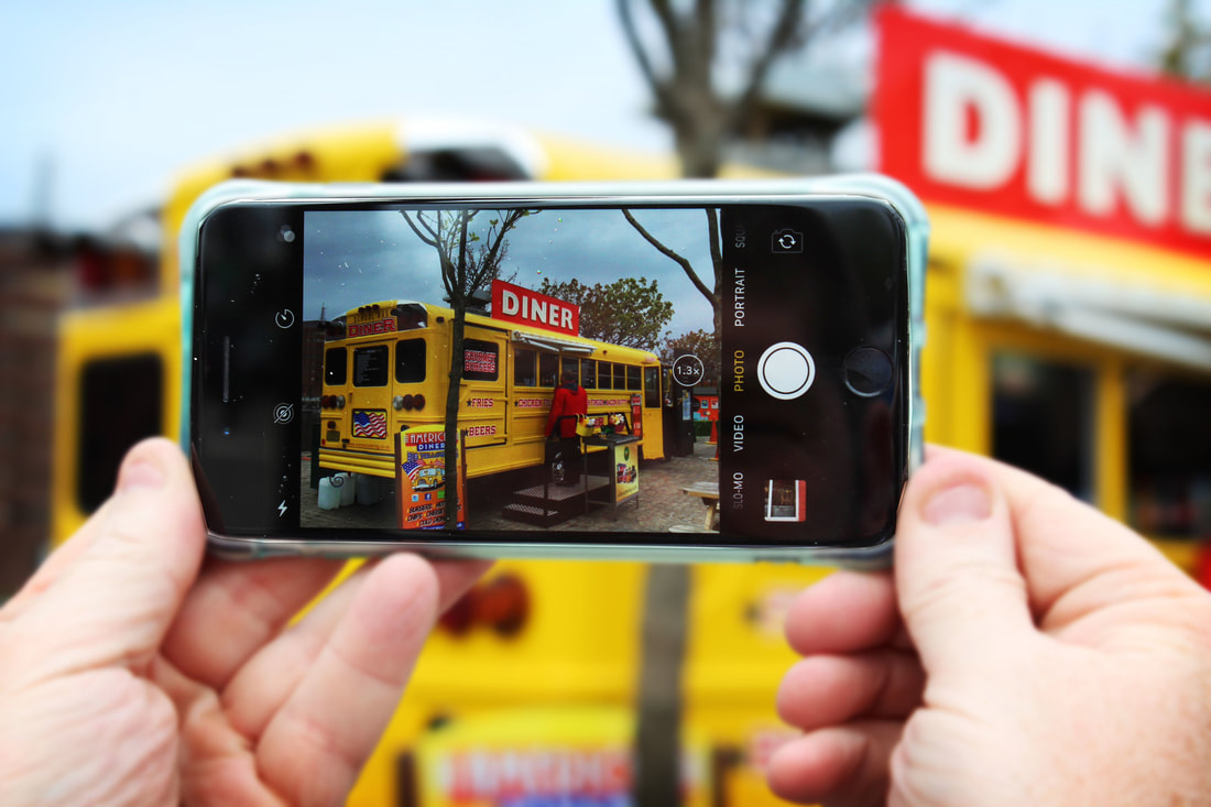
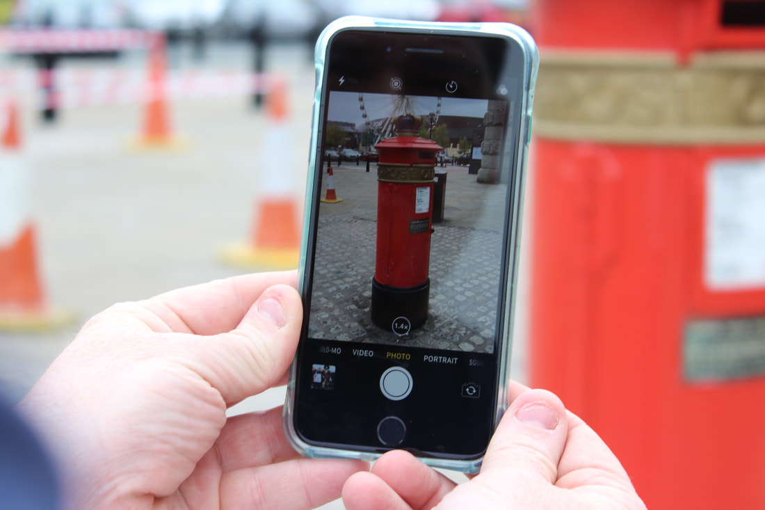
These images are all in colour showing boosted saturation and colours of famous areas and landmarks around Liverpool. I really like these images and think the levels and curves have worked well colourising the image and show a unique part that is unexpected.
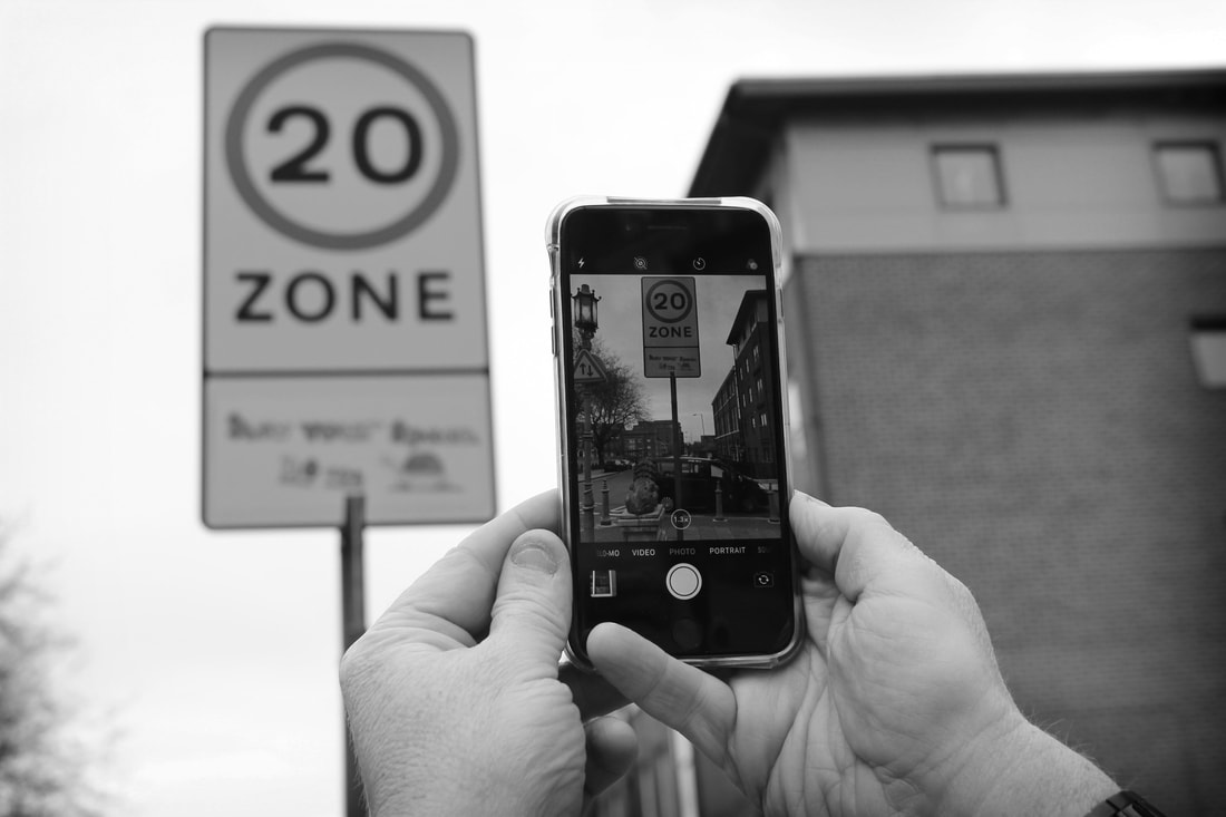
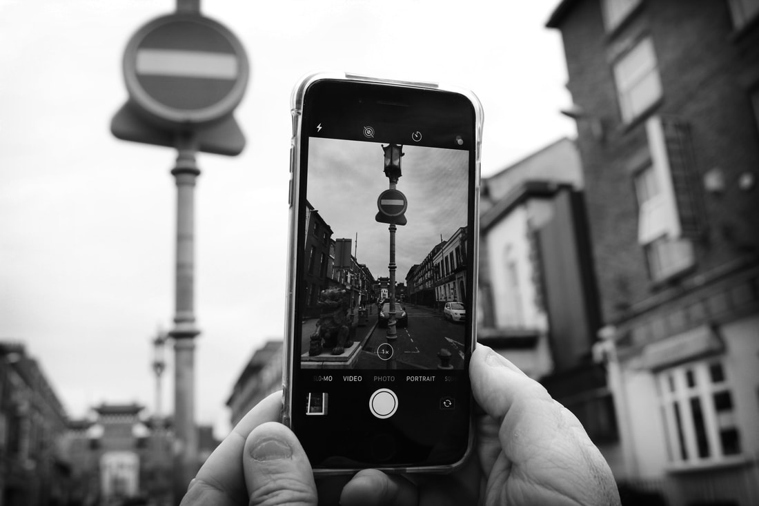
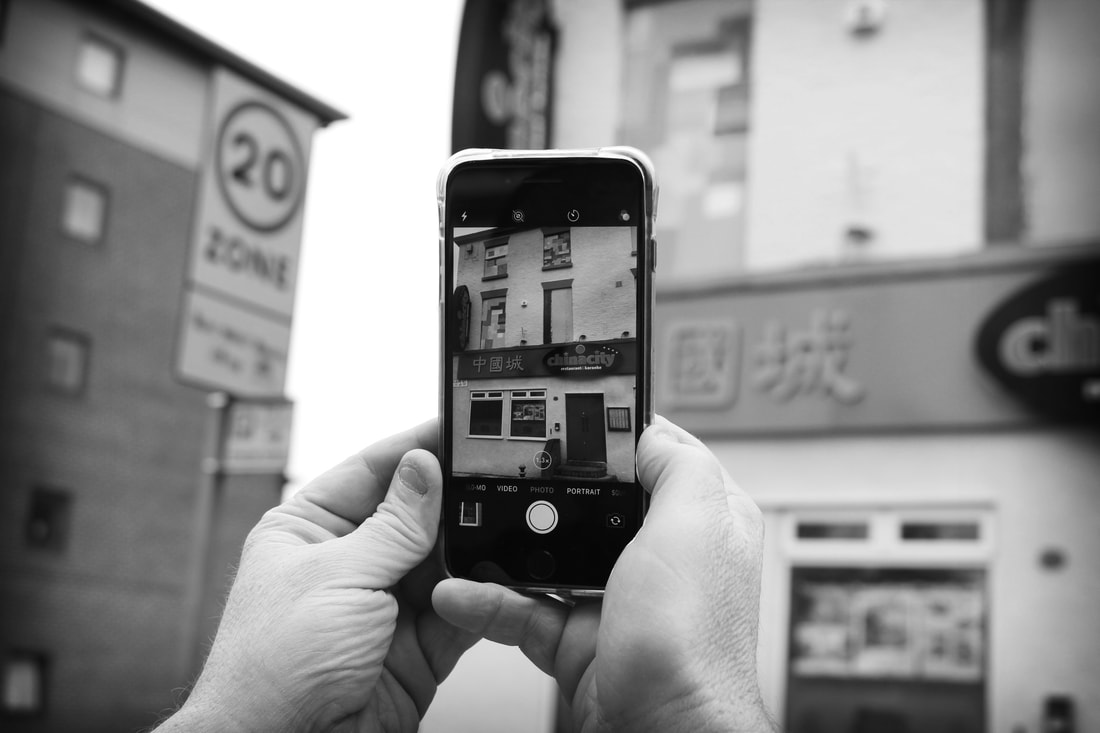
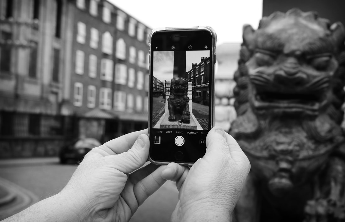

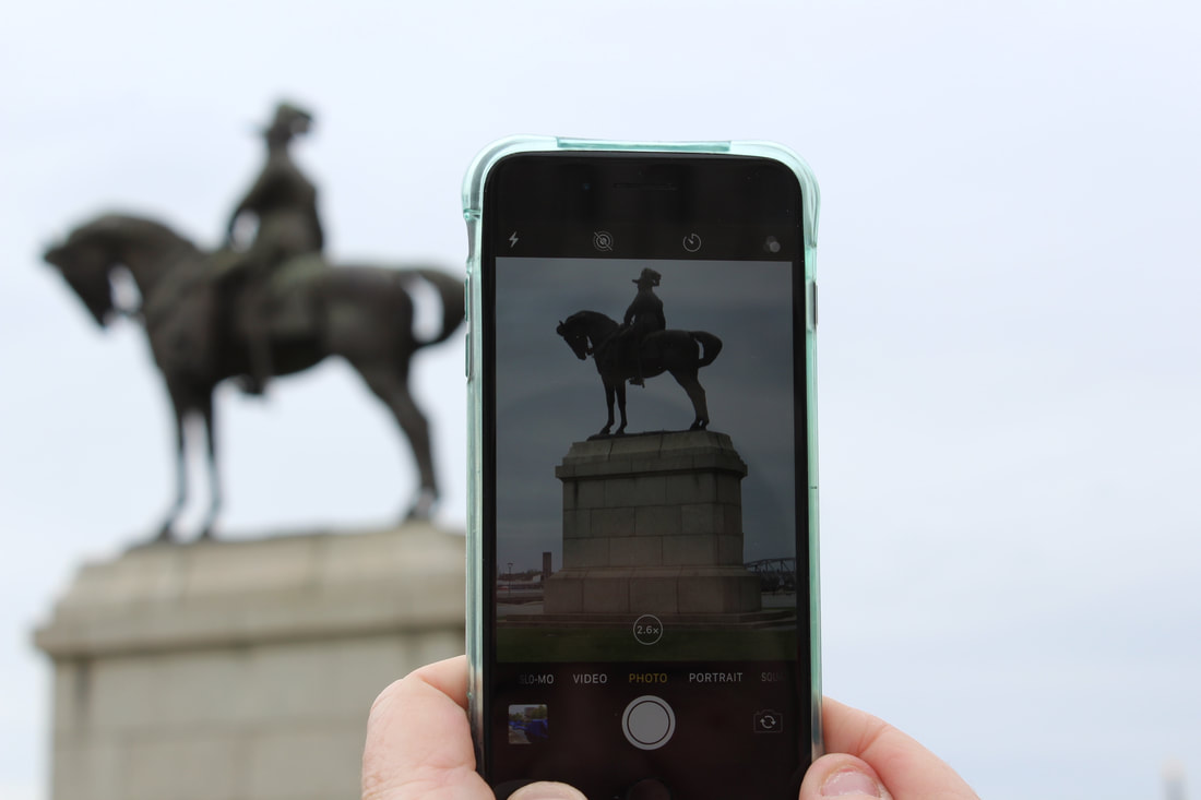
Above is 6 high contrasting black and white images using Bill Brands style work. These images have all been connected as a set gallery because they all photograph stationary objects or items. I like these images and think they have urned out really well.
This image is a big frame black and white Bill Brandt inspired work as the levels and contrast have been boosted up completely, the outer edges of the phone have been blurred to make the main focus be the inside of the phone. This works really well and i think shows what being unexpected in photography is all about.
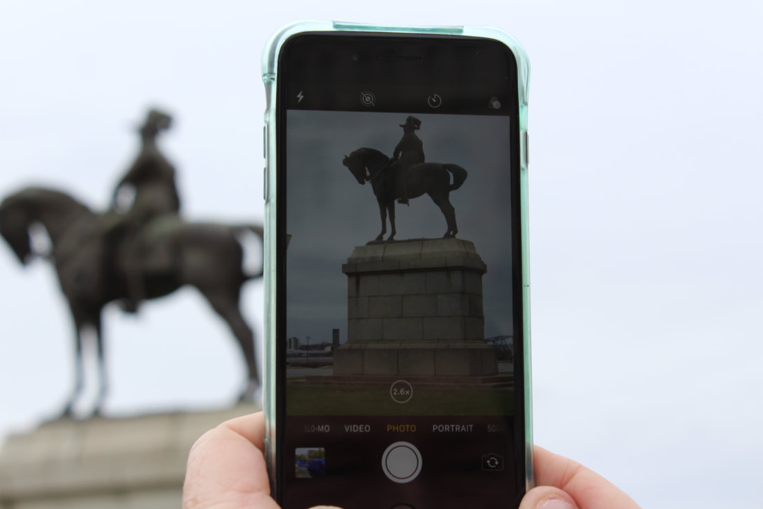
This image is very similar to the 1 above, except has photoshop differences to make it stand out in colour. The image is a big frame black and white Bill Brandt inspired work as the levels and contrast have been boosted up completely, the outer edges of the phone have been blurred to make the main focus be the inside of the phone. This works really well and i think shows what being unexpected in photography is all about.
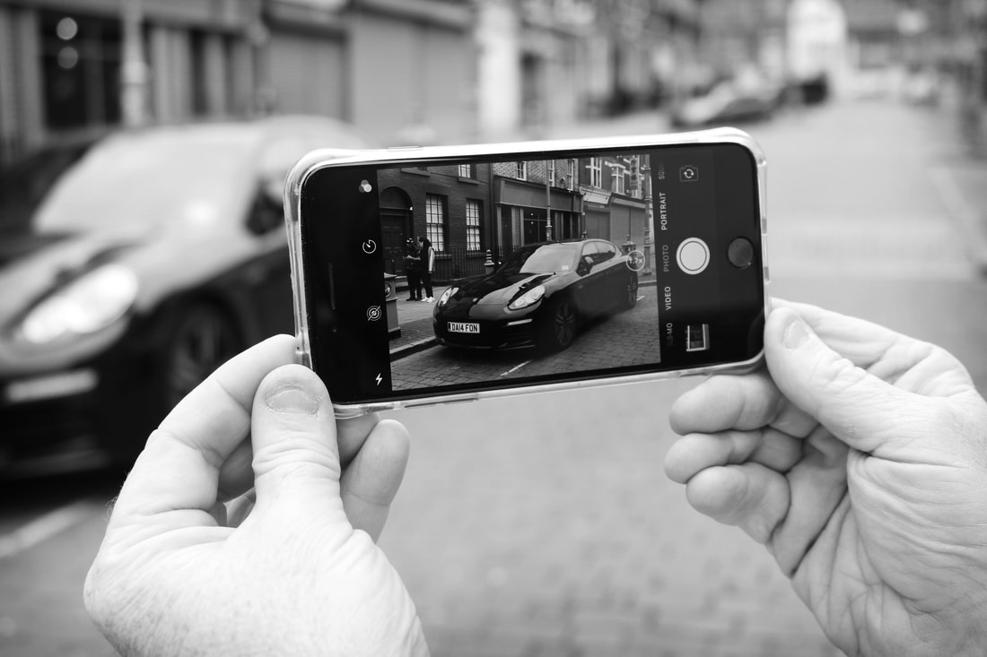
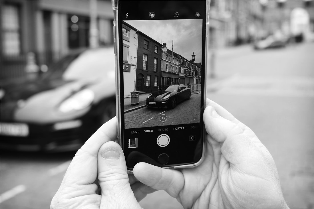
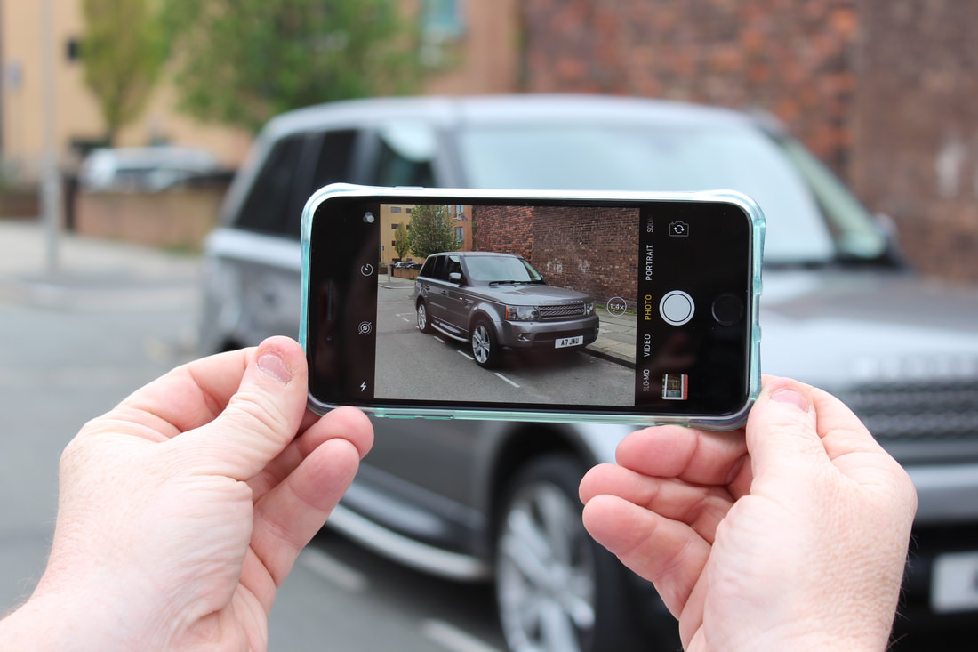
Above is a set of 3 high contrasting black and white images that show different angles of this very expensive parked car within Liverpool, I really like these images adn think they show of unexpected photography very well.
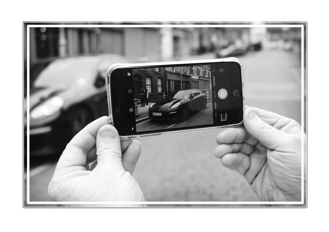
These 3 images are the same as the ones above but have a very fancy square based white glowing border around the image to make it feel more inclosed and high bight all the key parts to this image.
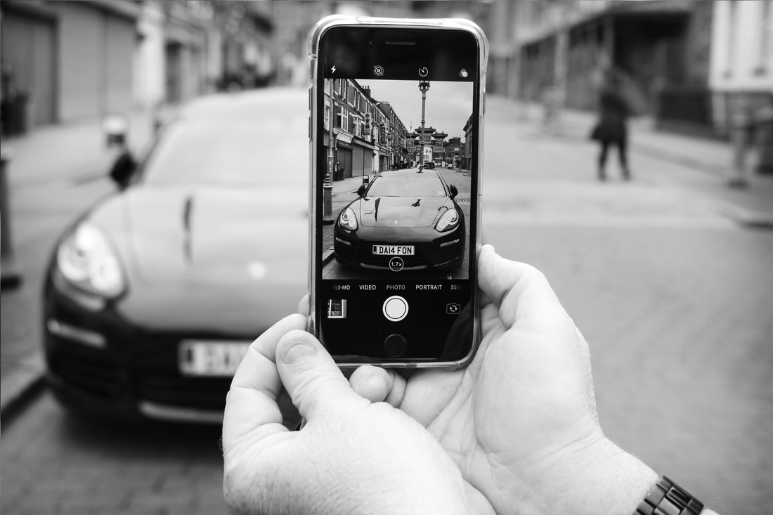
The image above is a very detailed phone perspective image and has multiple different photoshop edits applied. Firstly the image was taen as part of the 3 black and white images set above and worked that well i wanted to add it as a big frame image, to start my editing process I made the image black and white and then blurred the outer edges of the phones perspective dragging all the attention into the phone screen and not what is around it, to make it feel more clean and un cut i added a pop filter of poster edges to make it feel more real and hand drawn. Finally, added a simple but effective whit sliced border around the outer edges of the picture.
